|
Title: Potential Bitcoin Prices - Infographic For You To Share Post by: sunnankar on March 08, 2013, 04:22:13 PM A new graphic on Potential Bitcoin Prices (http://www.runtogold.com/bitcoin-price/) is available for you to share. Here is the Reddit submission (http://www.reddit.com/r/Bitcoin/comments/19x1zz/potential_bitcoin_prices_infographic_for_you_to/) so please upvote.
http://www.runtogold.com/images/potential-bitcoin-prices.jpg Title: Re: Potential Bitcoin Prices - Infographic For You To Share Post by: ehoffman on March 08, 2013, 04:41:19 PM Nice one-pager presentation ;)
Title: Re: Potential Bitcoin Prices - Infographic For You To Share Post by: SgtSpike on March 08, 2013, 04:50:19 PM I like it!
Title: Re: Potential Bitcoin Prices - Infographic For You To Share Post by: sunnankar on March 08, 2013, 04:57:12 PM I like it! Great, please help it out on Reddit if you can and be sure to share it with new people so they know the financial possibilities. Title: Re: Potential Bitcoin Prices - Infographic For You To Share Post by: proudhon on March 08, 2013, 05:22:25 PM That infographic is ridiculous.
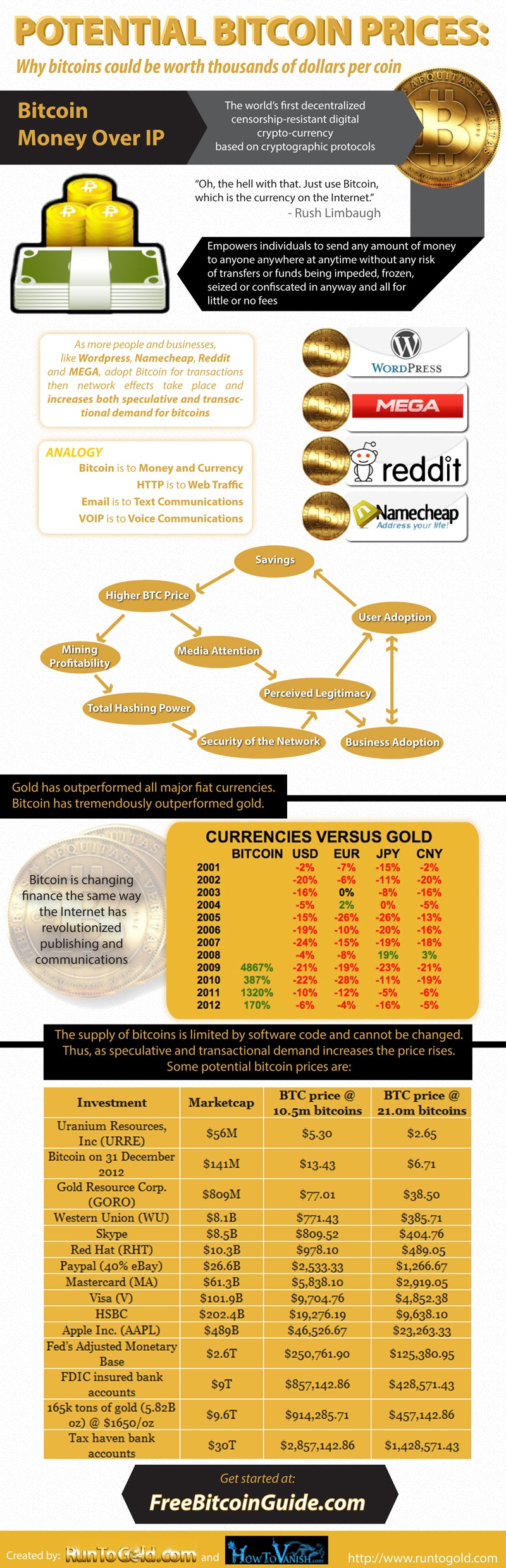
Title: Re: Potential Bitcoin Prices - Infographic For You To Share Post by: Peter Lambert on March 08, 2013, 05:53:53 PM The bottom chart is a bit hard to understand at first, but when I figured out what the numbers meant, I really like the last line:
"Tax haven bank accounts - market cap: $30T - Bitcoin Price (If bitcoin had that market cap): $2.86 million" I wonder how soon it will be that the villain in a spy movie asks for money to be sent to a bitcoin address? Edit: Crap, I was looking at it too fast maybe I need new glasses, but I think I misread the decimal as the thousands separator. Talk about misuse of significan digits, we went from an estimate with one significant digit (30T) to a derived value with nine significant digits (2857142.86). Title: Re: Potential Bitcoin Prices - Infographic For You To Share Post by: Qoheleth on March 08, 2013, 05:59:55 PM I really really dislike this image.
For one thing, it acts as though "hoarding" is the only thing that will drive up the price, which says bad stuff about BTC as a currency. If we have a functioning, growing economy, what will drive up the price will be that there aren't enough BTC in circulation to keep up with the Bitcoin economy's value velocity. If "hoarding" is the primary price driver, we have something that looks suspiciously similar to a Keynesian deflationary spiral. But on a more fundamental level, the whole chart acts like the investment upside is the big argument for BTC, which is awful for the Bitcoin community because it attracts HYIP idiots and con-men, while raising all the red flags that would keep serious investors away. Title: Re: Potential Bitcoin Prices - Infographic For You To Share Post by: bullioner on March 08, 2013, 06:04:54 PM "Tax haven bank accounts - market cap: $30T - Bitcoin Price (If bitcoin had that market cap): $2.857 billion" Why say beellions, when it actually said ... meellions? Also: the head of that column would be better if it was labelled "Asset", instead of "Investment". Not all of the assets listed qualify as investments, at least in a strict but commonly used sense where to qualify as an investment, something has to act as a factor in production, rather than just hold value. Title: Re: Potential Bitcoin Prices - Infographic For You To Share Post by: Bitobsessed on March 08, 2013, 06:09:41 PM I really really dislike this image. Why? 1) It acts as though "hoarding" is the only thing that will drive up the price (if what drives up the price is that there aren't enough BTC in circulation to keep up with the Bitcoin economy's value velocity, we have a growing economy; if "hoarding", we have something that looks like a Keynesian deflationary spiral). 2) On a more fundamental level, the whole chart acts like driving up the price is the big argument for BTC (which attracts HYIP idiots and con-men while triggering scam alarms for people looking for something real). I agree, by the time I got to the bottom all I was thinking was "hoarding" and "scam" for some reason. EDIT: They need to get rid of that Hoarding bubble towards the top. Just remove it all together and that would help IMO. Title: Re: Potential Bitcoin Prices - Infographic For You To Share Post by: Peter Lambert on March 08, 2013, 06:13:17 PM "Tax haven bank accounts - market cap: $30T - Bitcoin Price (If bitcoin had that market cap): $2.857 billion" Why say beellions, when it actually said ... meellions? Also: the head of that column would be better if it was labelled "Asset", instead of "Investment". Not all of the assets listed qualify as investments, at least in a strict but commonly used sense where to qualify as an investment, something has to act as a factor in production, rather than just hold value. You got me, I edited the post above. Title: Re: Potential Bitcoin Prices - Infographic For You To Share Post by: notme on March 08, 2013, 06:20:19 PM I really really dislike this image. For one thing, it acts as though "hoarding" is the only thing that will drive up the price, which says bad stuff about BTC as a currency. If we have a functioning, growing economy, what will drive up the price will be that there aren't enough BTC in circulation to keep up with the Bitcoin economy's value velocity. If "hoarding" is the primary price driver, we have something that looks suspiciously similar to a Keynesian deflationary spiral. But on a more fundamental level, the whole chart acts like the investment upside is the big argument for BTC, which is awful for the Bitcoin community because it attracts HYIP idiots and con-men, while raising all the red flags that would keep serious investors away. I'm pretty sure Keynes was high when he came up with the deflationary spiral. What if like, everybody didn't spend their money, man. It would become more and more valuable and nobody would want to spend it. ::) People will still buy what they need. They will just buy less of what the don't need. How is making resource usage more efficient going to cause problems? Inflationary money makes people waste resources. However, I do agree this graphic is too focused on potential gains, and not enough on the advantages of bitcoin that might translate to it being so valuable if it stands the test of time. Title: Re: Potential Bitcoin Prices - Infographic For You To Share Post by: Tomatocage on March 08, 2013, 06:21:12 PM How do we read that last part? (Potential price of Bitcoins) I get the line for Bitcoin price, but what do the other lines mean (Visa, AAPL, Western Union)? Sorry, I'm a little slow.
Title: Re: Potential Bitcoin Prices - Infographic For You To Share Post by: Severian on March 08, 2013, 06:29:20 PM Nice chart.
Hoarding is part of the cycle of any commodity worth its salt. Not sure why it seems to upset some folks. Trace, you'll be interested to hear that a friend, VP at a large American corporation, invested a considerable amount in Bitcoin the other day. I helped him make the transaction and showed him how to make a paper wallet. He bought a few coins from me last year and has been sold on its performance since. He likes going to business meetings/conventions and asking other execs if they've heard of Bitcoin. When they answer "No" he replies with, "Good. Gives me a little more time." Title: Re: Potential Bitcoin Prices - Infographic For You To Share Post by: Bitobsessed on March 08, 2013, 06:34:00 PM How do we read that last part? (Potential price of Bitcoins) I get the line for Bitcoin price, but what do the other lines mean (Visa, AAPL, Western Union)? Sorry, I'm a little slow. Paypal for example, their market cap is $26.6 Billion. If that $26.6 Billion was converted to Bitcoins, or Bitcoin's market cap was the same i.e. $26.6 Billion at the current number of coins released (10.5 million) each BTC would be worth $2,533.33. Anyone correct me if I am wrong here. Oh, reread your post...the other lines (Visa, AAPL, Western Union), that is their share of the market. Hope that helps. Title: Re: Potential Bitcoin Prices - Infographic For You To Share Post by: Qoheleth on March 08, 2013, 06:35:02 PM I'm pretty sure Keynes was high when he came up with the deflationary spiral. What if like, everybody didn't spend their money, man. It would become more and more valuable and nobody would want to spend it. Putting aside for the moment the validity or invalidity of the deflationary spiral in the real world, there are a lot of people who believe in it, and we're discussing a proposed advertisement that those people are going to read. Are we going to spend infographic space reassuring people that the deflationary spiral is a load of hokum?::) People will still buy what they need. They will just buy less of what the don't need. How is making resource usage more efficient going to cause problems? Inflationary money makes people waste resources. It's opening a can of worms that we don't even need to open. And, worse, the flowchart insinuates that "hoarding" is the sole price driver, which, for a functioning currency, is just plain incorrect! How do we read that last part? (Potential price of Bitcoins) I get the line for Bitcoin price, but what do the other lines mean (Visa, AAPL, Western Union)? Sorry, I'm a little slow. I assume it means "if the Bitcoin market cap equaled that of these companies".I feel like a better comparison would be "if Bitcoin processed the same velocity of money as these companies", but that's a harder number to calculate because "peak money transfer traffic" of these companies isn't publicly released to my knowledge. Title: Re: Potential Bitcoin Prices - Infographic For You To Share Post by: Qoheleth on March 08, 2013, 06:53:42 PM Paypal's peak transaction processing is about 100 transactions per second. Assuming that their average transaction size is still $57 (the 2005 number), that's $5700 per second, or $20.5 million per hour. To process the same amount of exchanged value as Paypal processes today, 1BTC would have to equal $2 today, or $1 once all 21M are minted.
Visa's transaction volume in 2011 was $6 trillion, their average TPS is 2500, and their peak TPS is 10K. So at peak they process $2.74 billion per hour. To represent the same amount of exchanged value as the Visa network represents today, 1BTC would have to equal $260.93 today, or $130.46 once all 21M are minted. Of course, these assume that every bitcoin in existence is being constantly exchanged - that there are no cold wallets or savings accounts. Any BTC held as store of value will reduce the effective BTC in circulation and drive up the minimum necessary price further. Title: Re: Potential Bitcoin Prices - Infographic For You To Share Post by: notme on March 08, 2013, 06:59:23 PM Paypal's peak transaction processing is about 100 transactions per second. Assuming that their average transaction size is still $57 (the 2005 number), that's $5700 per second, or $20.5 million per hour. To process the same amount of exchanged value as Paypal processes today, 1BTC would have to equal $2 today, or $1 once all 21M are minted. Visa's transaction volume in 2011 was $6 trillion, their average TPS is 2500, and their peak TPS is 10K. So at peak they process $2.74 billion per hour. To represent the same amount of exchanged value as the Visa network represents today, 1BTC would have to equal $260.93 today, or $130.46 once all 21M are minted. Of course, these assume that every bitcoin in existence is being constantly exchanged - that there are no cold wallets or savings accounts. Any BTC held as store of value will reduce the effective BTC in circulation and drive up the minimum necessary price further. Are you really extrapolating peak volume measured in seconds to longer time scales? That doesn't seem like a valid methodology. Also, good job leaving out how you jumped from $X million per hour to $Y/1BTC. Title: Re: Potential Bitcoin Prices - Infographic For You To Share Post by: Qoheleth on March 08, 2013, 07:17:51 PM Are you really extrapolating peak volume measured in seconds to longer time scales? That doesn't seem like a valid methodology. Also, good job leaving out how you jumped from $X million per hour to $Y/1BTC. Bitcoin transactions take 6 confirmations to clear; thus, bitcoins cannot move faster on average than 1 hour per transaction. Thus, at the busiest moment of the year, the total value of all BTC in circulation is guaranteed to be at least equal to the total value of all transactions that were submitted in the previous hour.I'm estimating "the busiest hour" by multiplying the busiest second by 3600. Admittedly, that's going to be inaccurately large (and thus imply an inaccurately large BTC price). But other than that, all the assumptions I'm making are maximally conservative (for instance, that every bitcoin in existence is moving during peak transaction volume - as mentioned, any BTC that are not would increase the given minimums), so I'm comfortable with these calculations as a "minimum price" in the given scenarios. Title: Re: Potential Bitcoin Prices - Infographic For You To Share Post by: lebing on March 08, 2013, 09:15:42 PM Rush limbaugh is who you thought most appropriate to quote? ???
Some of the info was good/ well displayed though. Especially the market cap potential. Title: Re: Potential Bitcoin Prices - Infographic For You To Share Post by: Zangelbert Bingledack on March 09, 2013, 05:23:13 PM I made the original flow chart that appears in this infographic, and since it was for the audience here on bitcointalk.org I deliberately chose the word "hoarding" to make people realize that hoarding is not bad. However, for a mainstream audience it's probably better to change it to "saving" to avoid opening up that can of worms.
Title: Re: Potential Bitcoin Prices - Infographic For You To Share Post by: sunnankar on March 09, 2013, 05:43:02 PM I made the original flow chart that appears in this infographic, and since it was for the audience here on bitcointalk.org I deliberately chose the word "hoarding" to make people realize that hoarding is not bad. However, for a mainstream audience it's probably better to change it to "saving" to avoid opening up that can of worms. That was a very helpful flow chart to illustrate the virtuous cycle of adoption, savings and usage. |