|
Title: [Prototype phase] Orderbook Dynamics Charts (useful for HFT/algo analysis) Post by: Sapphire on September 20, 2016, 07:42:02 AM Hi everyone!
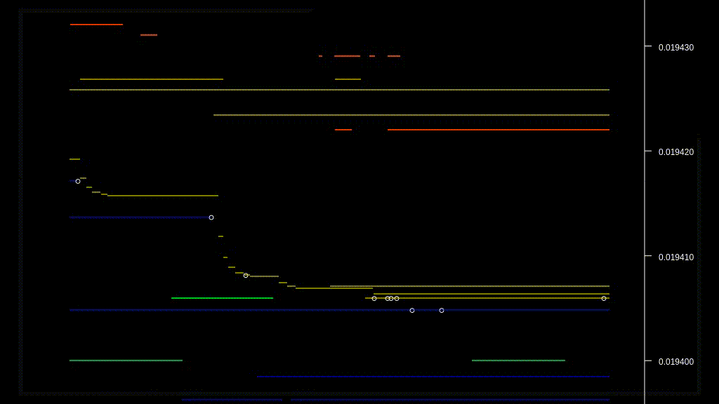
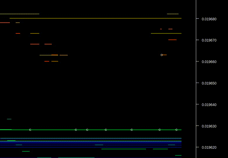
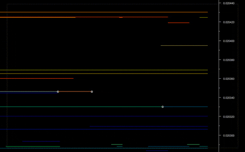
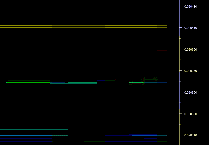
I've been developing trading charts that display orderbook dynamics, i.e. how orderbook changes with time. They help seeing how tens of orders are being created, removed and moved from price level to another, all that real-time. Below you can see some screencasts of that in action. Features.
Examples. Every line on the chart represents an order in the orderbook. Lines are colorized according to the order size. Yellow to red lines are asks. Yellow ones are small. The redder the color, the bigger the ask size. Blue to green are bids. Blue bids are small. The greener the color, the bigger the bid size. White circles are actual trades. https://media.giphy.com/media/l3vR00ELKedHdVFeg/giphy.gif Notice bots moving their orders in funny patterns: https://media.giphy.com/media/l3vRerNLKVThcF1e0/giphy.gif Zooming in to a larger scale: https://media.giphy.com/media/3o6ZtrBGky13QE4B9u/giphy.gif HFT activity, the bots are playing in the orderbook: https://media.giphy.com/media/l3vQX97lr7kWIA5xe/giphy.gif Contact me Let me know if anyone is interested in the charts. I'm accepting investments to speed up the development and provide the charts as a product. PM if you're interested in investing. Cheers! Title: Re: [Prototype phase] Orderbook Dynamics Charts (useful for HFT/algo analysis) Post by: Sapphire on September 28, 2016, 02:10:55 PM Anyone? :)
Title: Re: [Prototype phase] Orderbook Dynamics Charts (useful for HFT/algo analysis) Post by: coinableS on September 29, 2016, 01:52:39 AM Very unique and interesting implementation! You go through about why they are different colors, but why are some lines longer than others? Is it the time that the order is available, and when it ends the order was removed?
Title: Re: [Prototype phase] Orderbook Dynamics Charts (useful for HFT/algo analysis) Post by: Sapphire on September 29, 2016, 03:26:20 AM Very unique and interesting implementation! You go through about why they are different colors, but why are some lines longer than others? Is it the time that the order is available, and when it ends the order was removed? Exactly. So very short lines are orders that exists only for a tiny while. Do you have any specific use case in mind for these charts? |