|
Title: Bitcoin Identity Redesign Post by: gordonc on June 16, 2011, 12:20:27 AM Hello internet!
I originally intended to post this as a reply to the thread here: http://forum.bitcoin.org/?topic=45.0 (http://forum.bitcoin.org/?topic=45.0) but I can only fucking post in this forum. Anyway, I went ahead and did a bitcoin identity redesign project. The results are here: http://handsomecode.tumblr.com/post/6565610892/designing-a-better-bitcoin-identity (http://handsomecode.tumblr.com/post/6565610892/designing-a-better-bitcoin-identity) and the source files are here: https://www.views.fm/gordonc/btcidentity (https://www.views.fm/gordonc/btcidentity) Feel free to re-use and repurpose. Have fun. http://media.tumblr.com/tumblr_lmuol3zx9I1qznjpp.png http://media.tumblr.com/tumblr_lmupioyU7M1qznjpp.png http://media.tumblr.com/tumblr_lmuost1zBs1qznjpp.png Title: Re: Bitcoin Identity Redesign Post by: 88bitcoins on June 16, 2011, 12:28:28 AM Hey - this is nice. Used to work for a font foundry years ago. Nice use of type.
Title: Re: Bitcoin Identity Redesign Post by: fascistmuffin on June 16, 2011, 12:29:46 AM Looks slick, good job!
Title: Re: Bitcoin Identity Redesign Post by: pointbiz on June 16, 2011, 12:38:16 AM nice!
Title: Re: Bitcoin Identity Redesign Post by: ananas5 on June 16, 2011, 02:13:35 AM Looks great, I hope lots of online shops start accepting Bitcoins.
Title: Re: Bitcoin Identity Redesign Post by: EyeRis on June 16, 2011, 03:16:45 AM I believe this exact same post was already made? I could be wrong but I feel you may have copypasta'd this
Title: Re: Bitcoin Identity Redesign Post by: Gdawg on June 16, 2011, 04:01:59 AM Looks really nice. I hope we go to this as I don't like the look either.
Title: Re: Bitcoin Identity Redesign Post by: davux on June 16, 2011, 04:50:17 AM The design is very nice and looks fairly professional.
However, the striked B is a big no-no to me, because this is already the symbol for Thai Baht. If anyone thinks it's OK to reuse it because "after all, the $ sign is already used by many currencies", then go ahead and just use the $ sign for Bitcoin. Does it work? Of course it doesn't. So why would the Baht sign? And yes, although Thailand is far from the United States, it does exist, it's near from many places, and they do have internet there. People always make jokes about Americans not having any clue about the whole planet living outside the US, so it's time to prove that some/most of you guys are not so narrow-minded. Title: Re: Bitcoin Identity Redesign Post by: gordonc on June 16, 2011, 07:40:23 PM Good catch, I have to admit I have never seen Thai baht!
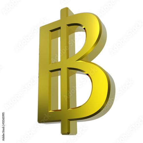
While a subtle point, I think there is a different between a striked ฿, as the Baht seems to universally use: http://www.google.com/search?um=1&hl=en&safe=off&biw=824&bih=718&tbm=isch&sa=1&q=thai+baht+symbol&oq=thai+baht+symbol&aq=f&aqi=&aql=&gs_sm=e&gs_upl=1868l2741l0l7l5l0l0l0l0l0l0ll0 and the modified B with and additional ascender and descender. Anyway, the existing iconography seems to have the same problem: http://bitcoin.nl/graphics/bitcoin_gold.png http://t2.ftcdn.net/jpg/00/13/56/59/400_F_13565995_euO0qDXvjoo4qC1qidvWms2fEskp2t5X.jpg This does beg the addition of treatment using 'btC' with perhaps another logo. Title: Re: Bitcoin Identity Redesign Post by: gordonc on June 17, 2011, 07:45:36 PM Hey - this is nice. Used to work for a font foundry years ago. Nice use of type. Thanks! I love the whole Museo family... Title: Re: Bitcoin Identity Redesign Post by: dayfall on June 17, 2011, 08:01:19 PM I say keep the original double strikes.
Title: Re: Bitcoin Identity Redesign Post by: 4n0n on June 17, 2011, 08:54:07 PM See this post I just made....
http://forum.bitcoin.org/index.php?topic=17757.msg234282#msg234282 .... with the crap graphics. That's a free letter that implies BT and can be freely claimed without pissing anyone off. Using that in a logo without the downmarket pawnbroker gold/yellow theme and we're onto a winner IMO. Whatever the end result, a rebranding is necessary. Great, clean graphics work within the obvious limitations btw! :) Title: Re: Bitcoin Identity Redesign Post by: gordonc on June 17, 2011, 09:01:36 PM See this post I just made.... http://forum.bitcoin.org/index.php?topic=17757.msg234282#msg234282 .... with the crap graphics. That's a free letter that implies BT and can be freely claimed without pissing anyone off. Using that in a logo without the downmarket pawnbroker gold/yellow theme and we're onto a winner IMO. Whatever the end result, a rebranding is necessary. Great, clean graphics work within the obvious limitations btw! :) I'm thinking that instead of going for an ASCII symbol the default written form should be 'btC.' Simple, explanatory, no need for weird characters. Planning to execute some identity designs based on 'btC' in the near future. Title: Re: Bitcoin Identity Redesign Post by: 4n0n on June 17, 2011, 09:11:55 PM Yep, I'm with you. Out of the hieroglyph options the lowercase bslash is the best option IMO, but I have to admit that after all these years I write....... $1, £1, 1 EUR. So perhaps the unique hieroglyph should be left alone.
Please, please, please forget about the implied-by-previous-logo wild west theme and do a free rebranding - you have the eye for the clean corpo look! :) Title: Re: Bitcoin Identity Redesign Post by: bitbonga on June 22, 2011, 04:20:11 PM Smooth!
Which font type did you use? I like it. Title: Re: Bitcoin Identity Redesign Post by: BitcoinATS.com on June 22, 2011, 07:56:02 PM These are very nice! What license are they being released under?
|