|
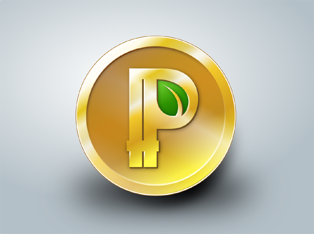
Title: Design Contest is Over - Say Hello to ppc's New Logo! Post by: Sentinelrv on July 11, 2013, 06:11:50 AM Voting is over. #199 wins the contest. Say hello to ppc's new logo! Now on to rebuilding the website!
http://i2.photobucket.com/albums/y17/Sentinelrv/Other-Images/ppcmed.png Title: Re: 2nd Round Voting for Peercoin Logo Design Contest Post by: Sentinelrv on July 11, 2013, 06:12:32 AM 1. What is the entry # for your favorite design?
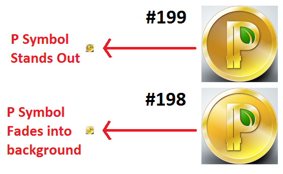
#199 2. What is the reason you chose to vote for this design? There are several reasons I chose to vote for #199. I believe it has the best colors when compared against all the other designs. The way the leaf is incorporated into the symbol is perfect in my opinion. Another important question I should answer is why I chose #199 instead of #198. Sunny King told me that #198 is his favorite so far. I like #198 also, but it unfortunately doesn't work in all situations. The Peercoin logo is going to be seen at a much smaller size many many more times than it will at a larger size. It will need to fit into small avatars and there are many places where a 16x16 icon is necessary. #198 just doesn't work at smaller sizes because the P symbol fades into the background. #199 doesn't have this problem. It stands out just fine at any size. The final logo needs to work at all sizes and I think #199 does the job. Check out this example I made to show off what I'm talking about... http://i2.photobucket.com/albums/y17/Sentinelrv/Other-Images/199vs198.png Title: Re: 2nd Round Voting for Peercoin Logo Design Contest Post by: FuzzyBear on July 11, 2013, 10:45:30 AM 1. What is the entry # for your favorite design?
#199 has my vote as well I believe 2. What is the reason you chose to vote for this design? I do really like the feel of #197 but I feel that there is just too much bright gold on it and the detail gets lost, #199 combines a nice level of "gleem" or shine off the coin while maintaining that the coin can be recognized when made small to an icon. The leaf in the center of the P is perfect, though #21 has an equally nice twist on this and it was a close call between these two for me, but I'll stick with #199 Any one else wanting to help raise awareness to this vote please upvote the thread on http://www.reddit.com/r/ppcoin/comments/1i2dgq/final_voting_round_please_place_your_final_vote/ Many thanks to Sentinelrv for again all your hard work in keeping this vote / contest running.... would not have happened without you so the community owes you... except for the developers who will now have to make all new builds and website icons and logos!! but seriously thank you from everyone over at http://www.ppcointalk.org/ as well :) FuzzyBear Title: Re: 2nd Round Voting for Peercoin Logo Design Contest Post by: Sentinelrv on July 11, 2013, 02:18:28 PM Muto over at ppcointalk.org doesn't meet the requirements for voting here, so I'm adding his vote for #199, since we already know who he is.
Title: Re: 2nd Round Voting for Peercoin Logo Design Contest Post by: d5000 on July 11, 2013, 04:29:36 PM 1. What is the entry # for your favorite design?
#199 2. What is the reason you chose to vote for this design? The same reasons Sentinelv has mentioned. #198 is a good option too but has the problem with the P fading with the background. Also, the colour mix of #199 is a bit simpler, the "shine" of the #198 doesn't convince me so much. The problem with the form of the leaf was solved in a good way in both designs, in my opinion better than in GameKyuubi's designs. Title: Re: 2nd Round Voting for Peercoin Logo Design Contest Post by: super3 on July 12, 2013, 01:04:52 AM #199, pretty much same reasons.
Title: Re: 2nd Round Voting for Peercoin Logo Design Contest Post by: craslovell on July 12, 2013, 02:45:07 AM 1. What is the entry # for your favorite design?
#199 2. What is the reason you chose to vote for this design? It is a very "clean" and professional looking design. I like the contrast improvements we can see at the back of the P, especially since it makes it stand out on the very small image. The other design fades away and almost looks like the logo of a number of clones coins with no value that have come out recently. The original P design was generally kept in shape, and the leaf is a perfect symbolization of the energy efficiency that ppcoin will bring to the crypto world. I'm all in for #199 :) Title: Re: 2nd Round Voting for Peercoin Logo Design Contest Post by: Sentinelrv on July 12, 2013, 10:12:38 PM Voting will close tonight at midnight EST time. If you haven't voted yet, please do so now. This is your last chance.
Title: Re: Final Voting Round for Peercoin Logo Design Contest Post by: Praxis on July 12, 2013, 11:48:01 PM 1. My pick: #48
2. Why: It's the most elegant, why not being over-decorated. The green leaf in the background integrates perfectly in this design, better than in #199 in my opinion. Title: Re: Design Contest is Over - Say Hello to ppc's New Logo! Post by: Sentinelrv on July 13, 2013, 04:22:31 AM Voting is over. #199 wins the contest. Say hello to ppc's new logo! Now on to rebuilding the website!
http://i2.photobucket.com/albums/y17/Sentinelrv/Other-Images/ppcmed.png Title: Re: Design Contest is Over - Say Hello to ppc's New Logo! Post by: super3 on July 13, 2013, 02:42:41 PM Voting is over. #199 wins the contest. Say hello to ppc's new logo! Now on to rebuilding the website! Where/when can we get the raw sources files for the logo?http://i2.photobucket.com/albums/y17/Sentinelrv/Other-Images/ppcmed.png Title: Re: Design Contest is Over - Say Hello to ppc's New Logo! Post by: mr_random on July 13, 2013, 03:06:27 PM I like it.
Title: Re: Design Contest is Over - Say Hello to ppc's New Logo! Post by: Sentinelrv on July 13, 2013, 03:47:17 PM Where/when can we get the raw sources files for the logo? I have to wait for the designer to upload the files. I asked him to make us a version with a transparent background first. Title: Re: Design Contest is Over - Say Hello to ppc's New Logo! Post by: Sentinelrv on July 14, 2013, 08:42:09 PM Here is the link to the files for #199...
http://www.mediafire.com/download/6s5pj7lk1ylra78/Peercoin_Logo_Files-199.zip |