|
Title: Bitcoin logos based on the original icon Post by: kroptofer on February 22, 2011, 05:56:42 AM Here is an image I created some months back:
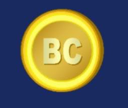
http://i1097.photobucket.com/albums/g352/kroptofer/bitcoin.jpg I don't know about you, but I still prefer the first logo which had the actual letters "BC" written on the coin instead of the strange double strikethrough "B" : It reminds me too much of the dollar and other currencies. Am I the only one bothered by this? Now, I'm obviously no graphic designer, but are there any out there who made logos with a similar way of thinking? (maybe some logos that don't look like the looney tunes title card, unlike mine) By the way, I have been generating bitcoins since at least April '09, but this is my first post here. I guess I was starting to feel left out of the discussions. Title: Re: Bitcoin logos based on the original icon Post by: kiba on February 22, 2011, 05:58:14 AM Broken image. :-\
Title: Re: Bitcoin logos based on the original icon Post by: Binford 6100 on February 22, 2011, 09:54:48 AM I don't know about you, but I still prefer the first logo which had the actual letters "BC" written on the coin that would be great for web sites if used as favicon img can i use it that way? it sucks having multiple tabs about btc open and all of them having the same img : ) Title: Re: Bitcoin logos based on the original icon Post by: theymos on February 22, 2011, 10:05:44 AM it sucks having multiple tabs about btc open and all of them having the same img : ) That also irritates me. I do prefer the newer slashed-B icon, though. Here is the old 16x16 "BC" icon: http://bitcoin.svn.sourceforge.net/viewvc/bitcoin/trunk/rc/bitcoin.ico?revision=1&pathrev=75 Title: Re: Bitcoin logos based on the original icon Post by: ribuck on February 22, 2011, 11:15:25 AM Now that "BTC" is heavily used to mean "bitcoins", I think it's worth deprecating "BC". When the "BC" logo was originally used, way back when, there was no widespread usage of "BTC". I think it's more than enough enough to have strikethrough-B and BTC, without reviving a third abbreviation.
Title: Re: Bitcoin logos based on the original icon Post by: Binford 6100 on February 22, 2011, 12:05:25 PM Now that "BTC" is heavily used to mean "bitcoins", I think it's worth deprecating "BC". When the "BC" logo was originally used, way back when, there was no widespread usage of "BTC". I think it's more than enough enough to have strikethrough-B and BTC, without reviving a third abbreviation. but for bitcoin central the bc logo is THE candidate for a favicon v 2.0 Title: Re: Bitcoin logos based on the original icon Post by: ribuck on February 22, 2011, 12:14:28 PM but for bitcoin central the bc logo is THE candidate for a favicon v 2.0 Sure, that's a natural and appropriate use of "BC".Title: Re: Bitcoin logos based on the original icon Post by: Mike Hearn on February 22, 2011, 01:19:01 PM Could it just be a B in a circle? That way it'd match the Ⓑ unicode symbol that some of us want to see adopted as the official symbol. I agree the double strikethrough isn't great, due to the Baht conflict.
Title: Re: Bitcoin logos based on the original icon Post by: theymos on February 22, 2011, 01:26:57 PM I agree the double strikethrough isn't great, due to the Baht conflict. The Baht has a single line. Bitcoin has two. Title: Re: Bitcoin logos based on the original icon Post by: Mike Hearn on February 22, 2011, 02:14:56 PM That's still pretty close. Dollar symbol is written with both one and two strikethroughs sometimes.
Title: Re: Bitcoin logos based on the original icon Post by: kroptofer on February 22, 2011, 07:07:05 PM but for bitcoin central the bc logo is THE candidate for a favicon v 2.0 Sure, that's a natural and appropriate use of "BC"."Natural and appropriate", eh? Well, what if I were to toy around with the logo, and the next favicon would look something like this: http://i1097.photobucket.com/albums/g352/kroptofer/bitcoinFace1.png or this: http://i1097.photobucket.com/albums/g352/kroptofer/bitcoinFace2.png or heck, maybe even - http://i1097.photobucket.com/albums/g352/kroptofer/bitcoinMascot1.png and a horizontal version: http://i1097.photobucket.com/albums/g352/kroptofer/bitcoinMascot2.png although instead of simply a favicon, I seem to have made a mascot. Imagine, he could be shooting at some real-world currency characters...alright I just spent way too much time on these, I think I'll go visit one of the geopolitical, socio-economic forums. Title: Re: Bitcoin logos based on the original icon Post by: sandos on February 22, 2011, 08:04:08 PM I laughed out loud!
You should post this on witcoin, I guess, and maybe expand on it. Title: Re: Bitcoin logos based on the original icon Post by: Jotto on February 22, 2011, 08:06:11 PM @kroptofer
Dude, post your Bitcoin-address! You're gonna be the receiver of my first bitcoin-tip! Title: Re: Bitcoin logos based on the original icon Post by: Anonymous on February 23, 2011, 12:42:11 AM but for bitcoin central the bc logo is THE candidate for a favicon v 2.0 Sure, that's a natural and appropriate use of "BC"."Natural and appropriate", eh? Well, what if I were to toy around with the logo, and the next favicon would look something like this: http://i1097.photobucket.com/albums/g352/kroptofer/bitcoinFace1.png or this: http://i1097.photobucket.com/albums/g352/kroptofer/bitcoinFace2.png or heck, maybe even - http://i1097.photobucket.com/albums/g352/kroptofer/bitcoinMascot1.png and a horizontal version: http://i1097.photobucket.com/albums/g352/kroptofer/bitcoinMascot2.png although instead of simply a favicon, I seem to have made a mascot. Imagine, he could be shooting at some real-world currency characters...alright I just spent way too much time on these, I think I'll go visit one of the geopolitical, socio-economic forums. Good Sir that is full of win ! This character should star in the bitcoin animation film :) Title: Re: Bitcoin logos based on the original icon Post by: comboy on February 23, 2011, 12:46:35 AM Somebody sell me t-shirt with this.
Title: Re: Bitcoin logos based on the original icon Post by: Local on February 23, 2011, 04:11:12 AM Kroptofer, that's excellent!
|