|
Title: Help reading charts Post by: bittkoiner on January 04, 2014, 11:52:24 AM Hi Folks!
Can someone explain how to analyze the marked area? And what the choppy lines means? http://s28.postimg.org/iesjevjax/image_2.jpg (http://postimg.org/image/iesjevjax/) And one more (The big colored field). http://dc-charts.com/images/btce_ppcoin_bitcoin_h4_yf.png http://dc-charts.com/images/depth_btce_ppcoin_btc_gbn.png Thanks Title: Re: Help reading charts Post by: magarto on January 04, 2014, 11:58:11 AM It would be great if someone can explain last chart. Thanks!
Title: Re: Help reading charts Post by: bittkoiner on January 04, 2014, 12:28:34 PM ps. the "invalid image" works :) ds.
Title: Re: Help reading charts Post by: durilup on January 04, 2014, 12:42:34 PM Green is what what people want to sell for, red is what people want to buy for, where they meet is the current price
Title: Re: Help reading charts Post by: Lethn on January 04, 2014, 12:52:04 PM http://www.babypips.com/school - This is about forex trading but it teaches you just about everything you need to know about technical chart reading no matter what market your in, I've actually found it's easier to read cryptocurrencies because there's a lot less manipulation and fraud going on.
Title: Re: Help reading charts Post by: Gentlemaniac on January 04, 2014, 12:54:26 PM Green is what what people want to sell for, red is what people want to buy for, where they meet is the current price Current Price (as shown in red in the first image) is the latest price at which a Bitcoin was traded. It is not derived from the order book. Title: Re: Help reading charts Post by: bittkoiner on January 05, 2014, 04:39:17 PM Can you put it this way, The price will go down until there is enough buyer to buy the amount that is for sale.
And the other way around is: The price will go up until the amount buy-orders match with the sale-orders? Title: Re: Help reading charts Post by: deepceleron on January 05, 2014, 05:41:47 PM This type of chart is called accumulated order book:
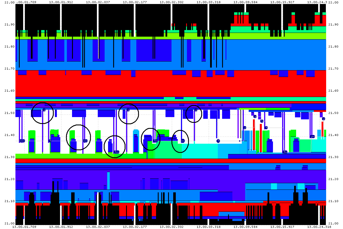
http://bitcoincharts.com/charts/mtgoxUSD/accumulated_orderbook.png On the bottom is the price (in this case USD). From the center going left, it shows how many market orders wanting to buy bitcoin at or above that price exist. Going right from the center, it shows how many market orders wanting to sell bitcoin at or below that price have been placed. The height is the number of bitcoins. This kind of chart can be read as: someone would need to buy 5,000 BTC to make the price 1070 (currently). It also lets you see "walls", prices where large orders will inhibit movement past a particular point. Don't feel bad, there are also charts that look like this: http://www.nanex.net/research/Norway.Interview/20111122.oo.13.00.01.709.FrL.0ms.gif Title: Re: Help reading charts Post by: bittkoiner on January 08, 2014, 01:02:17 PM 1.
Can you put it like this? The only thing that makes the price goes up is when the number of shares for sale are fewer than the numbers wanted? 2. In fact, the price/pcs is already set by btc-e.. Can an individual edit that? |