DeathAndTaxes (OP)
Donator
Legendary

 Offline Offline
Activity: 1218
Merit: 1079
Gerald Davis

|
 |
January 26, 2012, 01:48:55 PM
Last edit: January 26, 2012, 02:26:33 PM by DeathAndTaxes |
|
Option A  Option B  Yes I am being intentionally obscure because I would prefer results based on your first visual reaction. For wasting your time I will give 1 BTC to a random person in this thread. Just post a reply after you vote. Be sure to post a reply as I can't see who voted. You don't have to pick the winning design to win so just vote based on your own personal first reaction. Thanks. On edit: To make the random drawing a little more fair I already used random number generator to generate a decimal between 0 & 1. I hashed it so that is can be verified after the fact but still remains unknown to anyone but me. SHA-256 hash of pre-generated random number: ADC24B56FCFF884B5DC63ACF28A890DC1E64399B760752C4FCEF7A96C099CDF3 Winner = ROUNDDOWN(pre-generated rand / # of posts in thread*) *excluding all my posts and any duplicates. Example: IF the pre-generated rand was 0.5225 and there are 14 unique replies. 0.5225 * 14 = 7.315 Winner is the 7th reply. Not the pre-generated rand isn't 0.5225 (but it could be 0.52251  ). |
|
|
|
|
|
|
|
|
|
You get merit points when someone likes your post enough to give you some. And for every 2 merit points you receive, you can send 1 merit point to someone else!
|
|
|
Advertised sites are not endorsed by the Bitcoin Forum. They may be unsafe, untrustworthy, or illegal in your jurisdiction.
|
|
|
Matthew N. Wright
Untrustworthy
Hero Member
 Offline
Activity: 588
Merit: 500
Hero VIP ultra official trusted super staff puppet
|
 |
January 26, 2012, 01:50:00 PM |
|
I picked the first one because it's more realistic.
|
|
|
|
DeathAndTaxes (OP)
Donator
Legendary
Offline
Activity: 1218
Merit: 1079
Gerald Davis
|
|
January 26, 2012, 01:55:04 PM
Last edit: January 26, 2012, 02:06:08 PM by DeathAndTaxes |
|
Since there are more votes than posts as a reminder if you want a shot at the 1 BTC random drawing you also need to post in the thread.
This forum's software doesn't make visible voting possible. Grr.
|
|
|
|
|
ZodiacDragon84
Sr. Member
Offline
Activity: 266
Merit: 250
The king and the pawn go in the same box @ endgame
|
|
January 26, 2012, 01:59:02 PM |
|
I vote the blue one, but I do prefer red, Mr. D&T
|
|
|
|
|
kronosvl
|
|
January 26, 2012, 02:00:08 PM |
|
options B. Look like a board with 1 slot that can have addons. Depends for what you need it
|
|
|
|
Phinnaeus Gage
Legendary
 Offline
Activity: 1918
Merit: 1570
Bitcoin: An Idea Worth Spending

|
|
January 26, 2012, 02:10:34 PM |
|
I picked the first one because it's more realistic.
I think Matt is Wright. At first I was thinking the blue one, but in orange. And why isn't there an orange option, you racist bastard?  |
|
|
|
|
DeathAndTaxes (OP)
Donator
Legendary
Offline
Activity: 1218
Merit: 1079
Gerald Davis
|
|
January 26, 2012, 02:15:40 PM |
|
I picked the first one because it's more realistic.
I think Matt is Wright. At first I was thinking the blue one, but in orange. And why isn't there an orange option, you racist bastard? Wouldn't that be colorist? Once I settle on a design I may have artist try a couple different colors. My wife told me to go with blue because it implies strength, security, establishment. I have no idea if that is true but it sounded good. You might find it interesting what "they" say about Orange http://www.logocritiques.com/resources/color_psychology_in_logo_design/ |
|
|
|
|
farfiman
Legendary
Offline
Activity: 1449
Merit: 1001
|
|
January 26, 2012, 02:16:20 PM |
|
I choose A - the other looks like water is flowing off the top edge |
"We are just fools. We insanely believe that we can replace one politician with another and something will really change. The ONLY possible way to achieve change is to change the very system of how government functions. Until we are prepared to do that, suck it up for your future belongs to the madness and corruption of politicians."
Martin Armstrong
|
|
|
czebrda
Newbie
Offline
Activity: 29
Merit: 0
|
|
January 26, 2012, 02:21:25 PM |
|
Voted!
|
|
|
|
|
Matthew N. Wright
Untrustworthy
Hero Member
Offline
Activity: 588
Merit: 500
Hero VIP ultra official trusted super staff puppet
|
|
January 26, 2012, 02:27:49 PM |
|
Your wife is very smart and her reasoning behind suggesting blue are very valid, but blue is not typically a color associated with cryptography or microchips. Might I recommend a touch of green?  |
|
|
|
Kluge
Donator
Legendary
Offline
Activity: 1218
Merit: 1015
|
|
January 26, 2012, 02:32:54 PM |
|
Your wife is very smart and her reasoning behind suggesting blue are very valid, but blue is not typically a color associated with cryptography or microchips. Might I recommend a touch of green? That. (otherwise, A) |
|
|
|
|
DeathAndTaxes (OP)
Donator
Legendary
Offline
Activity: 1218
Merit: 1079
Gerald Davis
|
|
January 26, 2012, 02:37:39 PM |
|
Might I recommend a touch of green?
Hmm. When I read your response I was like "green? I don't know" Then I saw your mock up and I got to say I like it. Also did you add some "texture" or was that already in the design and color just made it pop? If I end up using it I will throw you a bonus genuine Bitcoin (in equally good but used condition). On edit:. Looking at the A design, B design, and your modified "C" design I think maybe A is less popular simply because the grey on grey lacks some "pop" that the blue in B provided. |
|
|
|
|
Phinnaeus Gage
Legendary
Offline
Activity: 1918
Merit: 1570
Bitcoin: An Idea Worth Spending
|
|
January 26, 2012, 02:41:04 PM |
|
Your wife is very smart and her reasoning behind suggesting blue are very valid, but blue is not typically a color associated with cryptography or microchips. Might I recommend a touch of green? Stop the presses! (pun intended) Aren't we all forgetting that Justin Bieber's favorite color is PURPLE?  |
|
|
|
|
Matthew N. Wright
Untrustworthy
Hero Member
Offline
Activity: 588
Merit: 500
Hero VIP ultra official trusted super staff puppet
|
|
January 26, 2012, 02:41:35 PM |
|
Might I recommend a touch of green?
Hmm. When I read your response I was like "green? I don't know" Then I saw your mock up and I got to say I like it. Also did you add some "texture" or was that already in the design and color just made it pop? If I end up using it I will throw you a bonus genuine Bitcoin (in equally good but used condition). On edit:. Looking at the A design, B design, and your modified "C" design I think maybe A is less popular simply because the grey on grey lacks some "pop" that the blue in B provided. Don't pay me anything, please. I didn't even check to see if the image was released for Creative Commons sharing. I grabbed it from here http://2.bp.blogspot.com/_fFl015dzuoc/SNJ2G2ISmaI/AAAAAAAAAp0/mLUGxEEdrWA/s400/Circuitboard.png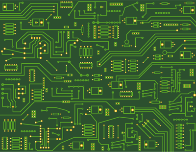 Then I changed the perspective, Dropped the opacity down to 48%, Erased the path over the T I am sure you can do better with some effort. Thanks though! |
|
|
|
DeathAndTaxes (OP)
Donator
Legendary
Offline
Activity: 1218
Merit: 1079
Gerald Davis
|
|
January 26, 2012, 02:47:13 PM |
|
Don't pay me anything, please. I didn't even check to see if the image was released for Creative Commons sharing.
Well your call I wasn't intending to use that exact logo but it kinda pushed my thinking into a different direction and I find new ideas are always worth a Bitcoin. How about if I ever get this venture off the ground I will buy an ad in your magazine instead? |
|
|
|
|
Matthew N. Wright
Untrustworthy
Hero Member
Offline
Activity: 588
Merit: 500
Hero VIP ultra official trusted super staff puppet
|
|
January 26, 2012, 02:57:58 PM |
|
Don't pay me anything, please. I didn't even check to see if the image was released for Creative Commons sharing.
Well your call I wasn't intending to use that exact logo but it kinda pushed my thinking into a different direction and I find new ideas are always worth a Bitcoin. How about if I ever get this venture off the ground I will buy an ad in your magazine instead? That'd be dandy! Subscribe while you're at it!  |
|
|
|
|
bravetheheat
|
|
January 26, 2012, 03:02:10 PM |
|
I choose option B, as it looks a tad bit better than option A. Have to agree though, it does look like there's water flowing off the edge. Better get your designer (or yourself) to fix that!
|
|
|
|
|
edd
Donator
Legendary
Offline
Activity: 1414
Merit: 1001
|
|
January 26, 2012, 03:04:14 PM |
|
I also prefer option B and agree that the "T" isn't quite right.
|
Still around.
|
|
|
|
P4man
|
|
January 26, 2012, 03:08:41 PM |
|
I would vote C.
B is better because of the color. But the T appears deeply engraved which looks wrong on a chip. With design A it appears superposed on the chip, which makes a tad more sense. Id combine them, keep the color but make it look as its on top of the chip, not deeply engraved.
|
|
|
|
DeathAndTaxes (OP)
Donator
Legendary
Offline
Activity: 1218
Merit: 1079
Gerald Davis
|
|
January 26, 2012, 03:21:52 PM |
|
I would vote C.
B is better because of the color. But the T appears deeply engraved which looks wrong on a chip. With design A it appears superposed on the chip, which makes a tad more sense. Id combine them, keep the color but make it look as its on top of the chip, not deeply engraved.
What about Matt's modified design https://bitcointalk.org/index.php?topic=61229.msg714381#msg714381 |
|
|
|
|
|
P4man
|
|
January 26, 2012, 03:27:14 PM |
|
IMO, its far worse than either of your proposals. It looks like grass growing on it. And even youd look closely to see what it is, its not like a PCB design on top of a chip makes any sense. So no.
|
|
|
|
grue
Legendary
Offline
Activity: 2058
Merit: 1431
|
|
January 26, 2012, 03:35:54 PM |
|
i like B better, but it's engraved too deep.
|
|
|
|
DeathAndTaxes (OP)
Donator
Legendary
Offline
Activity: 1218
Merit: 1079
Gerald Davis
|
|
January 26, 2012, 03:39:28 PM |
|
i like B better, but it's engraved too deep.
So shallow cut? Center the T so it doesn't "reach the edge"? The other critique on the B is that the cut goes to the edge (although some like it). Hmm or maybe make shallow cut and have the T extended to all 3 edges (kinda build on the open cut aspect)? |
|
|
|
|
|
P4man
|
|
January 26, 2012, 03:45:10 PM |
|
My 2 cents:  |
|
|
|
DeathAndTaxes (OP)
Donator
Legendary
Offline
Activity: 1218
Merit: 1079
Gerald Davis
|
|
January 26, 2012, 03:47:46 PM |
|
My 2 cents: I like it also. Thanks everyone lots of good feedback and suggestions in the thread. |
|
|
|
|
|
P4man
|
|
January 26, 2012, 03:49:17 PM |
|
BTW, excellent name, and good logo. Also allows to easily make a simple B&W 2D logo. Well done.
|
|
|
|
|
|
|
bulanula
|
|
January 26, 2012, 03:51:39 PM |
|
I also like option B !
|
|
|
|
|
DeathAndTaxes (OP)
Donator
Legendary
Offline
Activity: 1218
Merit: 1079
Gerald Davis
|
|
January 26, 2012, 03:57:02 PM |
|
BTW, excellent name, and good logo. Also allows to easily make a simple B&W 2D logo. Well done.
Thanks. Good conversion to greyscale is necessary for making high DPI, security grade hologram. |
|
|
|
|
|
Anillos
|
|
January 26, 2012, 04:42:24 PM |
|
I prefer A, but I like the "more blueish" letters (of word "cryptography") of B.
|
|
|
|
ZodiacDragon84
Sr. Member
Offline
Activity: 266
Merit: 250
The king and the pawn go in the same box @ endgame
|
|
January 26, 2012, 04:44:01 PM |
|
red is a power color! indicates security, confidence, strength, and aggression...my 2 cents
|
|
|
|
Therilith
Member
Offline
Activity: 62
Merit: 10
100X100111XX10
|
|
January 26, 2012, 05:24:03 PM |
|
Voted for A.
B looks a bit too... busy, somehow.
|
Money is power. If you would like to transfer some of your power to me (making yourself weaker and me stronger), use the following address: 1PoFSpghmpsebfwZwnu5PPmmv2u9uYgJKo
|
|
|
wachtwoord
Legendary
Offline
Activity: 2324
Merit: 1125
|
|
January 26, 2012, 05:35:56 PM |
|
Option B
|
|
|
|
|
|
evolve
|
|
January 26, 2012, 05:43:09 PM |
|
My 2 cents: This one. Out of the other two options, I voted "b" |
|
|
|
|
|
N.Olmos
|
|
January 26, 2012, 06:15:47 PM |
|
I vote for option A, but with better contrast/colors like P4man's version.
The engraved T goes against the look of the 3d model/perspective/circuit board component.
n.olmos
|
|
|
|
|
Timbo925
|
|
January 26, 2012, 06:18:35 PM |
|
keep it simple go for A |
|
|
|
|
|
dayfall
|
|
January 26, 2012, 07:20:32 PM |
|
The first is more real, but it is too bland. Why not just color the extrusion?
|
|
|
|
|
Costia
Newbie
Offline
Activity: 28
Merit: 0
|
|
January 26, 2012, 07:22:58 PM |
|
make it pink!
|
|
|
|
|
chume
Newbie
Offline
Activity: 39
Merit: 0
|
|
January 26, 2012, 07:27:06 PM |
|
This one. Out of the other two options, I voted "b" What evolve said. |
|
|
|
|
Lord F(r)og
Donator
Sr. Member
Offline
Activity: 477
Merit: 250
|
|
January 26, 2012, 07:41:40 PM |
|
I choose A - the other looks like water is flowing off the top edge I'm with |
|
|
|
|
Meni Rosenfeld
Donator
Legendary
Offline
Activity: 2058
Merit: 1054
|
|
January 26, 2012, 08:13:58 PM |
|
Your reward method is hoppable. The expected payout per vote when there are 30 votes already submitted is much higher than after, say, 200 votes.
B.
|
|
|
|
Scott J
Legendary
Offline
Activity: 1792
Merit: 1000
|
|
January 26, 2012, 08:29:04 PM |
|
Definitely B, IMO.
|
|
|
|
|
eja
Newbie
Offline
Activity: 39
Merit: 0
|
|
January 26, 2012, 08:56:07 PM |
|
I've voted A which I feel looks the best. Option B just looks weird to me, it is as if there's a canal/river running through the chip..
|
|
|
|
|
ZodiacDragon84
Sr. Member
Offline
Activity: 266
Merit: 250
The king and the pawn go in the same box @ endgame
|
|
January 26, 2012, 08:57:11 PM |
|
I've voted A which I feel looks the best. Option B just looks weird to me, it is as if there's a canal/river running through the chip..
Water cooled! |
|
|
|
Sherkel
aka Tombstoner
Full Member
Offline
Activity: 131
Merit: 100
|
|
January 26, 2012, 09:03:39 PM |
|
I like B. I like how the "T" goes in and how it's blue.
|
What do you get when you cross dominoes and The Matrix?
<A dominatrix!>
|
|
|
Krakonos
Member
Offline
Activity: 60
Merit: 10
|
|
January 26, 2012, 09:06:37 PM |
|
Voted for A, since it's more pleasing for my eye.
The B probably has bug (the T is not ended properly on the far side). It would be better if it was not so deep, but I'd vote for A anyway.
|
Tip jar: 1MWj8Etpt3ayLG5AvXwhtEU42szJD2m97z
|
|
|
|
Rejinx
|
|
January 26, 2012, 10:54:34 PM |
|
I rather A But, like stated earlier, I think A with a blue T would be best. |
|
|
|
|
DeathAndTaxes (OP)
Donator
Legendary
Offline
Activity: 1218
Merit: 1079
Gerald Davis
|
|
January 26, 2012, 11:02:05 PM |
|
Ok based on all the constructive feedback I asked for some revisions made.
First revision will be colorizing the "A" logo.
Second revision will be making changing the "B" logo so make the cut less shallow, centered, and not run off the "chip".
I will leave this thread open till 7PM EST so nobody can say I manipulated the drawing by controlling the number of post. Any post after 7PM doesn't count for the drawing. Any posts by noobs who couldn't post here are considered appended to the last valid post of this thread for the purpose of the drawing. Rule for the drawing are in the first post.
Thanks for all the great feedback.
|
|
|
|
|
DeathAndTaxes (OP)
Donator
Legendary
Offline
Activity: 1218
Merit: 1079
Gerald Davis
|
|
January 27, 2012, 12:27:07 AM |
|
So the pre-generated secret was (drumroll) 0.76313If you don't trust me you can verify the hash posted in OP here: http://hash.online-convert.com/sha256-generatorSo once I figure out how many unique responses there are in this thread (plus the 4 from noob thread) the 1 BTC will be awarded to the person who's unique post is ROUNDDOWN(0.76313 * # of unique responses). I got to run but I will do that later tonight. If someone wants to check for me remember to a) exclude all my posts b) exclude all duplicate posts by same user c) include the 4 noob posts from noob thread. Hypothetically if there are 20 unique posts then 0.76313 * 20 = 15.26 and the 15th unique response is the winner. noob thread (these 4 unique responses are to be considered appended to all responses in this thread) https://bitcointalk.org/index.php?topic=61230.msg714342#msg714342P.S. Next time I will just say the winner is unique post that is = (# of votes) * (secret number) to save me some work. Hindsight. |
|
|
|
|
dree12
Legendary
Offline
Activity: 1246
Merit: 1077
|
|
January 27, 2012, 02:13:21 AM |
|
0.76313
There are only 100000 possible numbers with 5 digits between 0 and 1. It was very easy to crack the "secret number" if it was this small! |
|
|
|
|
fb39ca4
Member
Offline
Activity: 100
Merit: 10
PlayGame.com
|
|
January 27, 2012, 02:51:54 AM |
|
I like the indent and the blue in B. However, the IC packaging should be a darker shade of gray to make it look more like a real one, and the T should be modified so it does not run off the edge.
|
|
|
|
fb39ca4
Member
Offline
Activity: 100
Merit: 10
PlayGame.com
|
|
January 27, 2012, 02:52:16 AM |
|
I like the indent and the blue in B. However, the IC packaging should be a darker shade of gray to make it look more like a real one, and the T should be modified so it does not run off the edge.
|
|
|
|
DeathAndTaxes (OP)
Donator
Legendary
Offline
Activity: 1218
Merit: 1079
Gerald Davis
|
|
January 27, 2012, 03:23:55 AM |
|
0.76313
There are only 100000 possible numbers with 5 digits between 0 and 1. It was very easy to crack the "secret number" if it was this small! Well still pretty hard to game but your right I didn't think about it at the time. A better pre-generation to hash would be: "The secret number is 0.493809809438. This is some some entropy (kcdsjc923jdkjwklw)". |
|
|
|
|
DeathAndTaxes (OP)
Donator
Legendary
Offline
Activity: 1218
Merit: 1079
Gerald Davis
|
|
January 27, 2012, 03:44:20 AM |
|
Wow that was more tedious work than I thought Post by: Matthew N. Wright on January 26, 2012, 08:50:00 AM
Post by: ZodiacDragon84 on January 26, 2012, 08:59:02 AM
Post by: kronosvl on January 26, 2012, 09:00:08 AM
Post by: Phinnaeus Gage on January 26, 2012, 09:10:34 AM
Post by: farfiman on January 26, 2012, 09:16:20 AM
Post by: czebrda on January 26, 2012, 09:21:25 AM
Post by: Kluge on January 26, 2012, 09:32:54 AM
Post by: bravetheheat on January 26, 2012, 10:02:10 AM
Post by: edd on January 26, 2012, 10:04:14 AM
Post by: P4man on January 26, 2012, 10:08:41 AM
Post by: grue on January 26, 2012, 10:35:54 AM
Post by: bitcoinTrader on January 26, 2012, 10:50:44 AM
Post by: bulanula on January 26, 2012, 10:51:39 AM
Post by: Anillos on January 26, 2012, 11:42:24 AM
Post by: Therilith on January 26, 2012, 12:24:03 PM
Post by: wachtwoord on January 26, 2012, 12:35:56 PM
Post by: evolve on January 26, 2012, 12:43:09 PM
Post by: N.Olmos on January 26, 2012, 01:15:47 PM
Post by: Timbo925 on January 26, 2012, 01:18:35 PM
Post by: Costia on January 26, 2012, 02:22:58 PM
Post by: chume on January 26, 2012, 02:27:06 PM
Post by: Lord Fog on January 26, 2012, 02:41:40 PM
Post by: Meni Rosenfeld on January 26, 2012, 03:13:58 PM
Post by: Scott J on January 26, 2012, 03:29:04 PM
Post by: eja on January 26, 2012, 03:56:07 PM
Post by: Tombstoner on January 26, 2012, 04:03:39 PM
Post by: Krakonos on January 26, 2012, 04:06:37 PM
Post by: Rejinx on January 26, 2012, 05:54:34 PM
Post by: Bitice on January 26, 2012, 09:18:35 AM (from noob forum)
Post by: meekrat on January 26, 2012, 12:16:10 PM (from noob forum)
Post by: urlord on January 26, 2012, 05:11:17 PM (from noob forum)
Post by: trentreznor321 on January 26, 2012, 05:13:10 PM (from noob forum) So I count 32 unique first posts and in this order. Weirdly there were 48 votes cast so 16 people didn't follow instructions. Good news for those who did is that your odds on winning went up 33%. Magic number was 0.76313. 0.76313 * 32 = 24.4. So 24th voter wins. That is ... (drumroll) ... Post by: Scott J on January 26, 2012, 03:29:04 PMScott J drop me a bitcoin address in the thread for your genuine slightly used Bitcoin. (If somehow I made a mistake which is possible because my method for entropy sucked and it turns out you were the winner not Scott let me know and I will pay out a 2nd Bitcoin). I think if I do something like this again I will just use (magic #) * (number of votes cast) and start at that post to look for the winner. If the post is invalid (person is excluded, duplicate post, etc) then just keep going to next post until you have a valid winner. |
|
|
|
|
DeathAndTaxes (OP)
Donator
Legendary
Offline
Activity: 1218
Merit: 1079
Gerald Davis
|
|
January 27, 2012, 04:08:25 AM |
|
That'd be dandy! Subscribe while you're at it! Done. |
|
|
|
|
DoubleIcaras
Member
Offline
Activity: 70
Merit: 10
Kill me~
|
|
January 27, 2012, 04:22:42 AM |
|
B is much more visually appealing.
|
|
|
|
|
LoupGaroux
|
|
January 27, 2012, 04:32:01 AM |
|
I would vote B.
Several times, I am from Chicago.
My rationale is for the very reason that most shy away from it... the Falling Water effect throws it off-kilter just enough to speak to steganography, the color blue covers pattern disruptive, and the apparent illusion provides the sleight of hand that keeps the viewer's attention diverted from the purpose of the image. I also appreciate the visualization that the blue is water, yet there are games being played with the perception of the level relative to the perceived surface of the base material.
Splendid effort.
|
|
|
|
|
ZodiacDragon84
Sr. Member
Offline
Activity: 266
Merit: 250
The king and the pawn go in the same box @ endgame
|
|
January 27, 2012, 05:11:51 AM |
|
I would vote B.
Several times, I am from Chicago.
My rationale is for the very reason that most shy away from it... the Falling Water effect throws it off-kilter just enough to speak to steganography, the color blue covers pattern disruptive, and the apparent illusion provides the sleight of hand that keeps the viewer's attention diverted from the purpose of the image. I also appreciate the visualization that the blue is water, yet there are games being played with the perception of the level relative to the perceived surface of the base material.
Splendid effort.
Thats deep man, really deep. Well played |
|
|
|
|
tonto
|
|
January 28, 2012, 02:17:39 AM |
|
I picked choice A because it looks (to me) better than B, even tho I love the color blue. It just looks/flows more naturally. |
|
|
|
|
Scott J
Legendary
Offline
Activity: 1792
Merit: 1000
|
|
January 28, 2012, 01:42:03 PM |
|
Magic number was 0.76313.
0.76313 * 32 = 24.4. So 24th voter wins.
That is ... (drumroll) ...
Post by: Scott J on January 26, 2012, 03:29:04 PM
Scott J drop me a bitcoin address in the thread for your genuine slightly used Bitcoin. Thanks very much, I don't normally win things 16hfcG4bJwBzVMhB6ptr8xC9ByRrFP1F9L |
|
|
|
|
DeathAndTaxes (OP)
Donator
Legendary
Offline
Activity: 1218
Merit: 1079
Gerald Davis
|
|
January 28, 2012, 03:17:34 PM |
|
Magic number was 0.76313.
0.76313 * 32 = 24.4. So 24th voter wins.
That is ... (drumroll) ...
Post by: Scott J on January 26, 2012, 03:29:04 PM
Scott J drop me a bitcoin address in the thread for your genuine slightly used Bitcoin. Thanks very much, I don't normally win things 16hfcG4bJwBzVMhB6ptr8xC9ByRrFP1F9L PAID. One (1) genuine Bitcoin used but in near mint condition. Tx Id: 6c6fcd1309aad258f0797956cfa677b7d2c9f7fffa914ccc8110d41f600c820b |
|
|
|
|
Scott J
Legendary
Offline
Activity: 1792
Merit: 1000
|
|
January 28, 2012, 06:13:21 PM |
|
Thank you, Bitcoin received.
Wouldn't say near mint condition - it's slightly scratched, but still usable.
|
|
|
|
|
jCole
Newbie
Offline
Activity: 49
Merit: 0
|
|
January 28, 2012, 11:17:44 PM |
|
I think B looks alot better  |
|
|
|
|
|


 Poll
Poll


