|
PowerGlove (OP)
|
 |
October 30, 2022, 01:27:07 AM Merited by Welsh (15), LoyceV (12), dkbit98 (10), vapourminer (6), GazetaBitcoin (5), 1miau (4), Foxpup (3), BitcoinGirl.Club (1), DdmrDdmr (1), tranthidung (1), Stalker22 (1), _BlackStar (1) |
|
Hey, everybody!  So, this is a different approach to the same problem I'm trying to address with my other patch/proposal: here. As a refresher, that proposal was to add a pair of arrows to each post to easily skip to the next/previous post by the same member within a topic. Personally, I would appreciate a feature like that, because I've found that responding to someone's post without first having read their other posts in that topic, frequently leads to frustratingly redundant exchanges. Other members have expressed different reasons for wanting a feature like that, so I believe it to be a generally useful idea. I'm quite proud of that patch, but while pondering the small usability flaw that it has (see that post for details) I came up with what I think is a superior approach: Instead of a pair of arrows, there is now a single checkbox-like widget near the bottom of each post. When you click it, it shows you only the posts in that topic that were written by that same member [1]. When you click it again, it reverts to showing you all of the posts within that topic. In my testing environment, this approach feels much better to use than the arrows do, and it ends up being quite a natural way to navigate large threads because of how it considers the specific post that was clicked on, in both directions (e.g. you can be on a thread with 100 pages, click on the widget within a specific post, see only the 3 or 4 posts made by that user, and then when you "leave" that mode by clicking the widget a second time you'll end up on the page of the specific post that was clicked on). Here's what it looks like in action (you'll have to imagine the surrounding posts; widget is next to "Report to moderator"): 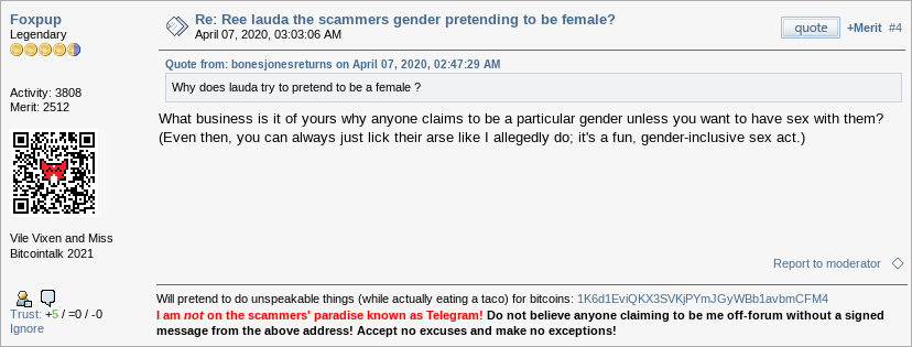 After clicking the widget, the diamond will fill-in and you'll see only the posts made by Foxpup (showing just two here): 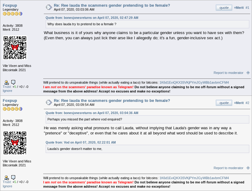 If you click the widget now, you'll end up back in "normal" mode where you can see everyone's posts again. Pretty nifty, no? The sudden appearance of a little diamond thingy will mean nothing to people who haven't read this post, so there are a couple of helpful, context-sensitive tooltips that show up when you hover over the widget:    For the technically-inclined forum users: This feature is implemented by modifying SMF to handle an extra URL parameter ("u=") when rendering topics. That means it can also be used "manually" (i.e. without the widget) which I'm guessing will find some uses. For example, if you're curious if a given user (say, theymos; u=35) has ever posted in a given topic (say, WO; topic=178336) then you could simply visit: https://bitcointalk.org/index.php?topic=178336;u=35 (though obviously this doesn't work just yet, because the patch hasn't been accepted). I've sent the code to theymos. As always, feedback from anyone about this proposed feature is appreciated (but, please consider my thoughts: here). If discussion leads to new/better ideas, I'll obviously consider incorporating them, and will then send theymos an updated patch. [1] If you click the widget on a guest post, then you'll see only the posts within that topic that were made by guests. |
|
|
|
|
|
|
|
|
|
Even in the event that an attacker gains more than 50% of the network's
computational power, only transactions sent by the attacker could be
reversed or double-spent. The network would not be destroyed.
|
|
|
Advertised sites are not endorsed by the Bitcoin Forum. They may be unsafe, untrustworthy, or illegal in your jurisdiction.
|
Stalker22
Legendary

 Offline Offline
Activity: 1484
Merit: 1358

|
|
October 30, 2022, 12:16:27 PM |
|
I think that this feature is a good idea, and it will be interesting to see this in action. My only suggestion is the placement of the checkbox-like widget. It is too close to the "Report" link. Would it be better to place it in the lower left corner, next to "Ignore"? That seems more logical to me, because it is supposed to do something opposite of what Ignore does.
|
|
|
|
Mahdirakib
Legendary
Offline
Activity: 1904
Merit: 1010
In Search of Incredible
|
|
October 30, 2022, 12:18:43 PM |
|
As a refresher, that proposal was to add a pair of arrows to each post to easily skip to the next/previous post by the same member within a topic. Personally, I would appreciate a feature like that, because I've found that responding to someone's post without first having read their other posts in that topic, frequently leads to frustratingly redundant exchanges. Other members have expressed different reasons for wanting a feature like that, so I believe it to be a generally useful idea.
We can easily check the each post of a single user in a topic through Ninjastic.space. It isn't complicated thing to use this feature on Ninjastic. We need to use the 'Author name' and 'Topic ID' to see all posts by the user in a topic. Moreover, Ninjastic.space has few more advance options in their search feature. BTW, your suggestion isn't bad at all. It will help us to view each post of a user in a topic by staying on the same page. But I think that Ninjastic.space is more than enough for this feature, isn't it? |
|
|
|
|

|
| R |
▀▀▀▀▀▀▀██████▄▄
████████████████
▀▀▀▀█████▀▀▀█████
████████▌███▐████
▄▄▄▄█████▄▄▄█████
████████████████
▄▄▄▄▄▄▄██████▀▀ | LLBIT | | | 4,000+ GAMES███████████████████
██████████▀▄▀▀▀████
████████▀▄▀██░░░███
██████▀▄███▄▀█▄▄▄██
███▀▀▀▀▀▀█▀▀▀▀▀▀███
██░░░░░░░░█░░░░░░██
██▄░░░░░░░█░░░░░▄██
███▄░░░░▄█▄▄▄▄▄████
▀▀▀▀▀▀▀▀▀▀▀▀▀▀▀▀▀▀▀ | █████████
▀████████
░░▀██████
░░░░▀████
░░░░░░███
▄░░░░░███
▀█▄▄▄████
░░▀▀█████
▀▀▀▀▀▀▀▀▀ | █████████
░░░▀▀████
██▄▄▀░███
█░░█▄░░██
░████▀▀██
█░░█▀░░██
██▀▀▄░███
░░░▄▄████
▀▀▀▀▀▀▀▀▀ |
| | | ██░░░░░░░░░░░░░░░░░░░░░░██
▀█▄░▄▄░░░░░░░░░░░░▄▄░▄█▀
▄▄███░░░░░░░░░░░░░░███▄▄
▀░▀▄▀▄░░░░░▄▄░░░░░▄▀▄▀░▀
▄▄▄▄▄▀▀▄▄▀▀▄▄▄▄▄
█░▄▄▄██████▄▄▄░█
█░▀▀████████▀▀░█
█░█▀▄▄▄▄▄▄▄▄██░█
█░█▀████████░█
█░█░██████░█
▀▄▀▄███▀▄▀
▄▀▄▀▄▄▄▄▀▄▀▄
██▀░░░░░░░░▀██ | | | | | | | .
▄▄▄▄▄▄▄▄▄▄▄▄▄▄▄▄▄▄▄▄▄▄▄▄▄▄▄▄▄
░▀▄░▄▄▄▄▄▄▄▄▄▄▄▄▄▄▄▄▄▄▄▄▄░▄▀
███▀▄▀█████████████████▀▄▀
█████▀▄░▄▄▄▄▄███░▄▄▄▄▄▄▀
███████▀▄▀██████░█▄▄▄▄▄▄▄▄
█████████▀▄▄░███▄▄▄▄▄▄░▄▀
████████████░███████▀▄▀
████████████░██▀▄▄▄▄▀
████████████░▀▄▀
████████████▄▀
███████████▀ | ▄▄███████▄▄
▄████▀▀▀▀▀▀▀████▄
▄███▀▄▄███████▄▄▀███▄
▄██▀▄█▀▀▀█████▀▀▀█▄▀██▄
▄██▀▄██████▀████░███▄▀██▄
███░█████████▀██░████░███
███░████░█▄████▀░████░███
███░████░███▄████████░███
▀██▄▀███░█████▄█████▀▄██▀
▀██▄▀█▄▄▄██████▄██▀▄██▀
▀███▄▀▀███████▀▀▄███▀
▀████▄▄▄▄▄▄▄████▀
▀▀███████▀▀ | | OFFICIAL PARTNERSHIP
FAZE CLAN
SSC NAPOLI | | |
|
|
|
tranthidung
Legendary
Offline
Activity: 2254
Merit: 3983
Farewell o_e_l_e_o

|
|
October 30, 2022, 12:56:43 PM Merited by vapourminer (2) |
|
You made a good patch but I have a suggestion and hope that you can go a bit further. So far, you can filter posts made by one member in a topic but could you filter a back and forth (question and reply) between two users, please? Like Foxup is an OP of a topic and LoyceV replies to Foxup's posts. Could you customize your patch to filter only discussions between two posters? There is an issue: - It is easy if LoyceV always quotes posts of Foxup for every reply.
- It is likely missing if LoyceV makes replies but does not quote posts of Foxup for some replies.
|
|
|
|
|
PX-Z
|
|
October 30, 2022, 03:01:03 PM |
|
As a refresher, that proposal was to add a pair of arrows to each post to easily skip to the next/previous post by the same member within a topic. Personally, I would appreciate a feature like that, because I've found that responding to someone's post without first having read their other posts in that topic, frequently leads to frustratingly redundant exchanges. Other members have expressed different reasons for wanting a feature like that, so I believe it to be a generally useful idea.
We can easily check the each post of a single user in a topic through Ninjastic.space. It isn't complicated thing to use this feature on Ninjastic. We need to use the 'Author name' and 'Topic ID' to see all posts by the user in a topic. Moreover, Ninjastic.space has few more advance options in their search feature. This is the check mate move for this suggestion unless it also hides in the user post history. I actually see this feature on modern forum software, this feature usually use for privacy purposes in a post. It uses hideuser tag [HIDEUSER=profile_id]
message_here
[/HIDEUSER]
But for the current system it cannot be used for that purpose. |
|
|
|
LoyceV
Legendary
Offline
Activity: 3290
Merit: 16577
Thick-Skinned Gang Leader and Golden Feather 2021
|
|
October 30, 2022, 03:46:10 PM |
|
I like it, this can be useful. Could you customize your patch to filter only discussions between two posters? Any idea how that can easily be implemented in the GUI? |
|
|
|
Stalker22
Legendary
Offline
Activity: 1484
Merit: 1358
|
|
October 30, 2022, 05:32:07 PM |
|
I like it, this can be useful. Could you customize your patch to filter only discussions between two posters? Any idea how that can easily be implemented in the GUI? Maybe using a checkbox and a text link. Something like this:  Users can select multiple members using the checkbox, and the filter is activated only after clicking on the link. |
|
|
|
_BlackStar
Legendary
Offline
Activity: 1064
Merit: 1228
|
|
October 30, 2022, 09:30:55 PM |
|
Anyway, I really appreciate your ideas and proposals to add new features to the forum, but I'm really looking forward to it and adapting it on Epochtalk because for now I'm very comfortable with the overall look of the forum. I also know this will come in handy, of course when I really want to review some post to report to moderator made by certain users. But as long as Epochtalk hasn't launched yet, then some upgrades are needed for the forum too, I guess. The current look of the forum has changed as I applied several extension, but this must be because it is based on my needs.  |
|
|
|
KingsDen
Legendary
Offline
Activity: 1078
Merit: 1024
Hello Leo! You can still win.
|
|
October 30, 2022, 11:44:38 PM Merited by vapourminer (2) |
|
I like it, this can be useful. Could you customize your patch to filter only discussions between two posters? Any idea how that can easily be implemented in the GUI? Maybe using a checkbox and a text link. Something like this: Users can select multiple members using the checkbox, and the filter is activated only after clicking on the link. Nice idea and if it works, it means that it can show more than two users. It could show as many users as selected. That will be a great feature. For instance, if I meet a topic at the 5 pages and above and I know too well that LoyceV, o_e_l_e_o and PowerGlobeve are the people with great ideas about that particular topic, I may decide to filter posts by only them in the thread which will definitely reduce the number of pages to one. An implementation to filter according to the number of merits earned in that very thread would be great also. |
|
|
|
|
PowerGlove (OP)
|
|
October 31, 2022, 01:12:18 AM |
|
Thanks for sharing your thoughts and suggestions, everybody! Placement of the widgetI can see the logic in having the widget next to "Ignore" like @Stalker22 suggested. I slightly prefer it where it is but I don't have a convincing argument for it, only that I like how "Report to moderator" is always pegged to the bottom-right and I don't like how "Ignore" moves around depending on the height of the post. How does everyone else feel about the placement? Should it go next to "Report to moderator", next to "Ignore" or somewhere else? Filtering more than one memberI like @tranthidung's suggestion of being able to multi-filter. This actually came up during development, because when I proudly showed my pooky wooky how this feature works, literally the first question out of her mouth was: "Does it work for more than one person?".  Technically, it's quite easy to support this (by making the "u=" parameter take a comma-separated list). Coming up with a sensible UI is a bit more tricky. Something like what @Stalker22 suggested (separate checkbox and on/off link) is likely the way to do it, but there are a few subtleties that I think would take a fair amount of effort to resolve. I can see three paths for multi-filtering: Path 1: Leave the patch the way it is for now, and tackle multi-filtering at a later date. Path 2: Change the patch so that it "technically" works (i.e. if you manually edit the URL and give "u=" a list, it'll do what's expected) but leave the UI the way it is. That'll mean that only tech-savvy members can do multi-filtering. Tackle the UI for multi-filtering at a later date. Path 3: Spend the time now to get the whole shebang working (functionality and UI). I'm not strongly opposed to Path 3 but I am a little reluctant. If a consensus forms around the idea that Path 3 is the way forward then I'll totally roll up my sleeves and get to work, but personally, I'm inclined towards Path 2; that way, we get a pretty cool feature right away (assuming theymos likes the patch) but the infrastructure for multi-filtering will be in place for a later attempt to come up with a sensible UI for it. What do you guys think? |
|
|
|
|
LoyceV
Legendary
Offline
Activity: 3290
Merit: 16577
Thick-Skinned Gang Leader and Golden Feather 2021
|
|
October 31, 2022, 09:00:32 AM |
|
Path 2: Change the patch so that it "technically" works (i.e. if you manually edit the URL and give "u=" a list, it'll do what's expected) but leave the UI the way it is. That'll mean that only tech-savvy members can do multi-filtering. Tackle the UI for multi-filtering at a later date. I think what got (OP) patched so quickly, is that it's a very small change to the UI. I prefer to keep changes minimal. |
|
|
|
BitcoinGirl.Club
Legendary
Offline
Activity: 2758
Merit: 2711
Farewell LEO: o_e_l_e_o
|
|
October 31, 2022, 09:15:59 AM |
|
Path 1: Leave the patch the way it is for now
Good work again OP. I will suggest to keep it minimal as the bot (😉) already suggested. |
|
|
|
vapourminer
Legendary
Offline
Activity: 4312
Merit: 3518
what is this "brake pedal" you speak of?
|
|
October 31, 2022, 10:01:17 AM Merited by PowerGlove (2) |
|
Thanks for sharing your thoughts and suggestions, everybody! Path 1: Leave the patch the way it is for now, and tackle multi-filtering at a later date. Path 2: Change the patch so that it "technically" works (i.e. if you manually edit the URL and give "u=" a list, it'll do what's expected) but leave the UI the way it is. That'll mean that only tech-savvy members can do multi-filtering. Tackle the UI for multi-filtering at a later date.Path 3: Spend the time now to get the whole shebang working (functionality and UI). I'm not strongly opposed to Path 3 but I am a little reluctant. If a consensus forms around the idea that Path 3 is the way forward then I'll totally roll up my sleeves and get to work, but personally, I'm inclined towards Path 2; that way, we get a pretty cool feature right away (assuming theymos likes the patch) but the infrastructure for multi-filtering will be in place for a later attempt to come up with a sensible UI for it. What do you guys think? path 2 sounds good. edit the url to add/edit a couple numbers in exchange for all that function we get ? even if it never went further than that (ie no UI) it still be a very useful tool. for sure i would hit up old threads using that soon as it came out. as following the more iconic/famous threads from this new angle could be very informative. and a big THANK YOU for your work on this, wherever it goes. |
|
|
|
|
dkbit98
Legendary
Offline
Activity: 2212
Merit: 7084
|
|
October 31, 2022, 10:33:36 AM |
|
I've sent the code to theymos. As always, feedback from anyone about this proposed feature is appreciated (but, please consider my thoughts: here). If discussion leads to new/better ideas, I'll obviously consider incorporating them, and will then send theymos an updated patch. I like this idea more than last suggestion you made with arrows. This is more simple to use and I think it would have use case among members including me, and if code changes are not drastic theymos should really implement this patch. One thing I don't like is having diamond next to Report to moderator button, that can confuse some members, so I would move it to different location if possible. Path 2: Change the patch so that it "technically" works (i.e. if you manually edit the URL and give "u=" a list, it'll do what's expected) but leave the UI the way it is. That'll mean that only tech-savvy members can do multi-filtering. Tackle the UI for multi-filtering at a later date.
Path 2 sounds good to me, but it's more important what path will theymos like more  |
.
.HUGE. | | | | | | █▀▀▀▀
█
█
█
█
█
█
█
█
█
█
█
█▄▄▄▄ | ▀▀▀▀▀▀▀▀▀▀▀▀▀▀▀▀▀▀▀▀▀▀▀▀▀▀▀▀▀▀▀▀▀▀▀▀▀▀▀▀▀▀▀▀▀▀▀▀▀▀▀▀▀▀▀▀▀▀▀▀▀▀▀▀▀▀▀▀▀▀▀▀▀▀▀▀▀▀▀▀▀▀▀▀▀▀▀▀▀▀▀▀▀▀▀▀▀▀▀▀▀▀▀▀▀▀▀▀▀▀▀▀▀▀▀▀▀▀▀▀▀▀▀▀▀▀▀▀▀▀▀▀▀▀▀▀▀▀▀▀▀▀▀▀▀▀▀▀▀▀▀▀▀▀▀▀▀▀
.
CASINO & SPORTSBOOK
▄▄▄▄▄▄▄▄▄▄▄▄▄▄▄▄▄▄▄▄▄▄▄▄▄▄▄▄▄▄▄▄▄▄▄▄▄▄▄▄▄▄▄▄▄▄▄▄▄▄▄▄▄▄▄▄▄▄▄▄▄▄▄▄▄▄▄▄▄▄▄▄▄▄▄▄▄▄▄▄▄▄▄▄▄▄▄▄▄▄▄▄▄▄▄▄▄▄▄▄▄▄▄▄▄▄▄▄▄▄▄▄▄▄▄▄▄▄▄▄▄▄▄▄▄▄▄▄▄▄▄▄▄▄▄▄▄▄▄▄▄▄▄▄▄▄▄▄▄▄▄▄▄▄▄▄▄▄ | ▀▀▀▀█
█
█
█
█
█
█
█
█
█
█
█
▄▄▄▄█ | | |
|
|
|
|
PowerGlove (OP)
|
|
October 31, 2022, 02:57:49 PM
Last edit: November 01, 2022, 01:01:58 AM by PowerGlove |
|
Path 1: Votes = 1 (@BitcoinGirl.Club) Path 2: Votes = 3 (@LoyceV, @vapourminer, @dkbit98) Path 3: Votes = 0 I'm relieved nobody voted for Path 3. Okay, I went ahead and finished the work for Path 2, so multi-filtering will be available for the people that know how to get to it. Before I send theymos the updated patch, I'd like some more people to share their thoughts on the placement of the widget. I've changed the spacing a little bit compared to the initial post. Using a longer example (to emphasize how things move with post height), which of the following four placements do you guys prefer? Placement AThis puts the widget next to "Report to moderator", like so: 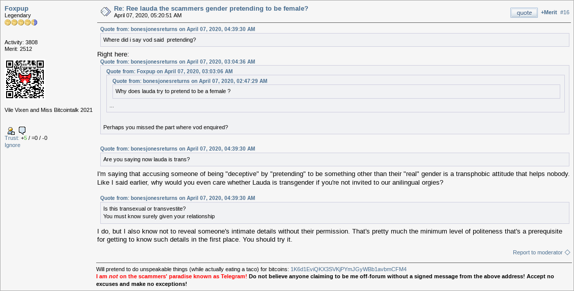 Placement B Placement BThis puts the widget next to "Ignore", like so: 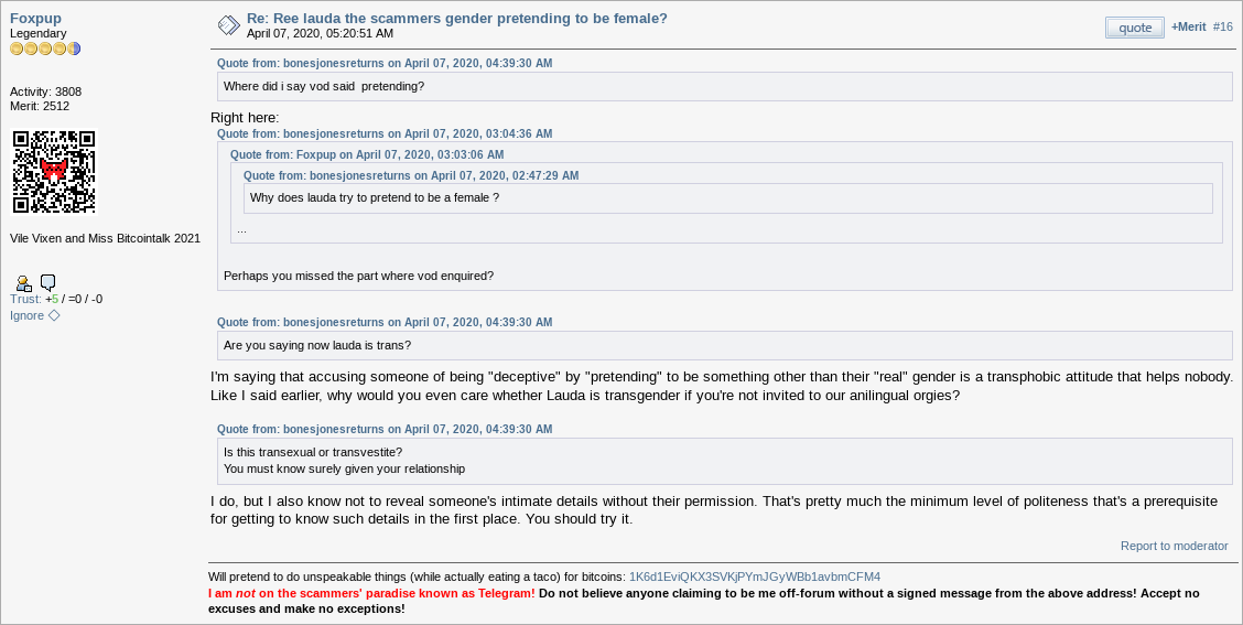 Placement C Placement CThis puts the widget next to the post counter, like so:  Placement D Placement DThis puts the widget next to the poster's name, like so:  Edit Edit: I added a fourth option, based on @dkbit98's suggestion. Further edit: I reduced the size of the diamond in placement D, because the first attempt was quite a bit bigger than the other placements and was lifting the name a little too high. I think the smaller diamond is much less conspicuous than the first attempt, which is a good thing (I think) because people have gotten used to how their names are displayed and messing with that too much is probably ill-advised.
|
|
|
|
|
dkbit98
Legendary
Offline
Activity: 2212
Merit: 7084
|
|
October 31, 2022, 04:14:32 PM |
|
Placement B
This puts the widget next to "Ignore", like so:
I like this Placement B the most, out of all the options you presented. The one I mentioned before could be confused and wrongly connected with moderator reports, and Placement C could be wrongly interpreted to have some connection with merits in upper right angle. One option you didn't mention was putting small diamond next to the username, if that is even possible, but like I said Placement B is also fine. |
.
.HUGE. | | | | | | █▀▀▀▀
█
█
█
█
█
█
█
█
█
█
█
█▄▄▄▄ | ▀▀▀▀▀▀▀▀▀▀▀▀▀▀▀▀▀▀▀▀▀▀▀▀▀▀▀▀▀▀▀▀▀▀▀▀▀▀▀▀▀▀▀▀▀▀▀▀▀▀▀▀▀▀▀▀▀▀▀▀▀▀▀▀▀▀▀▀▀▀▀▀▀▀▀▀▀▀▀▀▀▀▀▀▀▀▀▀▀▀▀▀▀▀▀▀▀▀▀▀▀▀▀▀▀▀▀▀▀▀▀▀▀▀▀▀▀▀▀▀▀▀▀▀▀▀▀▀▀▀▀▀▀▀▀▀▀▀▀▀▀▀▀▀▀▀▀▀▀▀▀▀▀▀▀▀▀▀
.
CASINO & SPORTSBOOK
▄▄▄▄▄▄▄▄▄▄▄▄▄▄▄▄▄▄▄▄▄▄▄▄▄▄▄▄▄▄▄▄▄▄▄▄▄▄▄▄▄▄▄▄▄▄▄▄▄▄▄▄▄▄▄▄▄▄▄▄▄▄▄▄▄▄▄▄▄▄▄▄▄▄▄▄▄▄▄▄▄▄▄▄▄▄▄▄▄▄▄▄▄▄▄▄▄▄▄▄▄▄▄▄▄▄▄▄▄▄▄▄▄▄▄▄▄▄▄▄▄▄▄▄▄▄▄▄▄▄▄▄▄▄▄▄▄▄▄▄▄▄▄▄▄▄▄▄▄▄▄▄▄▄▄▄▄▄ | ▀▀▀▀█
█
█
█
█
█
█
█
█
█
█
█
▄▄▄▄█ | | |
|
|
|
vapourminer
Legendary
Offline
Activity: 4312
Merit: 3518
what is this "brake pedal" you speak of?
|
|
October 31, 2022, 05:11:40 PM |
|
after seeing placement D, next to the user name looks best. kinda makes sense logically too putting it next to the thing it controls.
|
|
|
|
|
Stalker22
Legendary
Offline
Activity: 1484
Merit: 1358
|
|
October 31, 2022, 08:01:08 PM |
|
I vote for placement B or placement D. As I suggested before, this control is related to the user, so if we continue to follow the logic of the existing SMF interface, all controls and information related to the user should be in the left side of the interface. The right side is for posts and post-related controls.
|
|
|
|
LoyceV
Legendary
Offline
Activity: 3290
Merit: 16577
Thick-Skinned Gang Leader and Golden Feather 2021
|
|
October 31, 2022, 09:41:51 PM |
|
Placement D
This puts the widget next to the poster's name, like so: I vote for this one. I don't particularly like how it looks next to the username, but the location makes most sense. One thing worth considering, is that if theymos does end up accepting this patch, then I'd also like to add the same feature to the PM page! That would be GREAT! The only way to search for messages from a certain user is to search for a common character ("e") from that user. With hundreds of pages, it would be very convenient to only show messages from the user I'm looking for. |
|
|
|
|
PowerGlove (OP)
|
|
October 31, 2022, 09:51:10 PM
Last edit: November 01, 2022, 12:03:53 PM by PowerGlove |
|
I vote for placement B or placement D. As I suggested before, this control is related to the user, so if we continue to follow the logic of the existing SMF interface, all controls and information related to the user should be in the left side of the interface. The right side is for posts and post-related controls.
Yep, I think many will agree with you, but one counter-argument to the distinction that you're making (user-centric vs. post-centric) is that this widget is actually a little of both. It's user-centric because it filters by user, but it's post-centric because the specific post you're on when you click it plays a role (see: the example near the top of the initial post about the 100 page thread). It's a bit subtle, because it leans user-centric when you click on it initially, but post-centric when you click on it again. So, I think an argument can be made for putting it basically anywhere. and a big THANK YOU for your work on this, wherever it goes.
Thanks, man. I appreciate that! One thing worth considering, is that if theymos does end up accepting this patch, then I'd also like to add the same feature to the PM page! That would be GREAT! The only way to search for messages from a certain user is to search for a common character ("e") from that user. With hundreds of pages, it would be very convenient to only show messages from the user I'm looking for. Yep, implementing this for PMs is next on my list! When I had the idea, I was mightily impressed with myself, so I'm glad that someone else is excited about it, too!  Some thoughts on placement Some thoughts on placementI'm not that fond of placement B, both because of what I said earlier (it moves around depending on post height) and because I'd like to add this feature to PMs too (at some point, not now) and there's no "Ignore" link there (unless I'm missing it), so there'd be a slight asymmetry when using the feature on a post vs. on a message (i.e. it would be next to "Ignore" on a post but just kind of floating around on a message). Placement C has the same problem (but in a different way, there's already a checkbox at the top-right of PMs). I do like placement D, it's logical and it would work equally well for PMs, but it's pretty "flashy" putting a big ol' [I've since made it smaller] diamond next to everyone's name, so I'm concerned that theymos might think it's a little too disruptive. Placement A is kind of discreet and also works well for PMs (i.e. next to "Report To Admin", in that case). It's also not that illogical, once you consider what I said above to @Stalker22. Thanks for participating everyone, I think I'll let this thread soak for a bit, in case anybody else wants to cast their vote on placement, and then I'll send the (hopefully final) patch to theymos! |
|
|
|
|
|


