|
Title: ORA:: Logo submission & discussion thread Post by: Kora on July 17, 2014, 04:13:22 AM ORA threads
main thread (https://bitcointalk.org/index.php?topic=620518.0) dev discussion (https://bitcointalk.org/index.php?topic=675484.0) logo discussion (https://bitcointalk.org/index.php?topic=697958.0) bounty discussion (https://bitcointalk.org/index.php?topic=718077.0) CryptoFest (https://bitcointalk.org/index.php?topic=801933.0) Pentamon will update Logo related information HERE (https://bitcointalk.org/index.php?topic=697958.msg7952290#msg7952290) Many thanks to Pentamon for helping with the ORA Logo process :) And now, for something completely different.... ... let us go into second gear! I have set a deadline for submitting logo designs. 17 August 2014 I have set deadline for voting on the logos. 31 August 2014 I have concocted a voting mechanism, that takes into account that we will have to do everything on this thread, right here. The details are here, in the design guidelines message: https://bitcointalk.org/index.php?topic=697958.msg7952290#msg7952290 Voting, in a nutshell: You can vote any time, even before all designs are submitted, but you may vote only once. If you change your mind, you may go back and edit it. Regular commentators as well as designers are asked to submit three top choices in a voting post, that starts with the words: "Here is my vote", followed by the three top choices that you deem to be the best, in descending order. Just go to the submitted designs, and copy the image links, and post them in your voting post in descending order: Number 1, 2 and 3. If you post only one, it will be counted on position number three. Designers may vote for one of their own, but number two and three should be from another designer. Two thirds of the total vote, is given to the designers. Regular commentators will for the remaining third of the vote. I will follow this post with a vote post example. Let me know if we can improve on this process. Pentamon Welcome to the (K)Ora logo submission & discussion thread! Feel free to submit any logo designs and ideas in this thread. Thanks to Pentamon for suggesting this :) Try and follow nioccoin's advice and keep your logo design square shaped (see below). I'll keep using 'Kora' to identify our threads on the forum to avoid confusion, but are we "Kora" or "Ora"? I think the Logo designers could decide the issue! Which one looks better on a starfish? :) Enjoy, and remember, having fun is half the fun!! ... Pentamon Good suggestion Pentamon! A logo thread might be fun too. Any logo will need to fit in with nioccoin's website, but we can at least make a start at getting some suggestions. Yes, thanks for bringing that up. As long as the logo is a square dimension, such as a*a, or a round logo, it will fit easily in to the website. If we somehow end up with a rectangular logo or some oblong shape, which does happen, it will be more difficult to incorporate, but not impossible. Also, make sure to design in a transparency layer format of some kind, or at least have the ability to export it with transparency. I can read just about any major file format. At this point we will just plan to keep the images sort-of generic, and the site design will be switch-selectable in terms of colour scheme. For instance, the present colour scheme will almost certainly clash if we end up with the aforementioned starfish logo, so I'll try to keep the colours nimble. kind regards, nio Title: Re: Kora:: Logo submission & discussion thread Post by: S3MKi on July 17, 2014, 07:30:55 AM Ora is better for me.
Title: Re: Kora:: Logo submission & discussion thread Post by: DarkhorseofNxt on July 17, 2014, 12:10:10 PM Can we get this rolling.. may the best design wins.
Title: Re: Kora:: Logo submission & discussion thread Post by: gvans on July 17, 2014, 01:18:14 PM Ok I'll start with my starfish. Original sketch here https://bitcointalk.org/index.php?topic=675484.msg7725862#msg7725862
This new version is with a little thicker dimensions. https://dl.dropboxusercontent.com/u/18301977/gvans%20kora%20ver1%20300pix.png https://dl.dropboxusercontent.com/u/18301977/gvans%20kora%20ver1%2016pix.png 16pix size for coinmarketcap simplified https://dl.dropboxusercontent.com/u/18301977/gvans%20kora%20ver1%20160pix.png starfish, cog, nucleus, star, motion, whatever you want to see in it :) Title: Re: Kora:: Logo submission & discussion thread Post by: instacalm on July 17, 2014, 02:09:27 PM @gvans: slick! nice one
Title: Re: Kora:: Logo submission & discussion thread Post by: Pentamon on July 17, 2014, 04:35:32 PM Ok I'll start with my starfish. Original sketch here https://bitcointalk.org/index.php?topic=675484.msg7725862#msg7725862 This new version is with a little thicker dimensions. https://dl.dropboxusercontent.com/u/18301977/gvans%20kora%20ver1%20300pix.png https://dl.dropboxusercontent.com/u/18301977/gvans%20kora%20ver1%2016pix.png 16pix size for coinmarketcap simplified https://dl.dropboxusercontent.com/u/18301977/gvans%20kora%20ver1%20160pix.png starfish, cog, nucleus, star, motion, whatever you want to see in it :) I like it. I feel movement in it, sort of a gear or a twisting motion. Advancement. Nice. I wonder if you could try a few variations? Maybe let the 'twisting insides' - the lighter shades, not touch the side, ? Or try to turn them the other way, clockwise? How does your big image translate to a smaller pixel size? Have you tried to add a purple border or even a circle around this? What about a circle around the starfish? I wonder if you we can find an O inside it - I am the advocate for the name Ora, or even (k)Ora - which would set us apart from all other 'boring' names that don't have brackets included ;D Just a few suggestions. I want to encourage you. Pentamon Title: Re: Kora:: Logo submission & discussion thread Post by: Purple! on July 17, 2014, 08:24:00 PM Ok I'll start with my starfish. Original sketch here https://bitcointalk.org/index.php?topic=675484.msg7725862#msg7725862 This new version is with a little thicker dimensions. https://dl.dropboxusercontent.com/u/18301977/gvans%20kora%20ver1%20300pix.png https://dl.dropboxusercontent.com/u/18301977/gvans%20kora%20ver1%2016pix.png 16pix size for coinmarketcap simplified https://dl.dropboxusercontent.com/u/18301977/gvans%20kora%20ver1%20160pix.png starfish, cog, nucleus, star, motion, whatever you want to see in it :) I like it. I feel movement in it, sort of a gear or a twisting motion. Advancement. Nice. I wonder if you could try a few variations? Maybe let the 'twisting insides' - the lighter shades, not touch the side, ? Or try to turn them the other way, clockwise? How does your big image translate to a smaller pixel size? Have you tried to add a purple border or even a circle around this? What about a circle around the starfish? I wonder if you we can find an O inside it - I am the advocate for the name Ora, or even (k)Ora - which would set us apart from all other 'boring' names that don't have brackets included ;D Just a few suggestions. I want to encourage you. Pentamon I agree with Pentamon. :) Title: Re: Kora:: Logo submission & discussion thread Post by: sadface on July 17, 2014, 08:26:45 PM whats the bounty ?
Title: Re: Kora:: Logo submission & discussion thread Post by: Kora on July 17, 2014, 09:50:51 PM whats the bounty ? What do you think is fair? We could use some of the left over stakes. How many stakes for a killer logo? Title: Re: Kora:: Logo submission & discussion thread Post by: Pentamon on July 18, 2014, 01:29:25 AM If somebody comes up with a killer logo, I think they deserve to recommend any of their friends to get a stake, even after the 'barn door closed' - that's my suggestion.
Here are a number of logo designs. Feel free to change them into colour. Right now the live in a fontforge file. I post them small, because I can get a lot in at the same time, and I think that the logo must read well when it is small anyways. Like gvans said, plan for coinmarketcap. (thinking far, I like that, gvans!) https://dl.dropboxusercontent.com/s/sas8tw8zw97a5nu/Ora-designs.png Please let me know which ones you like, by giving the corresponding letters of this Ora font... I will respond by posting those individually and bigger, maybe another colour. Currently my personal favourites are in descending order: 6, =, and [ Pentamon Title: Re: Kora:: Logo submission & discussion thread Post by: Purple! on July 18, 2014, 03:05:02 AM https://i.imgur.com/Qtd0IFR.jpg
https://i.imgur.com/ezaFUjr.jpg https://i.imgur.com/NlxayKu.jpg https://i.imgur.com/bi5oQmP.jpg Title: Re: Kora:: Logo submission & discussion thread Post by: Anna! on July 18, 2014, 03:25:42 AM Hey there!
How do you like these? https://dl.dropboxusercontent.com/s/0szu9thn8awxiwo/Ora3.png https://dl.dropboxusercontent.com/s/9cjgjga8qz8a5he/orasmall.png I put purple on it because Purple! wanted it. :) :) Title: Re: Kora:: Logo submission & discussion thread Post by: sanbashiyi on July 18, 2014, 06:28:01 PM Hey there! How do you like these? https://dl.dropboxusercontent.com/s/0szu9thn8awxiwo/Ora3.png https://dl.dropboxusercontent.com/s/9cjgjga8qz8a5he/orasmall.png I put purple on it because Purple! wanted it. :) :) this logo look nice guy , i like it Title: Re: Kora:: Logo submission & discussion thread Post by: DarkhorseofNxt on July 20, 2014, 05:18:56 AM Need more participation from logo designers!
Can we also look into the possibility of "O" and not just the starfish. I think "O" for Ora has more room for logo creativity. Title: Re: Kora:: Logo submission & discussion thread Post by: Kora on July 20, 2014, 11:34:46 AM Need more participation from logo designers! Can we also look into the possibility of "O" and not just the starfish. I think "O" for Ora has more room for logo creativity. Thanks Darkhorse, I like the "O" idea too. The hand drawn logos from Purple! look great, and they're a bit humanoid to me (two arms, two legs & a head), and that got me thinking the starfish shape could be morphed into a character, maybe a super hero "ORA Man" with an "Ora" or an "O" on his jump suit. That might not work for the official logo, but having a cartoon type character for a mascot might be fun :) I've asked Pentamon to take the lead on the Logo stuff from now on. Title: Re: Kora:: Logo submission & discussion thread Post by: 1Referee on July 20, 2014, 11:59:24 AM I am willing to create a design, can you atleast give a hint of what kind of design you're looking for? That will make it easier to have something to work on.
Title: Re: Kora:: Logo submission & discussion thread Post by: Mac Red on July 20, 2014, 12:44:09 PM Great suggestions so far!
Ok I'll start with my starfish. Original sketch here https://bitcointalk.org/index.php?topic=675484.msg7725862#msg7725862 This new version is with a little thicker dimensions. https://dl.dropboxusercontent.com/u/18301977/gvans%20kora%20ver1%20300pix.png https://dl.dropboxusercontent.com/u/18301977/gvans%20kora%20ver1%2016pix.png 16pix size for coinmarketcap simplified https://dl.dropboxusercontent.com/u/18301977/gvans%20kora%20ver1%20160pix.png starfish, cog, nucleus, star, motion, whatever you want to see in it :) My personal favorite. 8) Simple, elegant and playful. The slight rotation does create a sense of movement and also helps making it more distinct (looking less like your typical star). I'm curious how it would look with less symmetry, like a real starfish. Example of what I'm talking about: http://image.naldzgraphics.net/2012/04/12-Starfish.jpg Oh and Kora VS Ora...I'd say we go for Ora. We should decide name asap. By the way, Ora seems to be latin word for seacoast? Title: Re: ORA:: Logo submission & discussion thread Post by: kussaka on July 21, 2014, 10:49:43 AM Title: Re: ORA:: Logo submission & discussion thread Post by: Equate on July 21, 2014, 10:53:34 AM Ok I'll start with my starfish. Original sketch here https://bitcointalk.org/index.php?topic=675484.msg7725862#msg7725862 This new version is with a little thicker dimensions. https://dl.dropboxusercontent.com/u/18301977/gvans%20kora%20ver1%20300pix.png https://dl.dropboxusercontent.com/u/18301977/gvans%20kora%20ver1%2016pix.png 16pix size for coinmarketcap simplified https://dl.dropboxusercontent.com/u/18301977/gvans%20kora%20ver1%20160pix.png starfish, cog, nucleus, star, motion, whatever you want to see in it :) I like this one but also would like to seethe star in some blue and mix of colors. Title: Re: ORA:: Logo submission & discussion thread Post by: Kora on July 21, 2014, 11:01:16 AM Hey they're very nice! I really like the top-right one, awesome work, thank you so much :) Title: Re: ORA:: Logo submission & discussion thread Post by: DarkhorseofNxt on July 21, 2014, 11:17:26 AM Kora,
Probably you can announce a bounty for the best logo design. What do you think? Title: Re: ORA:: Logo submission & discussion thread Post by: Kora on July 21, 2014, 12:48:32 PM Kora, Probably you can announce a bounty for the best logo design. What do you think? Good idea! What do you think would be a fair bounty? I'm thinking 5-10 stakes, and maybe we pick a short list and vote using the NXT AE or using a thread poll. What's a fair bounty people? Let's decide asap, is 5 too little, is 10 too much? Title: Re: Kora:: Logo submission & discussion thread Post by: Pentamon on July 21, 2014, 01:03:17 PM I am willing to create a design, can you atleast give a hint of what kind of design you're looking for? That will make it easier to have something to work on. Good question, 1Referee, Based upon my reading what has been said here, I would summarize as follows: Design guidelines for the Ora logo: see this posting: https://bitcointalk.org/index.php?topic=697958.msg7952290#msg7952290 So far, the starfish designs initiated by gvans, have been getting the most support, but this does not mean that there might be another great logo hiding somewhere under the rocks or in the intertidal zone.... Bounties are yet to be determined. My suggestion is to take whatever stakes are assigned for the logo bounty, and divide them to reward the participants in this open source design process (even fractional values should be considered, in my opinion). Please submit logos here on this thread. It may be useful to present two or three options, and ask for opinions about which ones are preferred. Remember this is a dialogue. Thank you for participating. Pentamon Title: Re: ORA:: Logo submission & discussion thread Post by: Pentamon on July 21, 2014, 01:08:51 PM Kora, Probably you can announce a bounty for the best logo design. What do you think? Good idea! What do you think would be a fair bounty? I'm thinking 5-10 stakes, and maybe we pick a short list and vote using the NXT AE or using a thread poll. What's a fair bounty people? Let's decide asap, is 5 too little, is 10 too much? Hi Kora ....that is still your name, is it? At least for now :) I think that 10 stakes is a good bounty. I also think that we should try to include people with that, that have not been 'drawn into' Ora yet. Thirdly: let us acknowledge the participants in this thread. For instance: gvans came up with the idea and the first design of a starfish logo. I think we should honour that, even though we might not end up with his final design. What do you think? Pentamon Title: Re: ORA:: Logo submission & discussion thread Post by: DarkhorseofNxt on July 21, 2014, 01:11:25 PM 10 stakes for total bounty on logo design. Winner gets more, participants get some. That would be good for distribution as well. I am ok with that.
Title: Re: Kora:: Logo submission & discussion thread Post by: Pentamon on July 21, 2014, 01:13:00 PM hi Purple! from your four designs, I like this one the most. The colors are nice, and I think the human shape of the starfish works. Arms and head slightly up, that reminds me of an embrace... Pentamon Title: Re: ORA:: Logo submission & discussion thread Post by: Pentamon on July 21, 2014, 01:16:40 PM 10 stakes for total bounty on logo design. Winner gets more, participants get some. That would be good for distribution as well. I am ok with that. Good. We are moving forward. Next, I would like to get a timeline idea from the movers and shakers... I think it is important to do this logo design well, but we don't have a lot of time, and people (at least in the northern hemisphere) are enjoying their summer, I hope. What I am saying: a deadline is important. So we can move on. I think two weeks, what are the opinions here? Pentamon Title: Re: Kora:: Logo submission & discussion thread Post by: Pentamon on July 21, 2014, 01:24:54 PM Hey there! How do you like these? https://dl.dropboxusercontent.com/s/0szu9thn8awxiwo/Ora3.png https://dl.dropboxusercontent.com/s/9cjgjga8qz8a5he/orasmall.png I put purple on it because Purple! wanted it. :) :) Hi Anna!, I see you also posted the tiny version of your design. I nearly missed it, because your other submission is so big and a bit overwhelming for me: I feel that you have too many things in there, too busy. Or, as the emperor said to Mozart: 'too many notes!' ;D ;D Here is your small design again: would you try to make it simpler, if you can? https://dl.dropboxusercontent.com/s/9cjgjga8qz8a5he/orasmall.png Pentamon Title: Re: ORA:: Logo submission & discussion thread Post by: Pentamon on July 21, 2014, 01:31:18 PM Hi kossaka, Thank you for a nice design. I like the twisty nature, and the little detail circles on the starfish arms, or legs. In the meantime - this is a moving target - it would appear that the name is going to be Ora. Could you give us a small version to see how it would do, the logo only without the (very nice) font next to it? Have you experimented with other colors? Pentamon Title: Re: Kora:: Logo submission & discussion thread Post by: Pentamon on July 21, 2014, 01:41:32 PM Ora logo - second and final voting round!
PLease go here to vote: https://bitcointalk.org/index.php?topic=697958.msg8688537#msg8688537 Pentamon Design guidelines for the Ora logo:
Bounties will be 10 Ora stakes, divided between participants in a yet-to-be-determined formula... I think that any participation should be recognized, that we should recognize good ideas and give the most weight on the final design, escalating from third to first place. Time line: Please submit all your designs before 17 August 2014. After that, we all will vote, here in this thread. Voting will last two weeks, so final result should be available by 31 August 2014. How to vote: Since NXT voting mechanism is not quite use-able yet, we will vote here in the Ora Logo Thread. Start by making a post that starts with "Here is my vote", followed by the three top choices that you deem to be the best, in descending order. Just go to the submitted designs, and copy the image links, and post them in your voting post in descending order: Number 1, 2 and 3. If you submit only one option, that one will be counted in position three, so with the lowest impact. Feel free to motivate your vote, with some additional comments. Try to just limit yourself to quoting only the logo image, not quoting the rest of the original message, unless that is part of your motivation. You can vote any time, but only once. So if you plan to vote early on and then you find a better design that was submitted later, you have to go back to your vote post, and edit it, prior to the deadline of voting. Voting mechanism: For various reasons, we will give a stronger vote to our artists. Votes by the designers, i.e. a person that has submitted a logo here, will count for two thirds of the total vote. (Designers may place one of the three choices to one of their own designs. The other two options have to be from another designer. If you submit only one design, it will be counted on the lowest impact level, number 3.) The remaining third of votes is made up by the regular commentators. So you know what you have to do, if you want your vote to be having a greater impact ;D (Kora, niocion, Mac Red, Fragora, DarkhorseofNXT and Pentamon have veto powers, but it is highly unlikely that they will need to exert that, since we have such a great process, and wonderful designs already) Please let me know if you detect anything that can be improved. Remember that I stumbled upon a Pot o' Ora, and I am happy to share these Ora :D Thank you for participating. Pentamon Title: Re: ORA:: Logo submission & discussion thread Post by: Kora on July 21, 2014, 02:11:52 PM Kora, Probably you can announce a bounty for the best logo design. What do you think? Good idea! What do you think would be a fair bounty? I'm thinking 5-10 stakes, and maybe we pick a short list and vote using the NXT AE or using a thread poll. What's a fair bounty people? Let's decide asap, is 5 too little, is 10 too much? Hi Kora ....that is still your name, is it? At least for now :) I think that 10 stakes is a good bounty. I also think that we should try to include people with that, that have not been 'drawn into' Ora yet. Thirdly: let us acknowledge the participants in this thread. For instance: gvans came up with the idea and the first design of a starfish logo. I think we should honour that, even though we might not end up with his final design. What do you think? Pentamon Thanks Pentamon! Great, we will go with 10 stakes as the bounty, with some scope for 'highly commended' smaller bounties. I agree that contributions like gvans starfish idea should be celebrated & rewarded even if they don't end up being selected, as it seems like that is a great area for other Logo designers to explore. Maybe the winner wont be a starfish, but it's still worthy of recognition. I'd say that goes for the humanoid starfish body too! Can ORA have a cuter mascot than Monero? I hope so :) Two weeks for a deadline works for me, and maybe we come up with a short list and have a vote!! Title: Re: Kora:: Logo submission & discussion thread Post by: gvans on July 21, 2014, 05:10:26 PM
Ora, you son of a bitcoin! lol ;D But yeah, Ora sound as good as Kora imo. Title: Re: ORA:: Logo submission & discussion thread Post by: shijilal on July 22, 2014, 11:57:03 AM Title: Re: ORA:: Logo submission & discussion thread Post by: DarkhorseofNxt on July 22, 2014, 03:32:36 PM Honest opinion. I like the freestyle starfish. Remove the coin. Title: Re: ORA:: Logo submission & discussion thread Post by: nioccoin on July 22, 2014, 05:13:25 PM Here's my two cents, on logo and graphic design in general, not just for k/ora.
The main rule I follow is not to make a logo per se, but to create a recognizable emblem. In other words, don't include any words as part of the *delivered* design, not a motto and not even the name of the product, in this case the coin. This rule applies only for linear wording. Arced and curved wording is best supplied as image files separate from the emblem, and then I can place and "stack" them in the website as needed. Of course, I would give preference to linearly-worded logos and avoid the curved and arced text to begin with. So why not the word itself, i.e., "Ora" or "Kora"? Because those can be added in during the web development process. Better yet, because they are added in during the web dev process, it is fully open in terms of what font can be used, and what size and placement. If at some point the font begins to look dated, it is a simple stylesheet change to fix it on the website. If the letters are embedded in the logo itself, it cannot be as easily changed or modified. So, let's talk kussaka's logo as an example. For that logo, I would put in the words to demonstrate the possibilities, but I would prefer that if that is the winner, the submission would be only the emblem, and then the name/style of the font and the colour code used for the emblem so I can match the font type, style, and colour. That leaves the emblem in a square format, and I can programmatically add the word "Ora" or "K Ora" in, so that the "K" is in the center of the starfish, and Ora is next to it. And, we can use any font and size we want both at present, and at a later date as needed. This is also what is at the root of my preference for a logo that is square or that can fit into a square format. I can always programmatically make a square logo look rectangular by adding a rectangle background to it, matching the colour. Also, square and round logos scale better for applications such as iphone formats, etc. kind regards, nio Title: Re: ORA:: Logo submission & discussion thread Post by: Pentamon on July 22, 2014, 05:49:27 PM Yes, DarkhorseofNXT and nioccoin seem to say the same thing: let us fing a strong logo only.
It shoul be scalable. On the bottom end of the scale, it should be recognizeable in a 16 by 16 pixel size, see gvans original design. Pentamon Title: Re: Kora:: Logo submission & discussion thread Post by: nioccoin on July 22, 2014, 06:51:57 PM Design guidelines for the Ora logo: .... No color themes have been decided yet. [/li][/list] ... Thank you for participating. Pentamon Let's talk about colour. I started with Mac Red's baseline colour scheme (greenish and orange-ish) for koracoin.com's registration system, which consists in these two codes: 5b8d5a db7537 You can see these at: http://www.timeanddate.com/countdown/to?iso=20140624T13&p0=12&fg1=5b8d5a&fg2=db7637&msg=Kora+Registration+Opening&csz=1 (http://www.timeanddate.com/countdown/to?iso=20140624T13&p0=12&fg1=5b8d5a&fg2=db7637&msg=Kora+Registration+Opening&csz=1) Don't be bound by this. This is an organic movement, and the community can vote on the "theme". The colour scheme can be anything the community wants it to be. I propose one of these two solutions for colour: 1. Wait and see what the winning logo is, and we will use that as a base for the website colour theme. That doesn't mean the website will consist in only those two colours, of course. We can then later vote on the colour scheme. 2. Have the logo designers also present a colour palette that complements the winning logo. They can even "mock up" an image of what a website might generally look like, with their colour scheme implemented, to demonstrate how the colours vibrate against each other. I am using the twitter bootstrap, because it's simple and clean, and until we are much farther along in the Ora coin dev process we don't have much data to put in a website. At this point it is a marketing tool and perhaps a stakeholder portal. So, here are some sample bootstrap-based websites to peruse, to give an idea of what is possible with it: http://expo.getbootstrap.com/ (http://expo.getbootstrap.com/) I am willing to change to any other bootstrap system. As most of you know, I heavily favour code reuse. Let twitter, jquery, etc do the heavy lifting ;) Don't like the twitter bootstrap? If you have an argument for one templating system over another, let's hear it. Just make sure your preferred system has an open license. I couldn't justify purchasing a license for any bootstrapping system when so many of them are free use. In any case, we will keep the website fluid and nimble so that we can make style/theme changes easily. kind regards, nio Title: Re: ORA:: Logo submission & discussion thread Post by: Pentamon on July 22, 2014, 10:09:41 PM Which one do you prefer:
Stark black: https://dl.dropboxusercontent.com/s/4dvrqn8v334lm4t/Ora-stark-black-100.png small version: https://dl.dropboxusercontent.com/s/1xeb2xhy8t1mfv0/Ora-stark-black-16.png or do you prefer some colour in there: https://dl.dropboxusercontent.com/s/cqmdf318z1ld1u5/Ora-stark-purple-.png small: https://dl.dropboxusercontent.com/s/qfxkoxit1ng457l/Ora-stark-purple-16.png Just keep the one you like in your reply. Thank Pentamon Title: Re: ORA:: Logo submission & discussion thread Post by: Pentamon on July 22, 2014, 10:13:32 PM Or do you like it without the round circle around the starfish?
https://dl.dropboxusercontent.com/s/0y076cjr3c8fyni/Ora-purple-heart.png small: https://dl.dropboxusercontent.com/s/sd6urjd5ha7sizs/Ora-purple-heart16.png Pentamon Title: Re: ORA:: Logo submission & discussion thread Post by: Pentamon on July 22, 2014, 10:22:26 PM OK, back to my growing library of rough designs...
Which one do you want to have the 'special treatment' ? Which colors do you like to see? https://dl.dropboxusercontent.com/s/7p1nye9c0qmno61/Ora-Library-2.png Pentamon Title: Re: ORA:: Logo submission & discussion thread Post by: Tearscoin on July 23, 2014, 02:09:11 AM OK, back to my growing library of rough designs... Which one do you want to have the 'special treatment' ? Which colors do you like to see? https://dl.dropboxusercontent.com/s/7p1nye9c0qmno61/Ora-Library-2.png Pentamon i like w. ;) Title: Re: ORA:: Logo submission & discussion thread Post by: davien on July 23, 2014, 03:38:19 AM i would go with the Y . for me that is the most positive and gives me the Ora feeling.
Title: Re: ORA:: Logo submission & discussion thread Post by: dawj20 on July 23, 2014, 04:14:06 AM https://i.imgur.com/LxNyF7Z.png
https://i.imgur.com/TBFlw0t.png http://imgur.com/TBFlw0t,LxNyF7Z#1 (http://imgur.com/TBFlw0t,LxNyF7Z#1) http://imgur.com/W5inyxn (http://imgur.com/W5inyxn) Title: Re: ORA:: Logo submission & discussion thread Post by: shijilal on July 23, 2014, 05:15:04 AM Why is it has to be a star fish??.. Why can't it be a simple O with an aura???
http://i59.tinypic.com/34is9b7.png Title: Re: ORA:: Logo submission & discussion thread Post by: kussaka on July 23, 2014, 08:28:48 AM Hi kossaka, Thank you for a nice design. I like the twisty nature, and the little detail circles on the starfish arms, or legs. In the meantime - this is a moving target - it would appear that the name is going to be Ora. Could you give us a small version to see how it would do, the logo only without the (very nice) font next to it? Have you experimented with other colors? Pentamon Ok :) http://s25.postimg.org/5nrx9rrhr/KORA_104_256.png http://s25.postimg.org/xzi2kk0rv/KORA_104_128a.png http://s25.postimg.org/vgwdjvf1n/KORA_104_64a.png http://s25.postimg.org/rj93ugs8b/KORA_104_16b.png http://s25.postimg.org/x65grxuqz/KORA_104_16a.png #fc944e 256p 128p 64p 16p http://s25.postimg.org/9x18pok4v/KORA_103_256.png http://s25.postimg.org/3ppupiodn/KORA_103_128b.png http://s25.postimg.org/bq8qrqup7/KORA_103_128c.png http://s25.postimg.org/s7dczo1kb/KORA_103_16a.png http://s25.postimg.org/61xun40yz/KORA_103_16c.png http://s25.postimg.org/6p5y44cmn/KORA_102_256a.png http://s25.postimg.org/ajvk1grmz/KORA_102_128.png http://s25.postimg.org/nzikqx04r/KORA_102_64.png http://s25.postimg.org/y7143bmcr/KORA_102_16.png And coin: http://s25.postimg.org/5dp04629b/KORA_101.png Title: Re: ORA:: Logo submission & discussion thread Post by: shijilal on July 23, 2014, 09:18:55 AM Title: Re: ORA:: Logo submission & discussion thread Post by: shijilal on July 23, 2014, 09:21:47 AM Its looking good.. Nice logos there kussaka
Ok :) http://s25.postimg.org/5nrx9rrhr/KORA_104_256.png http://s25.postimg.org/xzi2kk0rv/KORA_104_128a.png http://s25.postimg.org/vgwdjvf1n/KORA_104_64a.png http://s25.postimg.org/rj93ugs8b/KORA_104_16b.png http://s25.postimg.org/x65grxuqz/KORA_104_16a.png 256p 128p 64p 16p http://s25.postimg.org/9x18pok4v/KORA_103_256.png http://s25.postimg.org/3ppupiodn/KORA_103_128b.png http://s25.postimg.org/bq8qrqup7/KORA_103_128c.png http://s25.postimg.org/s7dczo1kb/KORA_103_16a.png http://s25.postimg.org/61xun40yz/KORA_103_16c.png http://s25.postimg.org/sugv2xnu7/KORA_102_256.png http://s25.postimg.org/ajvk1grmz/KORA_102_128.png http://s25.postimg.org/nzikqx04r/KORA_102_64.png http://s25.postimg.org/y7143bmcr/KORA_102_16.png And coin: http://s25.postimg.org/5dp04629b/KORA_101.png Title: Re: ORA:: Logo submission & discussion thread Post by: kussaka on July 23, 2014, 09:27:23 AM Its looking good.. Nice logos there kussaka Thanks. I like your round logo. :) Nice colors. It will look great on a black background, I think. Title: Re: ORA:: Logo submission & discussion thread Post by: Kora on July 23, 2014, 10:27:38 AM Why is it has to be a star fish??.. Why can't it be a simple O with an aura??? You don't have to use a starfish if you don't want to, nothing is compulsory :) The starfish idea comes from a book "The Starfish and the Spider: The Unstoppable Power of Leaderless Organizations" Here's a good summary https://docs.google.com/document/d/1nJ3JCDI4yQIN2O09DW6qApRhPrQXDj9wsxY-3jduOAw/edit?hl=en#heading=h.3fv7a5-3ynikb The ideas in the starfish & spider book are almost a training manual for people involved with crypto currencies (like us!!). I like the starfish concept for the Logo, but there's an infinite number of ways to express an idea in a Logo, so don't restrict yourself :) Title: Re: ORA:: Logo submission & discussion thread Post by: fragORA on July 24, 2014, 01:05:39 PM Title: Re: ORA:: Logo submission & discussion thread Post by: Pentamon on July 25, 2014, 01:05:18 PM Honest opinion. I like the freestyle starfish. Remove the coin. Thank you, shijilal, for the movement, the figure that agitates. I get a strong sense of a human/starfish, although the double lines confuse me a little, and might not scale well to a small version. Do you want to 'simplify' it a little? I also would leave out the surrounding 'coin' additions. Pentamon Title: Re: ORA:: Logo submission & discussion thread Post by: Kora on July 25, 2014, 01:11:16 PM This one has an 'Irish' feel to it, looks a bit like a shamrock :) Title: Re: ORA:: Logo submission & discussion thread Post by: Pentamon on July 25, 2014, 01:19:34 PM https://i.imgur.com/LxNyF7Z.png https://i.imgur.com/TBFlw0t.png http://imgur.com/TBFlw0t,LxNyF7Z#1 (http://imgur.com/TBFlw0t,LxNyF7Z#1) Wow! Professional! Sometimes the simplest designs are the strongest. It really scales well: an "O"! I find myself looking for meanings and associations. I am drawn to the divided outer elements. The angled cuts make me wonder: is it related to the Qora "Q" ? - no, that's not it. The outer elements could be a pair of hands, holding the "O". But no, it is more abstract. I despair a little. I have seen buildings and furniture like this, and it can easily feel clinical and cold. I am encouraged by the colours, though, they feel warmer, more friendly. Am I the only one who thinks these thoughts? Let me know what you think. Thank you, dawj20, by the way, for your participation. I think this is a very polished design. Pentamon Title: Re: ORA:: Logo submission & discussion thread Post by: Pentamon on July 25, 2014, 01:34:36 PM This one has an 'Irish' feel to it, looks a bit like a shamrock :) Ora can be so many things, that is the beauty. It is nearly a shame that we want to lock into one logo. Why can't we have rotating logos, to indicate the constant evolving and changing nature of this starfish organization? Maybe to reflex the different 'rays' or 'legs' that each have their own local brain, we should have multiple logos for Ora, (including an Irishized version). Sorry, just a little lateral thinking incontinence, ignore it. Back to fragORA's concept: Leaves! yes. How about one big leaf? I kind of see a 'D' in there, somehow, making me wonder: What is the importance of the stem coming down where the ORA letters are? I would leave these letters out, btw. Let the logo speak for itself, do you agree? How about a spiral on the outside, leading to a leaf in the inside? Growth, green, new, life. Pentamon Title: Re: ORA:: Logo submission & discussion thread Post by: Pentamon on July 25, 2014, 01:40:11 PM To me, the round one is better than the oval one. Definitely a possibility - just a single 'O' - nice a simple. I agree with kussaka that different colours might be helpful. I have to say that I think the multiple rings and the aura around and shades are distracting. How about adding a texture, rather? Here is an idea: Try to make it like an 'O' out of rope. Yes, take the NXT 'rope' texture and bend it into a circle. Anyone? Pentamon Title: Re: ORA:: Logo submission & discussion thread Post by: constary on July 25, 2014, 01:43:19 PM some pic is very beautiful
Title: Re: ORA:: Logo submission & discussion thread Post by: Pentamon on July 25, 2014, 01:49:17 PM Hi kossaka, Thank you for a nice design. I like the twisty nature, and the little detail circles on the starfish arms, or legs. In the meantime - this is a moving target - it would appear that the name is going to be Ora. Could you give us a small version to see how it would do, the logo only without the (very nice) font next to it? Have you experimented with other colors? Pentamon Ok :) (some lovely images removed) http://s25.postimg.org/6p5y44cmn/KORA_102_256a.png (more lovely images left out) Thanks, kussaka! What a strong design. Definitely a star fish. No mistaking it for anything else. I can even see the sand, the spade and the bucket that go with it. So that would be the strength and the downside: no seeing a person or gears in there. It is not vague enough for that. Even the "O" inside the starfish, or the mouth is smallish. So what we have to decide: do we want to have a Rohrschach 'blob' that let's everyone have their own interpretation, or connection to it, or do we want to be very clear. Because this design is very clear. Again, this is just one opinion. Please comment. Pentamon Title: Re: ORA:: Logo submission & discussion thread Post by: kira1474 on July 25, 2014, 04:46:21 PM My vision (ocean/sand theme). :)
Version 1 http://oi60.tinypic.com/r0768n.jpg Version 2 - Sandy oceanfloor in sunlight http://oi57.tinypic.com/2r6pn2d.jpg Imprint on oceanfloor; Ora's been here (and is not going away). Not a logo, just for inspiration and base for version 2. Thought it looked beautiful. http://oi57.tinypic.com/2vj3ptg.jpg Title: Re: ORA:: Logo submission & discussion thread Post by: fragORA on July 25, 2014, 06:20:14 PM This one has an 'Irish' feel to it, looks a bit like a shamrock :) Ora can be so many things, that is the beauty. It is nearly a shame that we want to lock into one logo. Why can't we have rotating logos, to indicate the constant evolving and changing nature of this starfish organization? Maybe to reflex the different 'rays' or 'legs' that each have their own local brain, we should have multiple logos for Ora, (including an Irishized version). Sorry, just a little lateral thinking incontinence, ignore it. Back to fragORA's concept: Leaves! yes. How about one big leaf? I kind of see a 'D' in there, somehow, making me wonder: What is the importance of the stem coming down where the ORA letters are? I would leave these letters out, btw. Let the logo speak for itself, do you agree? How about a spiral on the outside, leading to a leaf in the inside? Growth, green, new, life. Pentamon I wouldnt go with rotating logo as it will just cause confusion. The logo itself is meant to signify new growth, but I get your point that it shouldn't be coming from a "central" stem. (This is also a problem with the starfish imo)... So its back to the drawing board with the theme of many coming together and then growing. Title: Re: ORA:: Logo submission & discussion thread Post by: Equate on July 25, 2014, 06:51:28 PM I like this one , looks better than others and good work with the logos. Title: Re: ORA:: Logo submission & discussion thread Post by: Pentamon on July 25, 2014, 07:03:03 PM Interestingly, I got two people that liked a concept that I did not expect to follow up on.
However, thanks to Tearscoin and davien, for pointing out their preferences, I would like to ask: what is it that made pick this? I know it was not the exact same one, that you liked, but it is of this family: https://i.imgur.com/eEeYvl6.png https://i.imgur.com/mw7nhOS.png ------------------------------------------------ If I embroider on it a little: Maybe a little fatter: https://i.imgur.com/bgnmWmi.png it might scale better : https://i.imgur.com/W5P27qH.png ------------------------------------------------ What about colour: https://i.imgur.com/RKIrVHw.png ------------------------------------------------ Or do you like the 'bowler': https://i.imgur.com/nPzA9mL.png https://i.imgur.com/5XUKLzi.png ------------------------------------------------ Possibly with some colour: https://i.imgur.com/UuBG45R.png https://i.imgur.com/fQADUhd.png Branching out, movement, but as fragOra points out, possibly too centralized? Pentamon Title: Re: ORA:: Logo submission & discussion thread Post by: BoubonicNugz on July 26, 2014, 12:09:56 AM Hmmm, thought I might que in on this.
http://i.xomf.com/jhysr.png (http://xomf.com/jhysr) http://i.xomf.com/hbslf.png (http://xomf.com/hbslf) Something a little different than what's been tossed around so far :) ~ regards Title: Re: ORA:: Logo submission & discussion thread Post by: Pentamon on July 26, 2014, 01:56:06 AM Hi BoubonicNugz,
Thank you, this is a fresh direction, yes. What about re-using the central 'O' in the bigger design, like this? Or would that be too hard to read? https://i.imgur.com/VUalJhh.png (I hope you are OK with me changing one of your designs. Sort of open source brainstorming, is what is happening here.) I think the 16 pixel version is very distinct, easy recognizable, and quite 'noble'. Pentamon Title: Re: ORA:: Logo submission & discussion thread Post by: Memminger on July 26, 2014, 10:03:18 AM Title: Re: ORA:: Logo submission & discussion thread Post by: okbit on July 26, 2014, 03:54:56 PM Hmmm, thought I might que in on this. http://i.xomf.com/jhysr.png (http://xomf.com/jhysr) http://i.xomf.com/hbslf.png (http://xomf.com/hbslf) Something a little different than what's been tossed around so far :) ~ regards I like this one Title: Re: ORA:: Logo submission & discussion thread Post by: Kora on July 27, 2014, 06:02:20 AM Hey, some great work here guys, thank you :)
A while back I submitted the original 'Kora' logo Mac Red made for the announcment & registration webapp site to the MegaPixel project. https://nxtforum.org/meganxt/megapixel-%28historical-nxt-poster%29/ As we've changed our name I've asked could we submit a new one and Coradan said OK. This doesn't have to be the 'final' logo, but could we pick one for the historical NXT poster? Our free image is 5000 pixels, but if we want a bigger one we have to buy more megapixel assets (which I can do!). Even if we change logo later, it wont matter, but if we pick one and add our URL that would be great. As we're doing some new things on the NXT platform, I think we should be on the historical poster. Title: Re: ORA:: Logo submission & discussion thread Post by: Kora on July 27, 2014, 06:09:12 AM https://i.imgur.com/LxNyF7Z.png https://i.imgur.com/TBFlw0t.png http://imgur.com/TBFlw0t,LxNyF7Z#1 (http://imgur.com/TBFlw0t,LxNyF7Z#1) Very nice, great work! Title: Re: ORA:: Logo submission & discussion thread Post by: Kora on July 27, 2014, 06:10:25 AM I like this one , looks better than others and good work with the logos. I agree! Looks beautiful! Title: Re: ORA:: Logo submission & discussion thread Post by: Yuzu on July 27, 2014, 06:48:40 AM Hmmm, thought I might que in on this. http://i.xomf.com/jhysr.png (http://xomf.com/jhysr) http://i.xomf.com/hbslf.png (http://xomf.com/hbslf) Something a little different than what's been tossed around so far :) ~ regards This one is fantastic. Very professional and instantly recognizable. Title: Re: ORA:: Logo submission & discussion thread Post by: BoubonicNugz on July 27, 2014, 07:14:22 AM What about re-using the central 'O' in the bigger design, like this? Or would that be too hard to read? I typically try to avoid this as to avoid confusing 'icon' and 'name' recognition. When you start mixing the two, it becomes tricky to keep a 'strong identity'. Example, see this variation below. While it is somewhat recognizable, it's not overly intuitive if your not familiar with the name already. http://i.xomf.com/drbjd.png (http://xomf.com/drbjd) I also played around a little bit with wrapping 'ORA' or 'ora' alongside the circle, like so: http://i.xomf.com/ndxpl.png (http://xomf.com/ndxpl) And finally, I tried something a little different again. I like it. http://i.xomf.com/lgzkd.png (http://xomf.com/lgzkd) ~ Regards :) Title: Re: ORA:: Logo submission & discussion thread Post by: Kora on July 27, 2014, 07:38:40 AM Hmmm, thought I might que in on this. http://i.xomf.com/jhysr.png (http://xomf.com/jhysr) http://i.xomf.com/hbslf.png (http://xomf.com/hbslf) Something a little different than what's been tossed around so far :) ~ regards This one is fantastic. Very professional and instantly recognizable. Super! Looks very 'organic' to me, a bit like coral! Good to keep exploring the ocean vibe :) I hope we can use all these beautiful designs somewhere (t-shirts??) lol Title: Re: ORA:: Logo submission & discussion thread Post by: Memminger on July 27, 2014, 08:18:15 AM I have improved my proposal_
http://burkart.kfbcom.de/logo_ora.gif 16*16 http://burkart.kfbcom.de/logo_ora-mini.gif Title: Re: ORA:: Logo submission & discussion thread Post by: shijilal on July 27, 2014, 12:00:12 PM Title: Re: ORA:: Logo submission & discussion thread Post by: Pentamon on July 27, 2014, 12:31:29 PM This is actually something that I could look at for a long time, and not get tired of it. The tiny variations are true to the visual stimulus of a real life beach - not some minecraft generated image. At the same time, it does not stand out as a shouting logo, which says: "Heineken!" or "Coke!". Have you ever looked at the beach - between all the natural elements, there might be a bottle cap with a logo on it - it truly catches our eyes. Anyway, kira1474, thank you for your participation. I hope to see more posts under this name. Would you like to try the 16 by 16 pixel version of this? greetings from Pentamon Title: Re: ORA:: Logo submission & discussion thread Post by: Pentamon on July 27, 2014, 12:37:56 PM Interesting idea. How about making the thickness of the surrounding "O" the same as the "ra" inside? Do you agree with this: For short words or captions: longhand is harder to read than printed. Lowercase is harder than upper case. Sherif is harder to read than sans sherif. ? Pentamon Title: Re: ORA:: Logo submission & discussion thread Post by: Pentamon on July 27, 2014, 12:43:28 PM I have improved my proposal_ http://burkart.kfbcom.de/logo_ora.gif 16*16 http://burkart.kfbcom.de/logo_ora-mini.gif Hallo Memminger, Das ist sehr schön daß Du hier mitmachst! So, how come the colours of the little version are inverted from the big one? Maybe another version. I like the simplicity, and I like the 'waves' or 'net' or 'electron cloud' that the "O" makes around it, however your colours are a little loud for me. Funny how that affects me. I also experience a tension between the solid circle in the middle and the waves around - somehow the ratio does not feel 'right'. Am I the only one who feels that? Pentamon Title: Re: ORA:: Logo submission & discussion thread Post by: Pentamon on July 27, 2014, 02:08:29 PM Hey, some great work here guys, thank you :) A while back I submitted the original 'Kora' logo Mac Red made for the announcment & registration webapp site to the MegaPixel project. https://nxtforum.org/meganxt/megapixel-%28historical-nxt-poster%29/ As we've changed our name I've asked could we submit a new one and Coradan said OK. This doesn't have to be the 'final' logo, but could we pick one for the historical NXT poster? Our free image is 5000 pixels, but if we want a bigger one we have to buy more megapixel assets (which I can do!). Even if we change logo later, it wont matter, but if we pick one and add our URL that would be great. As we're doing some new things on the NXT platform, I think we should be on the historical poster. Hi Kora, Here in the logo design thread, I have the feeling that the process is still ongoing. However, if you are asking for a snapshot in time, I will put my current three recommendations like this, from highest to lowest: (I tried to resize them equally, so that we are not subconsciously affected by that aspect) http://i.xomf.com/jckhz.png http://i.xomf.com/bhlvw.png http://i.xomf.com/flqrh.png http://i.xomf.com/jcdgm.png http://i.xomf.com/vpjch.png http://i.xomf.com/fqzkr.png This is just an interim impression that I have. I think that colours and finer tweaking still might need to be done on these designs before you use them on the websites... Comments? How about more participants? Pentamon Title: Re: ORA:: Logo submission & discussion thread Post by: Equate on July 27, 2014, 02:52:07 PM One of the best looking logo for ORA so far. Title: Re: ORA:: Logo submission & discussion thread Post by: kira1474 on July 27, 2014, 03:39:33 PM This is actually something that I could look at for a long time, and not get tired of it. The tiny variations are true to the visual stimulus of a real life beach - not some minecraft generated image. At the same time, it does not stand out as a shouting logo, which says: "Heineken!" or "Coke!". Have you ever looked at the beach - between all the natural elements, there might be a bottle cap with a logo on it - it truly catches our eyes. Anyway, kira1474, thank you for your participation. I hope to see more posts under this name. Would you like to try the 16 by 16 pixel version of this? greetings from Pentamon Thank you for the kind comments. I've updated my post with some more ideas. Will attempt an 16x16 version soon (will likely be just the star and no coin). Title: Re: ORA:: Logo submission & discussion thread Post by: Memminger on July 27, 2014, 04:28:41 PM Now the colors are not as loud:
http://burkart.kfbcom.de/logo_ora.png 16x16: http://burkart.kfbcom.de/logo_ora_mini.png Title: Re: ORA:: Logo submission & discussion thread Post by: Memminger on July 27, 2014, 06:23:57 PM a new submission
http://burkart.kfbcom.de/logo_ora_n.png 16x16 http://burkart.kfbcom.de/logo_ora_n_mini.png Title: Re: ORA:: Logo submission & discussion thread Post by: airon2014 on July 27, 2014, 07:55:34 PM Hmmm, thought I might que in on this. http://i.xomf.com/jhysr.png (http://xomf.com/jhysr) http://i.xomf.com/hbslf.png (http://xomf.com/hbslf) Something a little different than what's been tossed around so far :) ~ regards Thats by far the best one here! Title: Re: ORA:: Logo submission & discussion thread Post by: CoinExchange on July 27, 2014, 10:24:43 PM Title: Re: ORA:: Logo submission & discussion thread Post by: TaunSew on July 27, 2014, 11:40:00 PM Hmmm, thought I might que in on this. http://i.xomf.com/jhysr.png (http://xomf.com/jhysr) http://i.xomf.com/hbslf.png (http://xomf.com/hbslf) Something a little different than what's been tossed around so far :) ~ regards Thats by far the best one here! Yes it's my favourite so far. Title: Re: ORA:: Logo submission & discussion thread Post by: figroll on July 28, 2014, 12:38:55 AM Just wanted to submit a logo design. Can be improved, i.e. text color etc.
https://i.imgur.com/SnmD6OK.png https://i.imgur.com/Z9UrJft.png https://i.imgur.com/W8nNoLe.png https://i.imgur.com/rXpfRzI.png Regards, figroll Title: Re: ORA:: Logo submission & discussion thread Post by: Pentamon on July 28, 2014, 04:22:48 PM Thank you for this design, CoinExchange,
You have a very polished and professionally looking 3d-look to your design. As for the name, I think Ora is a coin, yet, but we don't really make it so much part of the name. Were the surrounding two half-moons or sickles a reference to the 'C' in coin? Pentamon Title: Re: ORA:: Logo submission & discussion thread Post by: Pentamon on July 28, 2014, 04:25:44 PM Just wanted to submit a logo design. Can be improved, i.e. text color etc. https://i.imgur.com/SnmD6OK.png https://i.imgur.com/W8nNoLe.png Regards, figroll Thank you, figroll, I like this version better of the two, especially since it scales well to the small size, and is extremely recognizable. I get the impression of looking through a community woven telescope into a bright future. One question: how about trying a version without the 'see-through' whitewash, i.e. with solid colours? Can you make it look like a real weave? The five outside borders might be getting stronger, and they form a nice reference to the 'origional' starfish in our design journey. Or am I seeing too many things in there? Talk to me. Pentamon Title: Re: ORA:: Logo submission & discussion thread Post by: Pentamon on July 28, 2014, 04:41:08 PM I have to say, I find this very interesting and fun, following the designs that are submitted here at the Ora developing stand, as it were.
I think of it a little like a reflection of the bigger picture of what is happening in cryptoland - multiple individuals (or individual coins) presenting competing designs (or approaches to coins) that sort of compete for our collective attention. Not only our attention - but also our nods: "Yes, I like this." "Oh, now with this new functionality, I can do this!" Like memes, from one brain to another. I am struck, however by a certain brutal aspect of it all. It is a competition. Some trees in this forest, never make it past germination. Even so, this process has a certain continuity or connectedness of sorts. Designs often copy from each other, reference to each other, borrow from each other. Even the 'wildest one out there' has associations with the others. But then, I wonder, do we ever seen designs, (or coins), melt together, or come together in some way. Synthesis? Or is it always an absorption of the one into the other, a death, as it were? Just some tangential thoughts, for those who feel like talking about the process. Pentamon Title: Re: ORA:: Logo submission & discussion thread Post by: figroll on July 28, 2014, 11:21:46 PM Looking back at my first attempt It seemed very plain and the random void/hole in the center didn't really do much for the logo other than make you wonder why the void/hole was there in the first place. Here is my new take on the design.
https://i.imgur.com/7s7gKPo.png https://i.imgur.com/Y5fhOdj.png Additional definition https://i.imgur.com/R7vClNL.png https://i.imgur.com/TwxNUft.png figroll Title: Re: ORA:: Logo submission & discussion thread Post by: Pentamon on July 29, 2014, 05:40:39 AM The round void is the inside of the "O" of Ora.
Pentamon Title: Re: ORA:: Logo submission & discussion thread Post by: figroll on July 29, 2014, 07:50:52 AM Title: Re: ORA:: Logo submission & discussion thread Post by: CoinExchange on July 29, 2014, 02:15:56 PM Pentamon,
I sent you a PM. -CoinExchange Title: Re: ORA:: Logo submission & discussion thread Post by: davien on July 30, 2014, 05:21:00 AM this is my favorite so far. great job !
Title: Re: ORA:: Logo submission & discussion thread Post by: CoinExchange on July 30, 2014, 01:48:52 PM Thanks for the comment,
Here's an updates version removing the "Coin" from the phrase. Title: Re: ORA:: Logo submission & discussion thread Post by: Pentamon on July 31, 2014, 11:11:01 AM Thanks for the comment, Here's an updates version removing the "Coin" from the phrase. http://i59.tinypic.com/2rqerma.png I wonder how it would look without the shadow? Pentamon Title: Re: ORA:: Logo submission & discussion thread Post by: gvans on July 31, 2014, 07:36:11 PM _________________ gvans proposal² https://dl.dropboxusercontent.com/u/18301977/gvans%20square%20ora250pix%20purple.png 16pix https://dl.dropboxusercontent.com/u/18301977/gvans%20square%20ora16pix%20purple.png https://dl.dropboxusercontent.com/u/18301977/gvans%20square%20ora16pix%20green.png https://dl.dropboxusercontent.com/u/18301977/gvans%20square%20ora16pix%20pastel.png https://dl.dropboxusercontent.com/u/18301977/gvans%20square%20ora16pix%20orange.png https://dl.dropboxusercontent.com/u/18301977/gvans%20square%20ora16pix%20grey.png https://dl.dropboxusercontent.com/u/18301977/gvans%20square%20ora16pix%20multiple1.png https://dl.dropboxusercontent.com/u/18301977/gvans%20square%20ora16pix%20blue.png https://dl.dropboxusercontent.com/u/18301977/gvans%20square%20ora16pix%20red.png Colours may be varied, solid mix etc. The starfish arms have endless length. The starfish itself is part of background. Here's my other proposal https://dl.dropboxusercontent.com/u/18301977/gvans%20ora%20penta16green.png https://bitcointalk.org/index.php?topic=697958.msg8194456#msg8194456 Title: Re: ORA:: Logo submission & discussion thread Post by: Pentamon on July 31, 2014, 07:52:48 PM _________________ gvans proposal² https://dl.dropboxusercontent.com/u/18301977/gvans%20square%20ora250pix%20purple.png 16pix https://dl.dropboxusercontent.com/u/18301977/gvans%20square%20ora16pix%20purple.png https://dl.dropboxusercontent.com/u/18301977/gvans%20square%20ora16pix%20green.png https://dl.dropboxusercontent.com/u/18301977/gvans%20square%20ora16pix%20pastel.png https://dl.dropboxusercontent.com/u/18301977/gvans%20square%20ora16pix%20orange.png https://dl.dropboxusercontent.com/u/18301977/gvans%20square%20ora16pix%20grey.png https://dl.dropboxusercontent.com/u/18301977/gvans%20square%20ora16pix%20multiple1.png https://dl.dropboxusercontent.com/u/18301977/gvans%20square%20ora16pix%20blue.png https://dl.dropboxusercontent.com/u/18301977/gvans%20square%20ora16pix%20red.png Colours may be varied, solid mix etc. The starfish arms have endless length. Starfish is made of background colour. Wow, this is very recognizable, and strong, even in different colors. That could lead to various versions of the logo on a website (let's say one color scheme for the bounties, one for the developers questions, the multicolored one for the Wiki, etc....) It kind of goes together with your original design, like a positive and negative of a photo. No reason it could not be used like that. Very versatile. I also like the tension between symmetry and off-beat asymmetry. I think I have a new favourite... Pentamon Title: Re: ORA:: Logo submission & discussion thread Post by: DarkhorseofNxt on August 01, 2014, 02:57:50 AM _________________ gvans proposal² https://dl.dropboxusercontent.com/u/18301977/gvans%20square%20ora250pix%20purple.png 16pix https://dl.dropboxusercontent.com/u/18301977/gvans%20square%20ora16pix%20purple.png https://dl.dropboxusercontent.com/u/18301977/gvans%20square%20ora16pix%20green.png https://dl.dropboxusercontent.com/u/18301977/gvans%20square%20ora16pix%20pastel.png https://dl.dropboxusercontent.com/u/18301977/gvans%20square%20ora16pix%20orange.png https://dl.dropboxusercontent.com/u/18301977/gvans%20square%20ora16pix%20grey.png https://dl.dropboxusercontent.com/u/18301977/gvans%20square%20ora16pix%20multiple1.png https://dl.dropboxusercontent.com/u/18301977/gvans%20square%20ora16pix%20blue.png https://dl.dropboxusercontent.com/u/18301977/gvans%20square%20ora16pix%20red.png Colours may be varied, solid mix etc. The starfish arms have endless length. The starfish itself is part of background. This is what i had in my mind. Nice. Title: Re: ORA:: Logo submission & discussion thread Post by: Anna! on August 01, 2014, 03:46:28 AM _________________ gvans proposal² https://dl.dropboxusercontent.com/u/18301977/gvans%20square%20ora250pix%20purple.png 16pix https://dl.dropboxusercontent.com/u/18301977/gvans%20square%20ora16pix%20purple.png https://dl.dropboxusercontent.com/u/18301977/gvans%20square%20ora16pix%20green.png https://dl.dropboxusercontent.com/u/18301977/gvans%20square%20ora16pix%20pastel.png https://dl.dropboxusercontent.com/u/18301977/gvans%20square%20ora16pix%20orange.png https://dl.dropboxusercontent.com/u/18301977/gvans%20square%20ora16pix%20grey.png https://dl.dropboxusercontent.com/u/18301977/gvans%20square%20ora16pix%20multiple1.png https://dl.dropboxusercontent.com/u/18301977/gvans%20square%20ora16pix%20blue.png https://dl.dropboxusercontent.com/u/18301977/gvans%20square%20ora16pix%20red.png Colours may be varied, solid mix etc. The starfish arms have endless length. The starfish itself is part of background. I like these ones but maybe it should be round. Title: Re: ORA:: Logo submission & discussion thread Post by: Purple! on August 01, 2014, 03:53:16 AM _________________ gvans proposal² https://dl.dropboxusercontent.com/u/18301977/gvans%20square%20ora250pix%20purple.png 16pix https://dl.dropboxusercontent.com/u/18301977/gvans%20square%20ora16pix%20purple.png https://dl.dropboxusercontent.com/u/18301977/gvans%20square%20ora16pix%20green.png https://dl.dropboxusercontent.com/u/18301977/gvans%20square%20ora16pix%20pastel.png https://dl.dropboxusercontent.com/u/18301977/gvans%20square%20ora16pix%20orange.png https://dl.dropboxusercontent.com/u/18301977/gvans%20square%20ora16pix%20grey.png https://dl.dropboxusercontent.com/u/18301977/gvans%20square%20ora16pix%20multiple1.png https://dl.dropboxusercontent.com/u/18301977/gvans%20square%20ora16pix%20blue.png https://dl.dropboxusercontent.com/u/18301977/gvans%20square%20ora16pix%20red.png Colours may be varied, solid mix etc. The starfish arms have endless length. The starfish itself is part of background. I like this one it looks cool to me i like the way it goes from dark to light. ;) Title: Re: ORA:: Logo submission & discussion thread Post by: kussaka on August 01, 2014, 10:05:05 AM Hi All! Some good works is presented here already.
My new version for the logo. This picture - a source of inspiration for me. http://s25.postimg.org/6i8303qpb/ORA_201_pic_400.png Here structure of the starfish looks like a decentralized network (from "The Starfish and the Spider"). I hope you like it. :) LOGO: http://s25.postimg.org/oh7cb2h2n/ORA_202_400a.pnghttp://s25.postimg.org/9wlo2hwq7/ORA_202_400b.png COIN: http://s25.postimg.org/km3y8hxwv/ORA_202_800_coins.png FAVICON: 64x64 http://s25.postimg.org/475fi6qjv/ORA_202_64.png 16x16 http://s25.postimg.org/6afupuqcr/ORA_202_16.png Title: Re: ORA:: Logo submission & discussion thread Post by: DarkhorseofNxt on August 01, 2014, 10:09:40 AM Good designs are coming. Bravo. Nice work.
Title: Re: ORA:: Logo submission & discussion thread Post by: kussaka on August 01, 2014, 11:17:26 AM Green colors.
LOGO: http://s25.postimg.org/dt3lc873j/ORA_202_400g1.png FAVICON: 64x64 http://s25.postimg.org/vhvc3uiuj/ORA_202_64g1.png 16x16 http://s25.postimg.org/feiv41hbf/ORA_202_16g.png Title: Re: ORA:: Logo submission & discussion thread Post by: Mac Red on August 01, 2014, 11:21:23 AM @kussaka
Slick! Some really nice designs in this topic. 8) Title: Re: ORA:: Logo submission & discussion thread Post by: kussaka on August 01, 2014, 11:55:16 AM @kussaka Slick! Some really nice designs in this topic. 8) Thank's. :) Title: Re: ORA:: Logo submission & discussion thread Post by: gvans on August 01, 2014, 12:52:56 PM @kussaka
Cool stuff! I like the calm colours. Title: Re: ORA:: Logo submission & discussion thread Post by: CoinExchange on August 01, 2014, 02:05:30 PM Thanks for the comment, Here's an updates version removing the "Coin" from the phrase. http://i59.tinypic.com/2rqerma.png I wonder how it would look without the shadow? Pentamon Here it is without shadow, Title: Re: ORA:: Logo submission & discussion thread Post by: Mac Red on August 01, 2014, 02:17:01 PM @CoinExchange
Looks even better without shadows IMO. Clean but still elegant. Title: Re: ORA:: Logo submission & discussion thread Post by: kussaka on August 01, 2014, 09:24:52 PM @kussaka Cool stuff! I like the calm colours. Thank's, Gvans! I really like your last version of the logo. Very strong! Title: Re: ORA:: Logo submission & discussion thread Post by: bob131313 on August 01, 2014, 11:27:29 PM Hi All! Some good works is presented here already. My new version for the logo. This picture - a source of inspiration for me. http://s25.postimg.org/6i8303qpb/ORA_201_pic_400.png Here structure of the starfish looks like a decentralized network (from "The Starfish and the Spider"). I hope you like it. :) LOGO: http://s25.postimg.org/oh7cb2h2n/ORA_202_400a.pnghttp://s25.postimg.org/9wlo2hwq7/ORA_202_400b.png COIN: http://s25.postimg.org/km3y8hxwv/ORA_202_800_coins.png FAVICON: 64x64 http://s25.postimg.org/475fi6qjv/ORA_202_64.png 16x16 http://s25.postimg.org/6afupuqcr/ORA_202_16.png I like this one. Great job! Title: Re: ORA:: Logo submission & discussion thread Post by: megashira1 on August 02, 2014, 03:09:43 AM How about something along these lines? A lot more can be done design wise with AURA opposed to ORA.
http://s30.postimg.org/60d2ox1v5/aura2.jpg http://s24.postimg.org/ad6c6tpx1/aurabanner1.jpg Feel me? Title: Re: Kora:: Logo submission & discussion thread Post by: Kora on August 02, 2014, 04:28:41 AM Design guidelines for the Ora logo:
Please submit logos here on this thread. It may be useful to present two or three options, and ask for opinions about which ones are preferred. Remember this is a dialogue. Bounties will be 10 Ora stakes, divided between participants in a yet-to-be-determined formula... I think that any participation should be recognized, that we should recognize good ideas and give the most weight on the final design. Time line and Deadline: to be determined. Thank you for participating. Pentamon Welcome to my ORA 'Tip' List! ;D 1 Million ORA to Pentamon for: - showing sincere & enthusiastic early support for (K)ORA - running the Logo thread - suggesting the name 'ORA' - inspiration for 'Welcome to my ORA 'Tip' List! ;D Title: Re: ORA:: Logo submission & discussion thread Post by: megashira1 on August 02, 2014, 04:45:38 AM woops.. didnt read the guidelines
Title: Re: Kora:: Logo submission & discussion thread Post by: Pentamon on August 03, 2014, 02:02:37 AM Welcome to my ORA 'Tip' List! ;D 1 Million ORA to Pentamon for: - showing sincere & enthusiastic early support for (K)ORA - running the Logo thread - suggesting the name 'ORA' - inspiration for 'Welcome to my ORA 'Tip' List! ;D Wow, I saw this rainbow forming, I started walking towards it, and I came to the start of the rainbow, and lucky me, I was handed a Pot o' Ora! What shall I do with it? I asked myself. I could hide it, squirrel it away -- but I fear it might rot. I could sell it -- but I fear I might regret that. I know, I will share it. This way, I will have and I will hopefully give joy. I will share it with those that say or do something that I like. Welcome, all, to my Pot o' Ora! By the way,thank you, Kora! Somebody that observes my fascination with Ora from an intimate distance, commented: "... but a million times zero is still zero." Ah, this is the magical point where she is wrong. I take a few steps back, and I see the rainbow again, forming in the sky. The colours are getting more vibrant. We all know that there are amazing things hiding at the other end of this rainbow... and we will get there! It also is clear to me that the path to there is not always straight and fast. Pentamon Title: Re: ORA:: Logo submission & discussion thread Post by: Pentamon on August 03, 2014, 02:24:04 AM And now, for something completely different....
... let us go into second gear! I have set a deadline for submitting logo designs. 17 August 2014 I have set deadline for voting on the logos. 31 August 2014 I have concocted a voting mechanism, that takes into account that we will have to do everything on this thread, right here. The details are here, in the design guidelines message: https://bitcointalk.org/index.php?topic=697958.msg7952290#msg7952290 Voting, in a nutshell: You can vote any time, even before all designs are submitted, but you may vote only once. If you change your mind, you may go back and edit it. Regular commentators as well as designers are asked to submit three top choices in a voting post, that starts with the words: "Here is my vote", followed by the three top choices that you deem to be the best, in descending order. Just go to the submitted designs, and copy the image links, and post them in your voting post in descending order: Number 1, 2 and 3. If you post only one, it will be counted on position number three. Designers may vote for one of their own, but number two and three should be from another designer. Two thirds of the total vote, is given to the designers. Regular commentators will for the remaining third of the vote. I will follow this post with a vote post example. Let me know if we can improve on this process. Pentamon Title: Re: ORA:: Logo submission & discussion thread Post by: Pentamon on August 03, 2014, 02:32:00 AM Vote Post Example
Here is my vote: 1. https://dl.dropboxusercontent.com/u/18301977/gvans%20square%20ora250pix%20purple.png 2. http://s25.postimg.org/9wlo2hwq7/ORA_202_400b.png 3. http://i.xomf.com/jhysr.png (http://xomf.com/jhysr) It hurts me to make a cut off here, since we have more nice designs. Hey, I even left my own designs out... well, I know when I see quality ;D Pentamon Title: Re: ORA:: Logo submission & discussion thread Post by: johnwest on August 03, 2014, 09:59:20 PM Vote Post Example Here is my vote: 1. https://dl.dropboxusercontent.com/u/18301977/gvans%20square%20ora250pix%20purple.png 2. http://s25.postimg.org/9wlo2hwq7/ORA_202_400b.png 3. http://i.xomf.com/jhysr.png (http://xomf.com/jhysr) It hurts me to make a cut off here, since we have more nice designs. Hey, I even left my own designs out... well, I know when I see quality ;D Pentamon For me 2nd option is best, it's really different design. Like it show much, but other design also very good. Title: Re: ORA:: Logo submission & discussion thread Post by: DarkhorseofNxt on August 04, 2014, 05:22:44 AM There are still time for logo submission. We want more logo.
Btw Pentamon, have you planned how the reward is going to be like? Title: Re: ORA:: Logo submission & discussion thread Post by: JimClone on August 04, 2014, 12:16:37 PM Title: Re: ORA:: Logo submission & discussion thread Post by: JimClone on August 04, 2014, 04:11:52 PM Or this ? Evolution of my design MK II
http://s29.postimg.org/43f42jp9f/star2.jpg (http://postimg.org/image/43f42jp9f/) Title: Re: ORA:: Logo submission & discussion thread Post by: kussaka on August 04, 2014, 11:43:12 PM Title: Re: ORA:: Logo submission & discussion thread Post by: bob131313 on August 05, 2014, 12:04:18 AM Great job! What is your nxt addy, I would like to donate some ora to you.
Title: Re: ORA:: Logo submission & discussion thread Post by: Yuzu on August 05, 2014, 12:24:01 AM Absolutely top notch. Title: Re: ORA:: Logo submission & discussion thread Post by: megashira1 on August 05, 2014, 02:04:08 AM very nice work kussaka ;)
Title: Re: ORA:: Logo submission & discussion thread Post by: DarkhorseofNxt on August 05, 2014, 03:47:30 AM Brilliant work Kussaka. Gvans, boubanic you guys got some serious contender. ;D Title: Re: ORA:: Logo submission & discussion thread Post by: gvans on August 05, 2014, 09:44:35 AM gvans ora dodecahedron https://dl.dropboxusercontent.com/u/18301977/gvans%20ora%20penta200.png 16pix https://dl.dropboxusercontent.com/u/18301977/gvans%20ora%20penta16pink.png https://dl.dropboxusercontent.com/u/18301977/gvans%20ora%20penta16orange.png https://dl.dropboxusercontent.com/u/18301977/gvans%20ora%20penta16blue.png https://dl.dropboxusercontent.com/u/18301977/gvans%20ora%20penta16purple.png https://dl.dropboxusercontent.com/u/18301977/gvans%20ora%20penta16green.png Colours may be varied. 3-dimensional logo with 4 solid colours. From 2d 5-sided starfish to 3d 12-sided pentagon. https://dl.dropboxusercontent.com/u/18301977/gvans%20ora%20penta100txtblue.png Here's my other proposal https://dl.dropboxusercontent.com/u/18301977/gvans%20square%20ora16pix%20orange.png https://bitcointalk.org/index.php?topic=697958.msg8124364#msg8124364 Title: Re: ORA:: Logo submission & discussion thread Post by: johnwest on August 05, 2014, 12:34:45 PM I really like it wallpaper, will use for my PC too. Title: Re: ORA:: Logo submission & discussion thread Post by: gvans on August 05, 2014, 01:26:33 PM 16x16pix size collection so far. Random order.
https://dl.dropboxusercontent.com/u/18301977/ora%2016pix%20collection.png Title: Re: ORA:: Logo submission & discussion thread Post by: Pentamon on August 05, 2014, 02:33:15 PM Brilliant work Kussaka. Gvans, boubanic you guys got some serious contender. ;D +1 Very professional, and strong theme. I am really starting to have some fun here... I happened to look at the NEM logo contest - they took a very long time, and to my eyes, the logos that are here at ORA are more creative and professional. Not to say anything bad about NEM - I acquired a stake after they came out on the NXT AE, but something in the ORA process seems to just go smoother and - gulp! - quicker! This gives me confidence in the future of ORA. Pentamon Title: Re: ORA:: Logo submission & discussion thread Post by: DarkhorseofNxt on August 05, 2014, 02:45:08 PM 16x16pix size collection so far. Random order. https://dl.dropboxusercontent.com/u/18301977/ora%2016pix%20collection.png :o we have this many logo collection already? Nice. Title: Re: ORA:: Logo submission & discussion thread Post by: Pentamon on August 05, 2014, 03:14:34 PM 16x16pix size collection so far. Random order. https://dl.dropboxusercontent.com/u/18301977/ora%2016pix%20collection.png How delightful, look at all these cute buttons! Thank you for doing this. Somehow you do this miniaturization better than my efforts, gvans. I can recognize the originals better than I though I would. I want to ask you for a more complete list, but I realize that might take time. It might be handy for people to look at when they get ready to vote in a few days. This ties in with a question by DarkhorseofNxt: There are still time for logo submission. We want more logo. Btw Pentamon, have you planned how the reward is going to be like? Yes, I have some ideas, and I would like to hear opinions and improvements: There is a saying, and a song, which says: "The winner takes it all!" It always bothered me, until I realized that we all will be winners, if the winning ORA design produced here, will do everything that a good logo can: be a recognizable, inviting and inspiring identity that to everyone who sees it: We are ORA! We are an inviting, growing starfish organization. We have an identity, that you may want to be part of! Ok, scrap that, start over: The logo should communicate much, much more, than what I can ever do with my keyboard and my limited imagination. Truly a challenge, especially because the eyeballs that look at it, are all so different. They are all round, I know, but people have so many different associations, and that is the reason I think we will vote on the design. Back to the reward: I think that every person who submitted a design, should get at least a token participation reward. From there, it should ramp up, with the winning design clearly getting the lion's share. With 'ramp up'. I mean we should try to acknowledge the ones that did not win, but contributed ideas and thoughts that helped others. Since that is very hard to tease out, i was wondering: could we use our voting outcome, to build the 'allocation ramp'? In other words, could we use the voting outcome to divide the 10 allocated Ora stakes? I would 'double up' the final winner, if you know what I mean, to keep the incentive there to reach the peak. DarkhorseofNxt, and anybody else, let me know what you think. Pentamon Title: Re: ORA:: Logo submission & discussion thread Post by: Pentamon on August 05, 2014, 03:28:28 PM First design: http://s3.postimg.org/mggbuzakv/star.jpg (http://postimg.org/image/mggbuzakv/)
Or this ? Evolution of my design MK II http://s29.postimg.org/43f42jp9f/star2.jpg (http://postimg.org/image/43f42jp9f/) Hi JimClone, thank you for your participation. I see that you took the idea of the little round 'nibs' on the starfish, and use them on the font. I see sandy beaches, with flickering lightbulbs around the windows of the restaurant nearby. I like the way that the design idea carries over, and I like the idea that there could be an ORA font - it's own recognizable writing font, as unique and recognizable as the font that we associate with Coca Cola. I would like to encourage you to work in that direction. Maybe read the updated guidelines again, the name is now Ora - https://bitcointalk.org/index.php?topic=697958.msg7952290#msg7952290 Pentamon Title: Re: ORA:: Logo submission & discussion thread Post by: Pentamon on August 05, 2014, 03:35:57 PM gvans ora dodecahedron https://dl.dropboxusercontent.com/u/18301977/gvans%20ora%20penta200.png 16pix https://dl.dropboxusercontent.com/u/18301977/gvans%20ora%20penta16pink.png https://dl.dropboxusercontent.com/u/18301977/gvans%20ora%20penta16orange.png https://dl.dropboxusercontent.com/u/18301977/gvans%20ora%20penta16blue.png https://dl.dropboxusercontent.com/u/18301977/gvans%20ora%20penta16purple.png https://dl.dropboxusercontent.com/u/18301977/gvans%20ora%20penta16green.png Colours may be varied. 3-dimensional logo with 4 solid colours. From 2d 5-sided starfish to 3d 12-sided pentagon. https://dl.dropboxusercontent.com/u/18301977/gvans%20ora%20penta100txtblue.png Every new design from gvans, makes me go: Yes! Ok, folks, we are going to keep this process going on for at least another six months, so that I can see more of designs from gvans, kussaka and BuobonicNugz. Just kidding, of course, we are staying on schedule. But seriously, have any of you peaked yet? The end-spurt is coming and I am loving the designs. Pentamon Title: Re: ORA:: Logo submission & discussion thread Post by: DarkhorseofNxt on August 05, 2014, 04:18:40 PM 16x16pix size collection so far. Random order. https://dl.dropboxusercontent.com/u/18301977/ora%2016pix%20collection.png How delightful, look at all these cute buttons! Thank you for doing this. Somehow you do this miniaturization better than my efforts, gvans. I can recognize the originals better than I though I would. I want to ask you for a more complete list, but I realize that might take time. It might be handy for people to look at when they get ready to vote in a few days. This ties in with a question by DarkhorseofNxt: There are still time for logo submission. We want more logo. Btw Pentamon, have you planned how the reward is going to be like? Yes, I have some ideas, and I would like to hear opinions and improvements: There is a saying, and a song, which says: "The winner takes it all!" It always bothered me, until I realized that we all will be winners, if the winning ORA design produced here, will do everything that a good logo can: be a recognizable, inviting and inspiring identity that to everyone who sees it: We are ORA! We are an inviting, growing starfish organization. We have an identity, that you may want to be part of! Ok, scrap that, start over: The logo should communicate much, much more, than what I can ever do with my keyboard and my limited imagination. Truly a challenge, especially because the eyeballs that look at it, are all so different. They are all round, I know, but people have so many different associations, and that is the reason I think we will vote on the design. Back to the reward: I think that every person who submitted a design, should get at least a token participation reward. From there, it should ramp up, with the winning design clearly getting the lion's share. With 'ramp up'. I mean we should try to acknowledge the ones that did not win, but contributed ideas and thoughts that helped others. Since that is very hard to tease out, i was wondering: could we use our voting outcome, to build the 'allocation ramp'? In other words, could we use the voting outcome to divide the 10 allocated Ora stakes? I would 'double up' the final winner, if you know what I mean, to keep the incentive there to reach the peak. DarkhorseofNxt, and anybody else, let me know what you think. Pentamon Everyone gets something. And winner gets more. Thats the idea. But i would like to see all this logos being used in someway. I dont know. Something may come in our "journey" . Maybe in some promotions or campaigns etc. Last thing i want to see all the nice colorful logos is wasted. Just my opinion. Title: Re: ORA:: Logo submission & discussion thread Post by: Pentamon on August 05, 2014, 05:19:23 PM 16x16pix size collection so far. Random order. https://dl.dropboxusercontent.com/u/18301977/ora%2016pix%20collection.png How delightful, look at all these cute buttons! Thank you for doing this. Somehow you do this miniaturization better than my efforts, gvans. I can recognize the originals better than I though I would. I want to ask you for a more complete list, but I realize that might take time. It might be handy for people to look at when they get ready to vote in a few days. This ties in with a question by DarkhorseofNxt: There are still time for logo submission. We want more logo. Btw Pentamon, have you planned how the reward is going to be like? Yes, I have some ideas, and I would like to hear opinions and improvements: There is a saying, and a song, which says: "The winner takes it all!" It always bothered me, until I realized that we all will be winners, if the winning ORA design produced here, will do everything that a good logo can: be a recognizable, inviting and inspiring identity that to everyone who sees it: We are ORA! We are an inviting, growing starfish organization. We have an identity, that you may want to be part of! Ok, scrap that, start over: The logo should communicate much, much more, than what I can ever do with my keyboard and my limited imagination. Truly a challenge, especially because the eyeballs that look at it, are all so different. They are all round, I know, but people have so many different associations, and that is the reason I think we will vote on the design. Back to the reward: I think that every person who submitted a design, should get at least a token participation reward. From there, it should ramp up, with the winning design clearly getting the lion's share. With 'ramp up'. I mean we should try to acknowledge the ones that did not win, but contributed ideas and thoughts that helped others. Since that is very hard to tease out, i was wondering: could we use our voting outcome, to build the 'allocation ramp'? In other words, could we use the voting outcome to divide the 10 allocated Ora stakes? I would 'double up' the final winner, if you know what I mean, to keep the incentive there to reach the peak. DarkhorseofNxt, and anybody else, let me know what you think. Pentamon Everyone gets something. And winner gets more. Thats the idea. But i would like to see all this logos being used in someway. I dont know. Something may come in our "journey" . Maybe in some promotions or campaigns etc. Last thing i want to see all the nice colorful logos is wasted. Just my opinion. You are thinking the same way I do. If you ever have played with Prezi.com? You may think of a way to connect all the designs. Here is an idea: The little warts or patterns on the starfish: if you zoom in on them, they show the other designs, that are all part of the embryology of what is becoming Ora. Not quite fractal, but similar. Pentamon Title: Re: ORA:: Logo submission & discussion thread Post by: Pentamon on August 05, 2014, 08:24:03 PM Is there anybody here, who can help me edit this Prezi?
http://prezi.com/zk-cuegzir2_/logo-for-ora/ (http://prezi.com/zk-cuegzir2_/logo-for-ora/) I am hoping to enter all the entries, grouped by designer, in a 'rainbow'. This will be useful for voting and also for displaying the results. let me know if you want to participate. Pentamon Title: Re: ORA:: Logo submission & discussion thread Post by: CoinExchange on August 06, 2014, 06:02:19 AM Title: Re: ORA:: Logo submission & discussion thread Post by: DarkhorseofNxt on August 06, 2014, 06:15:58 AM Looks awesome
Title: Re: ORA:: Logo submission & discussion thread Post by: figroll on August 06, 2014, 07:58:39 AM Here's a few more, small icons are pretty poor show but if we got a few days sure I can do a few more designs.
https://i.imgur.com/5xP7iIs.png https://i.imgur.com/jYNSbjQ.png https://i.imgur.com/UFRiji2.png https://i.imgur.com/OYboZe8.png https://i.imgur.com/hgE9urz.png https://i.imgur.com/9OP6OrR.png Title: Re: ORA:: Logo submission & discussion thread Post by: Kora on August 06, 2014, 08:26:14 AM Outstanding work from EVERYONE! Thank you so much :) I'd love to use ALL the logos, I really would!!
Title: Re: ORA:: Logo submission & discussion thread Post by: Mac Red on August 06, 2014, 10:09:33 PM Said it before and I'll say it again; very nice submissions! Will be difficult to choose only three for the vote.
Title: Re: ORA:: Logo submission & discussion thread Post by: fragORA on August 07, 2014, 12:52:38 PM Title: Re: ORA:: Logo submission & discussion thread Post by: Pentamon on August 07, 2014, 04:08:03 PM Looks awesome Yes, I like this one better than your first version, yet it is the same concept. Amazing what a few changes can do, isn't it? Very strong recognition. Pentamon Title: Re: ORA:: Logo submission & discussion thread Post by: Pentamon on August 07, 2014, 04:11:24 PM Spiral, growth, green. I like the second option. The first one, with the 'ra' over the spiralling lines, is too much clashing for my taste. Of course, that is just my taste. Somebody else might like it. Pentamon Title: Re: ORA:: Logo submission & discussion thread Post by: Pentamon on August 07, 2014, 04:27:14 PM Here's a few more, small icons are pretty poor show but if we got a few days sure I can do a few more designs. https://i.imgur.com/5xP7iIs.png https://i.imgur.com/jYNSbjQ.png https://i.imgur.com/UFRiji2.png https://i.imgur.com/OYboZe8.png https://i.imgur.com/hgE9urz.png https://i.imgur.com/9OP6OrR.png I seem to detect a homage to kussaka's latest design - the offset three 'stamps' as it were. It is nice to see ideas being used back and forth. Pentamon Title: Re: ORA:: Logo submission & discussion thread Post by: Purple! on August 07, 2014, 10:25:38 PM Hi BoubonicNugz, Thank you, this is a fresh direction, yes. What about re-using the central 'O' in the bigger design, like this? Or would that be too hard to read? https://i.imgur.com/VUalJhh.png (I hope you are OK with me changing one of your designs. Sort of open source brainstorming, is what is happening here.) I think the 16 pixel version is very distinct, easy recognizable, and quite 'noble'. Pentamon I like this one. Title: Re: ORA:: Logo submission & discussion thread Post by: vsmamm on August 08, 2014, 06:14:48 AM Hi kussaka, i am using your logo to make a video for ORA, please remind me if you mind this.
https://i.imgur.com/aMthpha.jpg Title: Re: ORA:: Logo submission & discussion thread Post by: Finley on August 08, 2014, 06:18:35 AM Hmmm, thought I might que in on this. This logo is fine to me.simple but impressive!http://i.xomf.com/jhysr.png (http://xomf.com/jhysr) http://i.xomf.com/hbslf.png (http://xomf.com/hbslf) Something a little different than what's been tossed around so far :) ~ regards Title: Re: ORA:: Logo submission & discussion thread Post by: DarkhorseofNxt on August 08, 2014, 06:45:18 AM Hi kussaka, i am using your logo to make a video for ORA, please remind me if you mind this. https://i.imgur.com/aMthpha.jpg Its not Kora. Title: Re: ORA:: Logo submission & discussion thread Post by: Pentamon on August 08, 2014, 05:30:41 PM Hi kussaka, i am using your logo to make a video for ORA, please remind me if you mind this. https://i.imgur.com/aMthpha.jpg Its not Kora. Yes, it is now Ora.... Making a film is very interesting. It is nice if you ask first, before using a logo. I like that. Nonetheless, I have the impression that in this kind of open source logo contest environment that we have here, you actually honour somebody when you copy their design. This design from kussaka is nice, but there are other designs from kussaka, as well as others, that are very nice as well. You also will be struck with the friendly tone here. If you want to have a quick overview, you can look at this prezi: http://prezi.com/zk-cuegzir2_/logo-for-ora/ In about one week we will be done submitting, and the voting will take two weeks after that. Pentamon Title: Re: ORA:: Logo submission & discussion thread Post by: megashira1 on August 08, 2014, 05:33:27 PM Hi kussaka, i am using your logo to make a video for ORA, please remind me if you mind this. https://i.imgur.com/aMthpha.jpg That vid looks sickening! Title: Re: ORA:: Logo submission & discussion thread Post by: fragORA on August 09, 2014, 08:29:08 PM Title: Re: ORA:: Logo submission & discussion thread Post by: Mac Red on August 11, 2014, 07:03:57 PM My final vote! Great job everyone.
1. https://i.imgur.com/gZBAnCS.png https://i.imgur.com/re6OrFZ.png 2. https://ip.bitcointalk.org/?u=http%3A%2F%2Fs25.postimg.org%2Fesn1suwof%2FVOTE_15_200_1.png&t=543&c=zNnHXYJUrAkFMg 3. http://i.xomf.com/jhysr.png (http://xomf.com/jhysr) 4 (Bonus, this is my GF's favorite. ;D) https://i.imgur.com/Qtd0IFR.jpg Title: Re: ORA:: Logo submission & discussion thread Post by: Chaos514 on August 11, 2014, 07:21:18 PM Here's my vote:
1. https://ip.bitcointalk.org/?u=http%3A%2F%2Fs25.postimg.org%2Fkm3y8hxwv%2FORA_202_800_coins.png&t=543&c=vTmFB5SyHOC1yw I especially like the one with the black design. It reminds me of the Umbrella corporation ;D 2. https://ip.bitcointalk.org/?u=http%3A%2F%2Fi.xomf.com%2Flgzkd.png&t=543&c=rV3utCJ8Mw0fLA 3. https://ip.bitcointalk.org/?u=http%3A%2F%2Fs25.postimg.org%2F5nrx9rrhr%2FKORA_104_256.png&t=543&c=QtaQq3aGy-ueHA Title: Re: ORA:: Logo submission & discussion thread Post by: fragORA on August 11, 2014, 07:29:24 PM new vote submitted (page 15)
Title: Re: ORA:: Logo submission & discussion thread Post by: Purple! on August 11, 2014, 08:21:15 PM This is my vote
number 1: http://s25.postimg.org/vy9pb7h0v/VOTE_14_200_1.png http://s25.postimg.org/lk4a486wb/VOTE_ORA_KEY_14_16.png number 2: http://i.xomf.com/kwksc.png number 3: https://i.imgur.com/gZBAnCS.png https://i.imgur.com/re6OrFZ.png Title: Re: ORA:: Logo submission & discussion thread Post by: Pentamon on August 11, 2014, 08:40:49 PM Excellent! So it has begun!
By the end of August, we will have a final design. @ Puple!, remember to put up three choices, from your most favourite, to the least favourite. thanks for making a start. Pentamon Title: Re: ORA:: Logo submission & discussion thread Post by: Yuzu on August 11, 2014, 08:56:48 PM My vote is exactly the same as Mac Red's, in the same order. And since my husband is at work I'll just say his vote is the same. ;D
Title: Re: ORA:: Logo submission & discussion thread Post by: Pentamon on August 11, 2014, 10:38:51 PM My vote is exactly the same as Mac Red's, in the same order. And since my husband is at work I'll just say his vote is the same. ;D Thank you, throwing your vote behind somebody else's choice will work. We just need to know if those are two bitcointalk accounts, or two? Oh, and if Mac Red changes his choices at the last moment, decide what you want to do. Pentamon Title: Re: ORA:: Logo submission & discussion thread Post by: Yuzu on August 11, 2014, 10:43:31 PM My vote is exactly the same as Mac Red's, in the same order. And since my husband is at work I'll just say his vote is the same. ;D Thank you, throwing your vote behind somebody else's choice will work. We just need to know if those are two bitcointalk accounts, or two? Oh, and if Mac Red changes his choices at the last moment, decide what you want to do. Pentamon I'm sorry. I should have been more formal. My vote is as Mac Red's is presently. Barring that there are any further entries my vote will remain exactly the same. It is just one bitcointalk account, so you need only to count my vote, not my husband's. Title: Re: ORA:: Logo submission & discussion thread Post by: Purple! on August 11, 2014, 10:49:16 PM Excellent! So it has begun! By the end of August, we will have a final design. @ Puple!, remember to put up three choices, from your most favourite, to the least favourite. thanks for making a start. Pentamon Ok i fixed it. Title: Re: ORA:: Logo submission & discussion thread Post by: Pentamon on August 11, 2014, 10:51:14 PM My vote is exactly the same as Mac Red's, in the same order. And since my husband is at work I'll just say his vote is the same. ;D Thank you, throwing your vote behind somebody else's choice will work. We just need to know if those are two bitcointalk accounts, or two? Oh, and if Mac Red changes his choices at the last moment, decide what you want to do. Pentamon I'm sorry. I should have been more formal. My vote is as Mac Red's is presently. Barring that there are any further entries my vote will remain exactly the same. It is just one bitcointalk account, so you need only to count my vote, not my husband's. If you think that more designs are coming, you might to just quote Mac Reds post, and make that your vote. Sure, it clutters up the posts, but the images are all beautiful, and they form a lovely rainbow for Ora. Pentamon. Title: Re: ORA:: Logo submission & discussion thread Post by: Yuzu on August 11, 2014, 11:00:48 PM Here's my vote..so far (perhaps some new design will come and change my mind). 1. http://s25.postimg.org/oh7cb2h2n/ORA_202_400a.png 2. https://i.imgur.com/RKIrVHw.png 3. http://i.xomf.com/jhysr.png (http://xomf.com/jhysr) My vote is the same. Title: Re: ORA:: Logo submission & discussion thread Post by: DarkhorseofNxt on August 12, 2014, 01:16:30 AM This will be my vote. (Hoping more designs will come in)
1.) Hi All! Some good works is presented here already. My new version for the logo. This picture - a source of inspiration for me. http://s25.postimg.org/6i8303qpb/ORA_201_pic_400.png Here structure of the starfish looks like a decentralized network (from "The Starfish and the Spider"). I hope you like it. :) LOGO: http://s25.postimg.org/oh7cb2h2n/ORA_202_400a.pnghttp://s25.postimg.org/9wlo2hwq7/ORA_202_400b.png COIN: http://s25.postimg.org/km3y8hxwv/ORA_202_800_coins.png FAVICON: 64x64 http://s25.postimg.org/475fi6qjv/ORA_202_64.png 16x16 http://s25.postimg.org/6afupuqcr/ORA_202_16.png 2. _________________ gvans proposal² https://dl.dropboxusercontent.com/u/18301977/gvans%20square%20ora250pix%20purple.png 16pix https://dl.dropboxusercontent.com/u/18301977/gvans%20square%20ora16pix%20purple.png https://dl.dropboxusercontent.com/u/18301977/gvans%20square%20ora16pix%20green.png https://dl.dropboxusercontent.com/u/18301977/gvans%20square%20ora16pix%20pastel.png https://dl.dropboxusercontent.com/u/18301977/gvans%20square%20ora16pix%20orange.png https://dl.dropboxusercontent.com/u/18301977/gvans%20square%20ora16pix%20grey.png https://dl.dropboxusercontent.com/u/18301977/gvans%20square%20ora16pix%20multiple1.png https://dl.dropboxusercontent.com/u/18301977/gvans%20square%20ora16pix%20blue.png https://dl.dropboxusercontent.com/u/18301977/gvans%20square%20ora16pix%20red.png Colours may be varied, solid mix etc. The starfish arms have endless length. The starfish itself is part of background. Here's my other proposal https://dl.dropboxusercontent.com/u/18301977/gvans%20ora%20penta16green.png https://bitcointalk.org/index.php?topic=697958.msg8194456#msg8194456 3. Needs a little improvement. Should try simple colors or 2 colors. Title: Re: ORA:: Logo submission & discussion thread Post by: hala on August 12, 2014, 05:11:03 AM Here's a few more, small icons are pretty poor show but if we got a few days sure I can do a few more designs. https://i.imgur.com/5xP7iIs.png https://i.imgur.com/jYNSbjQ.png https://i.imgur.com/UFRiji2.png https://i.imgur.com/OYboZe8.png https://i.imgur.com/hgE9urz.png https://i.imgur.com/9OP6OrR.png looks nice , it like the DNA Title: Re: ORA:: Logo submission & discussion thread Post by: zhizhi321 on August 12, 2014, 06:22:39 AM And mine.. i like the first one, maybe the color needs improvementNumber1 https://ip.bitcointalk.org/?u=http%3A%2F%2Fi62.tinypic.com%2F14y2tkj.png&t=543&c=Pw6JadbpvHjxzQ Number2 https://ip.bitcointalk.org/?u=http%3A%2F%2Fi.xomf.com%2Fjhysr.png&t=543&c=bdQWd84n-5JgVA Number3 https://ip.bitcointalk.org/?u=http%3A%2F%2Fi.imgur.com%2Fjk98e5q.png&t=543&c=Jh34nXvbX5NArg https://ip.bitcointalk.org/?u=http%3A%2F%2Fi.imgur.com%2FrHNqqly.png&t=543&c=jLorE-R5sKBY7g Title: Re: ORA:: Logo submission & discussion thread Post by: Coinr88 on August 12, 2014, 07:21:40 AM Here's my vote: 1. https://ip.bitcointalk.org/?u=http%3A%2F%2Fs25.postimg.org%2F5nrx9rrhr%2FKORA_104_256.png&t=543&c=QtaQq3aGy-ueHA 2. https://ip.bitcointalk.org/?u=http%3A%2F%2Fi.xomf.com%2Flgzkd.png&t=543&c=rV3utCJ8Mw0fLA 3. https://ip.bitcointalk.org/?u=http%3A%2F%2Fs25.postimg.org%2Fkm3y8hxwv%2FORA_202_800_coins.png&t=543&c=vTmFB5SyHOC1yw Title: Re: ORA:: Logo submission & discussion thread Post by: Equate on August 12, 2014, 08:07:25 AM my vote.
1. https://ip.bitcointalk.org/?u=http%3A%2F%2Fi.xomf.com%2Flgzkd.png%26t%3D543%26c%3DrV3utCJ8Mw0fLA&t=543&c=oTJpNS2DWr4t-Q 2. https://ip.bitcointalk.org/?u=http%3A%2F%2Fs25.postimg.org%2Fkm3y8hxwv%2FORA_202_800_coins.png%26t%3D543%26c%3DvTmFB5SyHOC1yw&t=543&c=afYunN7Cu5zjvg Title: Re: ORA:: Logo submission & discussion thread Post by: ObscureBean on August 12, 2014, 09:37:32 AM Wow we got some really amazing designs here :o Nice that we have a lot of talented people in the Ora community 8)
I think it would great if you guys could reduce the size of all the logos so we can have them all fit on 1 page for comparison. You could then set up a poll. It'll be very difficult to choose though :D Good job guys! Title: Re: ORA:: Logo submission & discussion thread Post by: Pentamon on August 12, 2014, 11:36:44 AM Wow we got some really amazing designs here :o Nice that we have a lot of talented people in the Ora community 8) I think it would great if you guys could reduce the size of all the logos so we can have them all fit on 1 page for comparison. You could then set up a poll. It'll be very difficult to choose though :D Good job guys! Your wish is my command! ;D ;D Go to this prezi presentation, that has all the designs. : http://prezi.com/zk-cuegzir2_/logo-for-ora/ Let me know how I can make it more useful. Pentamon Title: Re: ORA:: Logo submission & discussion thread Post by: fragORA on August 12, 2014, 05:04:51 PM Wow we got some really amazing designs here :o Nice that we have a lot of talented people in the Ora community 8) I think it would great if you guys could reduce the size of all the logos so we can have them all fit on 1 page for comparison. You could then set up a poll. It'll be very difficult to choose though :D Good job guys! Your wish is my command! ;D ;D Go to this prezi presentation, that has all the designs. : http://prezi.com/zk-cuegzir2_/logo-for-ora/ Let me know how I can make it more useful. Pentamon good job. makes it a lot easier to view all logos with that Title: Re: ORA:: Logo submission & discussion thread Post by: Kora on August 13, 2014, 11:26:43 AM Here is my Logo 'top 10'!
Love them all, thanks everyone! Voting will be very difficult! http://i59.tinypic.com/23wtlwo.jpg Title: Re: ORA:: Logo submission & discussion thread Post by: Pentamon on August 13, 2014, 04:26:00 PM Here is my Logo 'top 10'! Love them all, thanks everyone! Voting will be very difficult! http://i59.tinypic.com/23wtlwo.jpg Ha-ha Kora! Since you are the catalyst for Ora, you may change my voting rules, of course. (Why does anybody follow these rules, anyways? That is an interesting question, but beside the point.) Your idea of keeping all the efforts has been brooding in my mind for a while. Here is an attempt in that direction: Maybe we can select a logo that has this inclusive quality. There are other designs that will lead themselves to this 'treatment', but I had limited time: https://dl.dropboxusercontent.com/s/vrf5kunik6rb08e/bubonicHandgrab.png let me know what you think. Pentamon Title: Re: ORA:: Logo submission & discussion thread Post by: Pentamon on August 13, 2014, 05:09:35 PM Ok, ok, I know I should be doing something else, but I could not help myself, this is too much fun:
https://dl.dropboxusercontent.com/s/do0dviayn3ycdgc/figroll-inclusive.png You got the idea - include others in your design. Now it is up to you guys. Kussaka, I think your latest 'tile' design is very suited to including all the other submissions, in a truly inclusive, decentralized design. Pentamon Title: Re: ORA:: Logo submission & discussion thread Post by: kraftmind on August 13, 2014, 05:23:18 PM Like it although it does look a bit like the symbol for biohazards
Title: Re: ORA:: Logo submission & discussion thread Post by: Pentamon on August 13, 2014, 05:51:33 PM Title: Re: ORA:: Logo submission & discussion thread Post by: Yuzu on August 13, 2014, 07:26:22 PM Just my humble opinion, but I think that each logo should stand alone. Though all the logos are great, a single design is much cleaner, more professional and easier to incorporate into websites, stationery, etc.
Title: Re: ORA:: Logo submission & discussion thread Post by: Mac Red on August 13, 2014, 08:24:51 PM Just my humble opinion, but I think that each logo should stand alone. Though all the logos are great, a single design is much cleaner, more professional and easier to incorporate into websites, stationery, etc. We could always do both; vote for 1 logo but still use something like that when promoting the project. It's always fun to show & check out creativite stuff people have made. Can't be a bad thing IMO! Title: Re: ORA:: Logo submission & discussion thread Post by: kraftmind on August 13, 2014, 08:55:16 PM Made this one in Minecraft :)
http://xomf.com/filestore/w/x/wxqvqt.png Title: Re: ORA:: Logo submission & discussion thread Post by: Pentamon on August 13, 2014, 09:29:46 PM Just my humble opinion, but I think that each logo should stand alone. Though all the logos are great, a single design is much cleaner, more professional and easier to incorporate into websites, stationery, etc. Oh yes, I agree, and that is what we are going to do: One awesome logo will be chosen. I am just saying, Ora being about people, the diverse nature of us and our tastes, associations, interpretations is hard to capture in one logo. Pentamon. Title: Re: ORA:: Logo submission & discussion thread Post by: Purple! on August 13, 2014, 10:44:50 PM It looks cool to me. :) Title: Re: ORA:: Logo submission & discussion thread Post by: figroll on August 14, 2014, 01:04:14 AM Title: Re: ORA:: Logo submission & discussion thread Post by: Anna! on August 14, 2014, 01:21:39 AM Here are some.
http://i.xomf.com/nwjzl.png http://i.xomf.com/fjhff.png http://i.xomf.com/mxfmv.png http://i.xomf.com/mlycb.png http://i.xomf.com/rrmpm.png http://i.xomf.com/snqzb.png http://i.xomf.com/bdskf.png http://i.xomf.com/rmjmm.png http://i.xomf.com/dgbvy.png http://i.xomf.com/flfrl.png Title: Re: ORA:: Logo submission & discussion thread Post by: DarkhorseofNxt on August 14, 2014, 01:32:02 AM Woow. Looks very nice man Title: Re: ORA:: Logo submission & discussion thread Post by: DarkhorseofNxt on August 14, 2014, 01:33:14 AM Here are some. http://i.xomf.com/nwjzl.png http://i.xomf.com/fjhff.png http://i.xomf.com/mxfmv.png http://i.xomf.com/mlycb.png http://i.xomf.com/rrmpm.png http://i.xomf.com/snqzb.png http://i.xomf.com/bdskf.png http://i.xomf.com/rmjmm.png http://i.xomf.com/dgbvy.png http://i.xomf.com/flfrl.png You definitely will get a tip from me for your efforts. Title: Re: ORA:: Logo submission & discussion thread Post by: Mac Red on August 14, 2014, 08:10:47 AM Love it. I have to wonder, how does it look with solid black color for the text ("ORA)"? Title: Re: ORA:: Logo submission & discussion thread Post by: gvans on August 14, 2014, 10:08:36 AM @figroll: Excellent stuff! Really a step up (hundred steps) from your first sketch imo! I like the 3d-movement in it. Just two personal thoughts. The star in the middle reminds me little of the flag of China :) Maybe small modification on colours would fix that. Also for the text, I would not maybe go all black, but just scale up the the colour pattern on the font so that there would be little less colours, fewer colour fields, larger patterns.
Just out of curiosity which program do you use, Adobe Illustrator? Title: Re: ORA:: Logo submission & discussion thread Post by: figroll on August 14, 2014, 10:38:13 AM Have to admit pleasantly surprised by the response, so many thanks.
Have taken the comments on board and here's the changes. https://i.imgur.com/IpLaQwA.png https://i.imgur.com/FwbKlBK.png Very slight color change on inner red star. https://i.imgur.com/z6R0Hzi.png https://i.imgur.com/CsdOF0h.png figroll @gvans: in answer to your question, been using Photoshop a while and learning/experimenting with Illustrator. Title: Re: ORA:: Logo submission & discussion thread Post by: Pentamon on August 14, 2014, 11:22:19 AM https://i.imgur.com/IpLaQwA.png Yes, this is a flying Ora spinnaker, the sail full of wind, Ora on it's way! Pentamon Title: Re: ORA:: Logo submission & discussion thread Post by: Mac Red on August 14, 2014, 11:37:14 AM Awesome. I think the black one especially looks really good, but perhaps with some space similar to your first example.
You've inspired me to play around with it a bit, hope you don't mind. Tried for example using #353535 instead of 100% black + very minor changes. Perhaps a little "." at the end would look nice as well. http://s10.postimg.org/qw4sbusw9/ora.png Another experiment: http://s28.postimg.org/kocptlgt9/ora.png Title: Re: ORA:: Logo submission & discussion thread Post by: figroll on August 14, 2014, 11:59:27 AM @Mac Red not at all feel free. Have to admit the light green to blue gradient looks very nice.
Very slight drop shadow? https://i.imgur.com/abUyeS0.png Coin https://i.imgur.com/CUm2hQj.png https://i.imgur.com/qjcyIHL.png figroll Title: Re: ORA:: Logo submission & discussion thread Post by: Mac Red on August 14, 2014, 12:07:41 PM @Mac Red not at all feel free. Have to admit the light green to blue gradient looks very nice. Very slight drop shadow? https://i.imgur.com/abUyeS0.png Coin https://i.imgur.com/CUm2hQj.png https://i.imgur.com/qjcyIHL.png figroll Hmm it looks cleaner without the shadow, IMO. But better in another way, because the lighter colors of the text looks sharper. So hm yeah it's a tuff one. Title: Re: ORA:: Logo submission & discussion thread Post by: DarkhorseofNxt on August 14, 2014, 12:14:40 PM Figroll,
Try this one out. I think the logo with border looks nice. Put it on top. Drop the ORA below the logo. And have some good space between the alphabets. Title: Re: ORA:: Logo submission & discussion thread Post by: figroll on August 14, 2014, 12:31:14 PM Title: Re: ORA:: Logo submission & discussion thread Post by: Pentamon on August 14, 2014, 12:37:41 PM @ Anna!
Wow, talking about sails that get filled with wind! Late in the game, but you got designs flowing. Nice. I am intrigued by design by you. I wonder if there is more that can be done with the O, the R and the A, without being too construed? http://i.xomf.com/fjhff.png Pentamon Title: Re: ORA:: Logo submission & discussion thread Post by: DarkhorseofNxt on August 14, 2014, 12:45:52 PM Yes and no lol. The position is yes. The round border only surrounding the logo and not the word ORA. The spacing is fine. I just want to look how it looka like. Title: Re: ORA:: Logo submission & discussion thread Post by: figroll on August 14, 2014, 01:01:43 PM Title: Re: ORA:: Logo submission & discussion thread Post by: Pentamon on August 14, 2014, 01:10:40 PM Lovely.
(tongue-in-cheek: "this is so much more than a band-aid-solution.") ;) How does the 16x16 of the logo look, without the Ora below? Pentamon Title: Re: ORA:: Logo submission & discussion thread Post by: DarkhorseofNxt on August 14, 2014, 01:12:27 PM Yeap! Also can you try with the word Ora in straight line with the logo. Some good space between the logo and the word ora. Logo bigger than the word ora. So ORA will be positioned kinda in the centre of the logo central point. Title: Re: ORA:: Logo submission & discussion thread Post by: figroll on August 14, 2014, 01:20:16 PM Lovely. (tongue-in-cheek: "this is so much more than a band-aid-solution.") ;) How does the 16x16 of the logo look, without the Ora below? Pentamon 16x16 https://i.imgur.com/zI4ndUG.png 32x32 https://i.imgur.com/cgu8RkD.png Title: Re: ORA:: Logo submission & discussion thread Post by: Equate on August 14, 2014, 01:22:34 PM https://ip.bitcointalk.org/?u=http%3A%2F%2Fs28.postimg.org%2Fkocptlgt9%2Fora.png&t=543&c=YgvFu9JNgGit4Q
Great looking logo , love it. Title: Re: ORA:: Logo submission & discussion thread Post by: instacalm on August 14, 2014, 01:22:41 PM @figroll, nice one!
Title: Re: ORA:: Logo submission & discussion thread Post by: fragORA on August 14, 2014, 02:20:23 PM This is my favourite from the newest bunch. Hmm my vote needs editing, keep up the good work
edit: the star needs a change . maybe the whole star should just be transparent https://ip.bitcointalk.org/?u=http%3A%2F%2Fi.imgur.com%2FgZBAnCS.png&t=543&c=5R7s12uTARZtMQ Title: Re: ORA:: Logo submission & discussion thread Post by: maximuss on August 14, 2014, 02:27:57 PM Title: Re: ORA:: Logo submission & discussion thread Post by: fragORA on August 14, 2014, 02:34:26 PM you are not too late and i like it too.
Title: Re: ORA:: Logo submission & discussion thread Post by: DarkhorseofNxt on August 14, 2014, 02:42:41 PM Simple yet modern. Liking it. Title: Re: ORA:: Logo submission & discussion thread Post by: maximuss on August 14, 2014, 02:56:16 PM Thanks guys, appreciated :)
Title: Re: ORA:: Logo submission & discussion thread Post by: Pentamon on August 14, 2014, 04:41:51 PM Welcome, maximuss, I like it. The Ora font, looks a little like a key, is interesting as well. I wonder about a 'blow-up' of that part, with the O bigger? Pentamon Title: Re: ORA:: Logo submission & discussion thread Post by: maximuss on August 14, 2014, 05:53:38 PM Welcome, maximuss, I like it. The Ora font, looks a little like a key, is interesting as well. I wonder about a 'blow-up' of that part, with the O bigger? Pentamon Thanks Pentamon, I've updated and enlarged the ora part of the design with a bigger O: https://cdn.mediacru.sh/szRmWJHiFtwK.png Title: Re: ORA:: Logo submission & discussion thread Post by: Pentamon on August 14, 2014, 06:15:56 PM Welcome, maximuss, I like it. The Ora font, looks a little like a key, is interesting as well. I wonder about a 'blow-up' of that part, with the O bigger? Pentamon Thanks Pentamon, I've updated and enlarged the ora part of the design with a bigger O: https://cdn.mediacru.sh/szRmWJHiFtwK.png Thank you, maximuss, that was quick! I do see a key - the cryptographic Ora key. Am I the only one? Pentamon Title: Re: ORA:: Logo submission & discussion thread Post by: instacalm on August 14, 2014, 06:17:46 PM Welcome, maximuss, I like it. The Ora font, looks a little like a key, is interesting as well. I wonder about a 'blow-up' of that part, with the O bigger? Pentamon Thanks Pentamon, I've updated and enlarged the ora part of the design with a bigger O: <img> Thank you, maximuss, that was quick! I do see a key - the cryptographic Ora key. Am I the only one? Pentamon It looks really cool indeed. figroll's and maximuss's logos are both great in my eyes. Title: Re: ORA:: Logo submission & discussion thread Post by: kussaka on August 14, 2014, 07:56:38 PM Lot of nice logoes, look great! It will be difficult to choose.
Maybe these articles can help to choose. ;) http://thebetahub.com/how-to-create-and-choose-the-right-logo-for-your-business/ (http://thebetahub.com/how-to-create-and-choose-the-right-logo-for-your-business/) http://www.martinkoss.com/social-branding/how-to-choose-the-right-logo/ (http://www.martinkoss.com/social-branding/how-to-choose-the-right-logo/) Title: Re: ORA:: Logo submission & discussion thread Post by: kussaka on August 14, 2014, 08:01:41 PM Welcome, maximuss, I like it. The Ora font, looks a little like a key, is interesting as well. I wonder about a 'blow-up' of that part, with the O bigger? Pentamon Thanks Pentamon, I've updated and enlarged the ora part of the design with a bigger O: https://cdn.mediacru.sh/szRmWJHiFtwK.png Thank you, maximuss, that was quick! I do see a key - the cryptographic Ora key. Am I the only one? Pentamon I see a key too.. Good association for the cryptocurrency's logo. looks great! Title: Re: ORA:: Logo submission & discussion thread Post by: fragORA on August 14, 2014, 10:32:08 PM Welcome, maximuss, I like it. The Ora font, looks a little like a key, is interesting as well. I wonder about a 'blow-up' of that part, with the O bigger? Pentamon Thanks Pentamon, I've updated and enlarged the ora part of the design with a bigger O: https://cdn.mediacru.sh/szRmWJHiFtwK.png Thank you, maximuss, that was quick! I do see a key - the cryptographic Ora key. Am I the only one? Pentamon I see a key too.. Good association for the cryptocurrency's logo. looks great! Like. You will need to lose the background though and considering the background where the logo will be used will usually be white, i think it needs a colour . Would gold or brass texture be too much i wonder ? Title: Re: ORA:: Logo submission & discussion thread Post by: DarkhorseofNxt on August 15, 2014, 12:49:14 AM Gold
Title: Re: ORA:: Logo submission & discussion thread Post by: Pentamon on August 15, 2014, 02:08:36 AM Lot of nice logoes, look great! It will be difficult to choose. Maybe these articles can help to choose. ;) http://thebetahub.com/how-to-create-and-choose-the-right-logo-for-your-business/ (http://thebetahub.com/how-to-create-and-choose-the-right-logo-for-your-business/) http://www.martinkoss.com/social-branding/how-to-choose-the-right-logo/ (http://www.martinkoss.com/social-branding/how-to-choose-the-right-logo/) I am going to watch with interest which three you vote for, kussaka ;) Pentamon Title: Re: ORA:: Logo submission & discussion thread Post by: DarkhorseofNxt on August 15, 2014, 03:18:16 AM This is going to be a real tough one. Even it is going to be hard deciding top 5.
@Pentamon, how are we going to vote? Decided method voting? Where? I am sorry if this has been answered. I have been a little busy with real life and here at the moment. This group of art designers can be Ora's design team if they are interested. Will be a good addition if you ask me. We can have our own designer team. 8) lotsa things to do. We also need someone to design an infographic on how to use Nxt client (register, secure account, nxt ae) to purchase Ora Asset and another would be How to use Secureae.com to purchase ora asset using bitcoin. This could be your next project for you if you are interested. Title: Re: ORA:: Logo submission & discussion thread Post by: Pentamon on August 15, 2014, 04:31:19 AM http://i.xomf.com/jvxyn.pngttp://i.xomf.com/jvxyn.pngquote author=fragORA link=topic=697958.msg8356791#msg8356791 date=1408055528]
Welcome, maximuss, I like it. The Ora font, looks a little like a key, is interesting as well. I wonder about a 'blow-up' of that part, with the O bigger? Pentamon Thanks Pentamon, I've updated and enlarged the ora part of the design with a bigger O: https://cdn.mediacru.sh/szRmWJHiFtwK.png Thank you, maximuss, that was quick! I do see a key - the cryptographic Ora key. Am I the only one? Pentamon I see a key too.. Good association for the cryptocurrency's logo. looks great! Like. You will need to lose the background though and considering the background where the logo will be used will usually be white, i think it needs a colour . Would gold or brass texture be too much i wonder ? [/quote] yes, +1 to what fragora said . The big round O could become a keyhole that goes with the key. Rough draft: http://i.xomf.com/jvxyn.png http://i.xomf.com/qpxky.png Title: Re: ORA:: Logo submission & discussion thread Post by: Kora on August 15, 2014, 08:12:37 AM Here is my Logo 'top 10'! Love them all, thanks everyone! Voting will be very difficult! http://i59.tinypic.com/23wtlwo.jpg Ha-ha Kora! Since you are the catalyst for Ora, you may change my voting rules, of course. (Why does anybody follow these rules, anyways? That is an interesting question, but beside the point.) Your idea of keeping all the efforts has been brooding in my mind for a while. Here is an attempt in that direction: Maybe we can select a logo that has this inclusive quality. There are other designs that will lead themselves to this 'treatment', but I had limited time: https://dl.dropboxusercontent.com/s/vrf5kunik6rb08e/bubonicHandgrab.png let me know what you think. Pentamon Oops, sorry Pentamon! I was just showing my short-list (which is a bit long at 10 lol) They're all great, and more still coming in today I see. It'll be tough to pick a single winner! edit: it probably goes against all known marketing conventions (i.e. don't dilute your 'brand' by having more than one logo) but we could consider using some of the 'highly commended' logos for other purposes. Maybe 'Logo bombing'?? Title: Re: ORA:: Logo submission & discussion thread Post by: DarkhorseofNxt on August 15, 2014, 08:36:57 AM You can use these logos in the campaigns though.
Title: Re: ORA:: Logo submission & discussion thread Post by: ObscureBean on August 15, 2014, 11:41:42 AM Well so far this is my favorite logo (minus the 'coin' at the end). I like the simplicity and the fact that it's not too aggressive on the eyes.
But I agree that there are a lot of awesome designs here. Good job everyone! :) Title: Re: ORA:: Logo submission & discussion thread Post by: maximuss on August 15, 2014, 12:05:10 PM Hi, I've updated the design with the keyhole and removed the background as requested. Also added a couple of metallic textures to see what they look like. Thanks.
https://cdn.mediacru.sh/o0NDMPQ03IF3.png https://cdn.mediacru.sh/V7BQvO2t3FuE.png https://cdn.mediacru.sh/e8vi1wlAAUSo.png Title: Re: ORA:: Logo submission & discussion thread Post by: kussaka on August 15, 2014, 12:29:14 PM Lot of nice logoes, look great! It will be difficult to choose. Maybe these articles can help to choose. ;) http://thebetahub.com/how-to-create-and-choose-the-right-logo-for-your-business/ (http://thebetahub.com/how-to-create-and-choose-the-right-logo-for-your-business/) http://www.martinkoss.com/social-branding/how-to-choose-the-right-logo/ (http://www.martinkoss.com/social-branding/how-to-choose-the-right-logo/) I am going to watch with interest which three you vote for, kussaka ;) Pentamon I vote so ... Forgive me Gvans and Maximuss. :) Both logos are perfect, but I could not resist to combine them together. http://s25.postimg.org/frj15v9wv/VOTE_11_800.png And vote to my second version of the logo. I combined my logo with a model site for example, to show features of it and the point it between strong competitors. :) http://s25.postimg.org/97g8zivvz/ORA_SITE_LOGO_2_3_800.png Title: Re: ORA:: Logo submission & discussion thread Post by: kussaka on August 15, 2014, 12:35:21 PM And can be difficult to count voices.
Maybe we will not vote for 1st, 2nd, 3rd place, and make one voice = one point. Each voter 3 equal voices he gives 3 different logo. There are many equally strong logo and it is difficult to allocate places (especially for designers, I think). And in 3 equal voices for three logos (proportionally) will be easier to count the votes for each logo then .. What do you think about it? In any case, some want to change their vote with new logo. Title: Re: ORA:: Logo submission & discussion thread Post by: fragORA on August 15, 2014, 02:09:52 PM Just messed a bit with your design maximuss . obviously it is still your design :)
https://i.imgur.com/LZaFAY5.png Title: Re: ORA:: Logo submission & discussion thread Post by: Pentamon on August 15, 2014, 02:14:27 PM Just messed a bit with your design maximuss . obviously it is still your design :) https://i.imgur.com/LZaFAY5.png Yeay, Baby! I am aware that many professional designers cringe at the idea that others take your design and change it ('mess with it'). However, this is the stuff of Open Source Development, guys. We live for the recognition, but more important is the final outcome: a product that is the mental baby of a collection of humans. Weird in a way, isn't it? Pentamon Title: Re: ORA:: Logo submission & discussion thread Post by: DarkhorseofNxt on August 15, 2014, 03:09:56 PM Get all flashy, but how does this logo look in something simple and 2d? In the end 2d is what people go for. My 2 cents.
Title: Re: ORA:: Logo submission & discussion thread Post by: Pentamon on August 15, 2014, 03:34:12 PM Voting for Ora Logo
Let me start with two quotes: This is going to be a real tough one. Even it is going to be hard deciding top 5. @Pentamon, how are we going to vote? Decided method voting? Where? I am sorry if this has been answered. I have been a little busy with real life and here at the moment. This group of art designers can be Ora's design team if they are interested. Will be a good addition if you ask me. We can have our own designer team. 8) lotsa things to do. We also need someone to design an infographic on how to use Nxt client (register, secure account, nxt ae) to purchase Ora Asset and another would be How to use Secureae.com to purchase ora asset using bitcoin. This could be your next project for you if you are interested. And can be difficult to count voices. Maybe we will not vote for 1st, 2nd, 3rd place, and make one voice = one point. Each voter 3 equal voices he gives 3 different logo. There are many equally strong logo and it is difficult to allocate places (especially for designers, I think). And in 3 equal voices for three logos (proportionally) will be easier to count the votes for each logo then .. What do you think about it? In any case, some want to change their vote with new logo. Thank you DarkhorseofNxt and kussaka, for drawing attention to the voting. I try to keep the most up to date info in the message that is linked to in the first post, but that is always somewhat hidden, isn't it? I am going to describe my intended voting procedure. Please comment: Remember, we are doing everything here on this forum thread. The only external resources is the Prezi presentation that I will try to keep updated with the voting results. http://prezi.com/zk-cuegzir2_/logo-for-ora/ You will see the submitted logos on this prezi 'migrate' to the middle as they get more votes. I will likely need a spreadsheet for this as well, but that is still to be done. Maybe somebody here is good at that and will help me? - we will need to trace every vote on the thread. Official deadline for design submissions is 17 August, however if somebody throws in a design later, it will be accepted. Obviously the later you submit, it will have the disadvantage of missing some early voters. Right now we are getting into some interesting collaboration here. ( I bet that those of you who follow other groups, will find the tone here at Ora quite pleasant.) Final deadline for voting is 31 August. Everyone votes only once. Some of us have voted already. If you change your mind, maybe because a new good design came along, just go back to your voting post and edit it, prior to 31 August 2014. Everyone has to give three choices. You may add text to motivate your choice. Everyone has to give them in order: 1, 2 and 3, with position 1 being the most liked one. Vote counting: I want to give three points for position 1, two for position 2, and one for position 3. If a person only enters one choice, I will count it on position three, one point only. (Rationale: encourage multiple options.) Designers (people that have submitted a design) may put ONE of the three options as their own. On any position they wish. So by point count, a designer could give half of the points to himself (three points for position one) and Designers votes also account for 2/3 of the total vote. (Rationale: they actually take a risk by taking part, and they likely might know design better than those of use that only consume.) I would like to hear if there are any strong objections to this process. The only 'messy part' that I possibly expect (apart from people not understanding the process) is if the vote is split by multiple submissions from one designer that are very similar, like colour changes, etc. In that case, we will use common sense in lumping obvious patterns together, won't we? I also would like to thank all the participants, especially the designers. As DarkhorseofNXT suggested, the process will hopefully continue, after the logo for Ora is finalized, because as we all know, Ora itself will need this kind of nurturing community process for hopefully a long time. Remember: As you nurture Ora, Ora nurtures you! (maybe somebody can put that in a nice latin version on a coin?) ;D Pentamon Title: Re: ORA:: Logo submission & discussion thread Post by: Pentamon on August 15, 2014, 03:36:14 PM Get all flashy, but how does this logo look in something simple and 2d? In the end 2d is what people go for. My 2 cents. True, very true. We should have an abbreviation for that: GIPTM - Give It Plain To Me! Pentamon Title: Re: ORA:: Logo submission & discussion thread Post by: fragORA on August 15, 2014, 03:43:41 PM Get all flashy, but how does this logo look in something simple and 2d? In the end 2d is what people go for. My 2 cents. Wot, you have a 3d monitor? It is 2d. Only kidding. I guess you would also need a plain version, but i do like the lock and key reference.Title: Re: ORA:: Logo submission & discussion thread Post by: Pentamon on August 15, 2014, 03:44:02 PM Lot of nice logoes, look great! It will be difficult to choose. Maybe these articles can help to choose. ;) http://thebetahub.com/how-to-create-and-choose-the-right-logo-for-your-business/ (http://thebetahub.com/how-to-create-and-choose-the-right-logo-for-your-business/) http://www.martinkoss.com/social-branding/how-to-choose-the-right-logo/ (http://www.martinkoss.com/social-branding/how-to-choose-the-right-logo/) I am going to watch with interest which three you vote for, kussaka ;) Pentamon I vote so ... Forgive me Gvans and Maximuss. :) Both logos are perfect, but I could not resist to combine them together. http://s25.postimg.org/frj15v9wv/VOTE_11_800.png And vote to my second version of the logo. I combined my logo with a model site for example, to show features of it and the point it between strong competitors. :) http://s25.postimg.org/97g8zivvz/ORA_SITE_LOGO_2_3_800.png I can't see properly, there are tears in my eyes.... I absolutely love what you have done here kussaka! Could you add one more, for position three, please, and then you will have fulfilled our voting process. You have managed to honour two other designers already, add a third one, besides yourself. You can take your time, of course, but at this point, I feel like just throwing in all my vote in behind what you have proposed. Thank you, thank you. (third thank you coming after your third vote) Pentamon Title: Re: ORA:: Logo submission & discussion thread Post by: DarkhorseofNxt on August 15, 2014, 04:20:24 PM Voting for Ora Logo Let me start with two quotes: This is going to be a real tough one. Even it is going to be hard deciding top 5. @Pentamon, how are we going to vote? Decided method voting? Where? I am sorry if this has been answered. I have been a little busy with real life and here at the moment. This group of art designers can be Ora's design team if they are interested. Will be a good addition if you ask me. We can have our own designer team. 8) lotsa things to do. We also need someone to design an infographic on how to use Nxt client (register, secure account, nxt ae) to purchase Ora Asset and another would be How to use Secureae.com to purchase ora asset using bitcoin. This could be your next project for you if you are interested. And can be difficult to count voices. Maybe we will not vote for 1st, 2nd, 3rd place, and make one voice = one point. Each voter 3 equal voices he gives 3 different logo. There are many equally strong logo and it is difficult to allocate places (especially for designers, I think). And in 3 equal voices for three logos (proportionally) will be easier to count the votes for each logo then .. What do you think about it? In any case, some want to change their vote with new logo. Thank you DarkhorseofNxt and kussaka, for drawing attention to the voting. I try to keep the most up to date info in the message that is linked to in the first post, but that is always somewhat hidden, isn't it? I am going to describe my intended voting procedure. Please comment: Remember, we are doing everything here on this forum thread. The only external resources is the Prezi presentation that I will try to keep updated with the voting results. http://prezi.com/zk-cuegzir2_/logo-for-ora/ You will see the submitted logos on this prezi 'migrate' to the middle as they get more votes. I will likely need a spreadsheet for this as well, but that is still to be done. Maybe somebody here is good at that and will help me? - we will need to trace every vote on the thread. Official deadline for design submissions is 17 August, however if somebody throws in a design later, it will be accepted. Obviously the later you submit, it will have the disadvantage of missing some early voters. Right now we are getting into some interesting collaboration here. ( I bet that those of you who follow other groups, will find the tone here at Ora quite pleasant.) Final deadline for voting is 31 August. Everyone votes only once. Some of us have voted already. If you change your mind, maybe because a new good design came along, just go back to your voting post and edit it, prior to 31 August 2014. Everyone has to give three choices. You may add text to motivate your choice. Everyone has to give them in order: 1, 2 and 3, with position 1 being the most liked one. Vote counting: I want to give three points for position 1, two for position 2, and one for position 3. If a person only enters one choice, I will count it on position three, one point only. (Rationale: encourage multiple options.) Designers (people that have submitted a design) may put ONE of the three options as their own. On any position they wish. So by point count, a designer could give half of the points to himself (three points for position one) and Designers votes also account for 2/3 of the total vote. (Rationale: they actually take a risk by taking part, and they likely might know design better than those of use that only consume.) I would like to hear if there are any strong objections to this process. The only 'messy part' that I possibly expect (apart from people not understanding the process) is if the vote is split by multiple submissions from one designer that are very similar, like colour changes, etc. In that case, we will use common sense in lumping obvious patterns together, won't we? I also would like to thank all the participants, especially the designers. As DarkhorseofNXT suggested, the process will hopefully continue, after the logo for Ora is finalized, because as we all know, Ora itself will need this kind of nurturing community process for hopefully a long time. Remember: As you nurture Ora, Ora nurtures you! (maybe somebody can put that in a nice latin version on a coin?) ;D Pentamon That is going to be a very troublesome procedure man. Why dont we just list all the submitted logo in a list with numbers. Then start a logo poll. Everyone gets 3 votes. Deadline on 31st august? Title: Re: ORA:: Logo submission & discussion thread Post by: DarkhorseofNxt on August 15, 2014, 04:21:32 PM Get all flashy, but how does this logo look in something simple and 2d? In the end 2d is what people go for. My 2 cents. Wot, you have a 3d monitor? It is 2d. Only kidding. I guess you would also need a plain version, but i do like the lock and key reference.Haha. ::) i thought it was 3d, with side effects. Sorry for my mistake. Title: Re: ORA:: Logo submission & discussion thread Post by: maximuss on August 15, 2014, 04:36:11 PM Flat versions:
https://cdn.mediacru.sh/a0oD-mQx5e39.png https://cdn.mediacru.sh/nc7wQvFd-o4p.png https://cdn.mediacru.sh/5fAsfUtf4VhT.png https://cdn.mediacru.sh/nbatjzsVMznt.png Title: Re: ORA:: Logo submission & discussion thread Post by: DarkhorseofNxt on August 15, 2014, 04:38:52 PM Flat versions: https://cdn.mediacru.sh/a0oD-mQx5e39.png https://cdn.mediacru.sh/nc7wQvFd-o4p.png https://cdn.mediacru.sh/5fAsfUtf4VhT.png https://cdn.mediacru.sh/nbatjzsVMznt.png What color works best with 16x16 and 32x32 Title: Re: ORA:: Logo submission & discussion thread Post by: kussaka on August 15, 2014, 04:58:38 PM I can't see properly, there are tears in my eyes.... I absolutely love what you have done here kussaka! Could you add one more, for position three, please, and then you will have fulfilled our voting process. You have managed to honour two other designers already, add a third one, besides yourself. You can take your time, of course, but at this point, I feel like just throwing in all my vote in behind what you have proposed. Thank you, thank you. (third thank you coming after your third vote) Pentamon Thank you! Ok, I understand. Then I vote so: --------------------------------------------- Updated my vote: Vote 1: I really like this design by Gvans!! It is best design ora-starfish for me. Simple and elegant! https://dl.dropboxusercontent.com/u/18301977/gvans%20square%20ora250pix%20purple.png Vote 2: I like these architectural forms and idea ora-key in design by Maximuss! Great work! https://cdn.mediacru.sh/e8vi1wlAAUSo.png Vote 3: Logo by Maximuss and corrected me a bit for wallpaper: http://s25.postimg.org/joqokjwtr/VOTE_15_200_3.png I like and other designs in this thread too.. but not vote more :-[ Title: Re: ORA:: Logo submission & discussion thread Post by: Pentamon on August 15, 2014, 05:01:42 PM Voting for Ora Logo Let me start with two quotes: This is going to be a real tough one. Even it is going to be hard deciding top 5. @Pentamon, how are we going to vote? Decided method voting? Where? I am sorry if this has been answered. I have been a little busy with real life and here at the moment. This group of art designers can be Ora's design team if they are interested. Will be a good addition if you ask me. We can have our own designer team. 8) lotsa things to do. We also need someone to design an infographic on how to use Nxt client (register, secure account, nxt ae) to purchase Ora Asset and another would be How to use Secureae.com to purchase ora asset using bitcoin. This could be your next project for you if you are interested. And can be difficult to count voices. Maybe we will not vote for 1st, 2nd, 3rd place, and make one voice = one point. Each voter 3 equal voices he gives 3 different logo. There are many equally strong logo and it is difficult to allocate places (especially for designers, I think). And in 3 equal voices for three logos (proportionally) will be easier to count the votes for each logo then .. What do you think about it? In any case, some want to change their vote with new logo. Thank you DarkhorseofNxt and kussaka, for drawing attention to the voting. I try to keep the most up to date info in the message that is linked to in the first post, but that is always somewhat hidden, isn't it? I am going to describe my intended voting procedure. Please comment: Remember, we are doing everything here on this forum thread. The only external resources is the Prezi presentation that I will try to keep updated with the voting results. http://prezi.com/zk-cuegzir2_/logo-for-ora/ You will see the submitted logos on this prezi 'migrate' to the middle as they get more votes. I will likely need a spreadsheet for this as well, but that is still to be done. Maybe somebody here is good at that and will help me? - we will need to trace every vote on the thread. Official deadline for design submissions is 17 August, however if somebody throws in a design later, it will be accepted. Obviously the later you submit, it will have the disadvantage of missing some early voters. Right now we are getting into some interesting collaboration here. ( I bet that those of you who follow other groups, will find the tone here at Ora quite pleasant.) Final deadline for voting is 31 August. Everyone votes only once. Some of us have voted already. If you change your mind, maybe because a new good design came along, just go back to your voting post and edit it, prior to 31 August 2014. Everyone has to give three choices. You may add text to motivate your choice. Everyone has to give them in order: 1, 2 and 3, with position 1 being the most liked one. Vote counting: I want to give three points for position 1, two for position 2, and one for position 3. If a person only enters one choice, I will count it on position three, one point only. (Rationale: encourage multiple options.) Designers (people that have submitted a design) may put ONE of the three options as their own. On any position they wish. So by point count, a designer could give half of the points to himself (three points for position one) and Designers votes also account for 2/3 of the total vote. (Rationale: they actually take a risk by taking part, and they likely might know design better than those of use that only consume.) I would like to hear if there are any strong objections to this process. The only 'messy part' that I possibly expect (apart from people not understanding the process) is if the vote is split by multiple submissions from one designer that are very similar, like colour changes, etc. In that case, we will use common sense in lumping obvious patterns together, won't we? I also would like to thank all the participants, especially the designers. As DarkhorseofNXT suggested, the process will hopefully continue, after the logo for Ora is finalized, because as we all know, Ora itself will need this kind of nurturing community process for hopefully a long time. Remember: As you nurture Ora, Ora nurtures you! (maybe somebody can put that in a nice latin version on a coin?) ;D Pentamon That is going to be a very troublesome procedure man. Why dont we just list all the submitted logo in a list with numbers. Then start a logo poll. Everyone gets 3 votes. Deadline on 31st august? Yes, deadline 31 August. Voting for the next two weeks. Don't worry, man, it will be fine and fun. Polls are messy. Thread based votes are precise. Just put your three top choices, in order. That is the hard part. Here is a voting example post, so that you can see what I want: https://bitcointalk.org/index.php?topic=697958.msg8159749#msg8159749 Pentamon Title: Re: ORA:: Logo submission & discussion thread Post by: figroll on August 15, 2014, 05:09:40 PM Not a very good logo but just thought these were nice. Plain and simple. Just experimenting again :)
https://i.imgur.com/zdKdnxL.png (https://i.imgur.com/zdKdnxL.png) https://i.imgur.com/6ZROjEa.png (https://i.imgur.com/6ZROjEa.png) They are pretty large so have just provided links. figroll Title: Re: ORA:: Logo submission & discussion thread Post by: Pentamon on August 15, 2014, 05:12:47 PM I can't see properly, there are tears in my eyes.... I absolutely love what you have done here kussaka! Could you add one more, for position three, please, and then you will have fulfilled our voting process. You have managed to honour two other designers already, add a third one, besides yourself. You can take your time, of course, but at this point, I feel like just throwing in all my vote in behind what you have proposed. Thank you, thank you. (third thank you coming after your third vote) Pentamon Thank you! Ok, I understand 1) Gvans 2) Maximuss 3) BoubonicNugz Oh, another surprise. You did not submit one of your own designs? I just want to make sure that I don't confuse you: I think that your synthesis of two designs, is beautiful. You are welcome to put it as number 1, if you want: If this design wins, we will have to unravel who gets the credits, but that is not insurmountable. To my way of thinking, this one has three daddies, or mommies, whichever: http://s25.postimg.org/frj15v9wv/VOTE_11_800.png I also think that your latest version for the Ora site is stunning. Why not put it up as part of your vote? http://s25.postimg.org/97g8zivvz/ORA_SITE_LOGO_2_3_800.png I am not trying to tell you what to do, just that we encourage three submissions. Here comes the third thank you: Thank you! Pentamon Title: Re: ORA:: Logo submission & discussion thread Post by: Mac Red on August 15, 2014, 05:13:29 PM Not a very good logo but just thought these were nice. Plain and simple. Just experimenting again :) https://i.imgur.com/zdKdnxL.png (https://i.imgur.com/zdKdnxL.png) https://i.imgur.com/6ZROjEa.png (https://i.imgur.com/6ZROjEa.png) They are pretty large so have just provided links. figroll Hmm I think I got a new desktop background. 8) Title: Re: ORA:: Logo submission & discussion thread Post by: figroll on August 15, 2014, 05:20:03 PM Not a very good logo but just thought these were nice. Plain and simple. Just experimenting again :) https://i.imgur.com/zdKdnxL.png (https://i.imgur.com/zdKdnxL.png) https://i.imgur.com/6ZROjEa.png (https://i.imgur.com/6ZROjEa.png) They are pretty large so have just provided links. figroll Hmm I think I got a new desktop background. 8) Here's the really plain versions. https://i.imgur.com/PAl7J2z.png (https://i.imgur.com/PAl7J2z.png) https://i.imgur.com/3yfYSLI.png (https://i.imgur.com/3yfYSLI.png) Enjoy Title: Re: ORA:: Logo submission & discussion thread Post by: Pentamon on August 15, 2014, 05:21:44 PM Flat versions: https://cdn.mediacru.sh/a0oD-mQx5e39.png https://cdn.mediacru.sh/nc7wQvFd-o4p.png https://cdn.mediacru.sh/5fAsfUtf4VhT.png https://cdn.mediacru.sh/nbatjzsVMznt.png The tiny version... we knew that would happen, didn't we? Two suggestions: both involve cutting the key in half: Go with your square "O" only - the handle of the key ? Very distinct, I would say. Or try kussaka's idea: put evan's square starfish outline inside your square "O" - I expect that to be recognizable as well, especially if you use complementing colours. Pentamon Title: Re: ORA:: Logo submission & discussion thread Post by: kussaka on August 15, 2014, 05:23:45 PM Oh, another surprise. You did not submit one of your own designs? Oh sorry ;D I was not attentive when I read your post and incorrectly understood. I corrected my voice. Title: Re: ORA:: Logo submission & discussion thread Post by: Pentamon on August 15, 2014, 05:24:26 PM Not a very good logo but just thought these were nice. Plain and simple. Just experimenting again :) https://i.imgur.com/zdKdnxL.png (https://i.imgur.com/zdKdnxL.png) https://i.imgur.com/6ZROjEa.png (https://i.imgur.com/6ZROjEa.png) They are pretty large so have just provided links. figroll Hmm I think I got a new desktop background. 8) Here's the really plain versions. https://i.imgur.com/PAl7J2z.png (https://i.imgur.com/PAl7J2z.png) https://i.imgur.com/3yfYSLI.png (https://i.imgur.com/3yfYSLI.png) Enjoy figroll !! you are a marathon runner, just warming up, or what? ;) Please try to put them in some form here for us to easy quote and vote on, if you don't mind. These surfaces are beautiful. And I am getting dizzy from all the good stuff dropping here... Pentamon Title: Re: ORA:: Logo submission & discussion thread Post by: Pentamon on August 15, 2014, 05:25:58 PM Oh, another surprise. You did not submit one of your own designs? Oh sorry ;D I was not attentive when I read your post and incorrectly understood. I corrected my voice. kussaka, It's all good. I am glad you persist with us. I hope you enjoy the process just as much as I do. Pentamon Title: Re: ORA:: Logo submission & discussion thread Post by: megashira1 on August 15, 2014, 05:29:52 PM Title: Re: ORA:: Logo submission & discussion thread Post by: Pentamon on August 15, 2014, 08:08:32 PM Or like this:
Credits go to maximuss, gvans and kussaka http://i.xomf.com/kwksc.png This is what i mean to use for the tiny version: http://i.xomf.com/jjrbx.png which is essentially : http://i.xomf.com/xrydp.png Just a thought. Pentamon Title: Re: ORA:: Logo submission & discussion thread Post by: TaunSew on August 15, 2014, 08:56:16 PM +1 Transformers... Robots in disguise :P Haha I like the logo but the song came to my immediate thinking Title: Re: ORA:: Logo submission & discussion thread Post by: Mac Red on August 15, 2014, 09:11:28 PM Some really cool new ideas being presented here. Also nice to see a website example! 8)
Title: Re: ORA:: Logo submission & discussion thread Post by: DarkhorseofNxt on August 16, 2014, 12:58:45 AM I am having trouble to vote. Hard to choose. :o
Title: Re: ORA:: Logo submission & discussion thread Post by: Pentamon on August 16, 2014, 01:59:56 AM I am having trouble to vote. Hard to choose. :o I know how you feel. Truly, this is the hard part. That is why I am so thankful that kussaka made his vote. You could just see his efforts - but he made his choice. Maybe you can read the links he provided for inspiration: Lot of nice logoes, look great! It will be difficult to choose. Maybe these articles can help to choose. ;) http://thebetahub.com/how-to-create-and-choose-the-right-logo-for-your-business/ (http://thebetahub.com/how-to-create-and-choose-the-right-logo-for-your-business/) http://www.martinkoss.com/social-branding/how-to-choose-the-right-logo/ (http://www.martinkoss.com/social-branding/how-to-choose-the-right-logo/) Another approach is to look at the list of designs, and vote strategically: http://prezi.com/zk-cuegzir2_/logo-for-ora/ Pentamon Title: Re: ORA:: Logo submission & discussion thread Post by: DarkhorseofNxt on August 16, 2014, 04:42:00 AM My Vote 1
http://s25.postimg.org/aywb4ewhb/ORA_202_1000a.png My Vote 2 https://cdn.mediacru.sh/szRmWJHiFtwK.png My Vote 3 https://i.imgur.com/21sOq3N.png @Pentamon, above will be my vote as well. I like the fact there is the starfish element and the "key" feature incorporated into one awesome ora logo. Honestly i didnt think the plain version of the "key" would be a good option but now, yeah, i will take that back. It make sense now to me. Also the fact that 1 designer incorporated 2 other designers idea into 1, guys you have my respect. Thanks to this corporation, i have come up with an idea. I will post that soon, hopefully we can be an undeniable moving factor in the future of crypto currency. Thank you all for making this happen. Darkhorse Title: Re: ORA:: Logo submission & discussion thread Post by: freigeist on August 16, 2014, 07:43:09 AM Hello
By seeing all the logos posted in this thread I think it will be very difficult almost impossible to decide about which one is better and to choose the best one. I would like to vote for more than 1 logo at time because I'm really undecided which one is better. I think a voting system which will include all the posted logos and will give a option to users to rate any logo from 1 to 5 or 1 to 10 would be the best solution but I don't know how this will work out or if this would be possible over NXT voting system. Title: Re: ORA:: Logo submission & discussion thread Post by: Pentamon on August 16, 2014, 12:04:28 PM Lot of nice logoes, look great! It will be difficult to choose. Maybe these articles can help to choose. ;) http://thebetahub.com/how-to-create-and-choose-the-right-logo-for-your-business/ (http://thebetahub.com/how-to-create-and-choose-the-right-logo-for-your-business/) http://www.martinkoss.com/social-branding/how-to-choose-the-right-logo/ (http://www.martinkoss.com/social-branding/how-to-choose-the-right-logo/) I am going to watch with interest which three you vote for, kussaka ;) Pentamon I vote so ... Forgive me Gvans and Maximuss. :) Both logos are perfect, but I could not resist to combine them together. http://s25.postimg.org/frj15v9wv/VOTE_11_800.png And vote to my second version of the logo. I combined my logo with a model site for example, to show features of it and the point it between strong competitors. :) http://s25.postimg.org/97g8zivvz/ORA_SITE_LOGO_2_3_800.png @Pentamon, above will be my vote as well. I like the fact there is the starfish element and the "key" feature incorporated into one awesome ora logo. Honestly i didnt think the plain version of the "key" would be a good option but now, yeah, i will take that back. It make sense now to me. Also the fact that 1 designer incorporated 2 other designers idea into 1, guys you have my respect. Thanks to this corporation, i have come up with an idea. I will post that soon, hopefully we can be an undeniable moving factor in the future of crypto currency. Thank you all for making this happen. Darkhorse @ Darkhorse, you are right, it is a feeling of respect and admiration that we get when we see that the developers (in this thread the graphical designers) work together around ideas that bring us further. If we can continue this kind of cooperation into the further development of Ora, beyond the logo, can you imagine what powerful process this will be? I am looking forward to your idea. There is a need for us to find new ways to support this direction, and a way to acknowledge all the people involved in it. Truly the whole is more than the sum of it's parts. Pentamon Title: Re: ORA:: Logo submission & discussion thread Post by: DarkhorseofNxt on August 16, 2014, 12:23:23 PM An industry of designer community supported by Ora. And incorporating designer community with marketing in creating a powerful and effective marketing tool to reach all kinds of folks.
A little bit of messy right now in my (contributed by the nxt hack). I will share with everyone once i have the details properly figured. Title: Re: ORA:: Logo submission & discussion thread Post by: Pentamon on August 16, 2014, 12:27:22 PM Or like this: Credits go to maximuss, gvans and kussaka http://i.xomf.com/kwksc.png This is what i mean to use for the tiny version: http://i.xomf.com/jjrbx.png which is essentially : http://i.xomf.com/xrydp.png Just a thought. Pentamon First I was thinking of sending a private message to gvans, kussaka and maximuss, however then I thought: everyone might as well know that I am asking, So here goes: @gvans, kussaka and maximuss, and other designers who want to jump in. If you guys agree, I would like to make this design my top vote. To my way of thinking, and as it turns out also for Darkhorse, this captures not only the history of collaboration, but also two concepts: starfish and key. However, I am not completely happy with certain details, and I lack the technical skills to make it happen. Would you consider polishing it? Things that I would like to see changed, in order to evaluate it, are: 1. The big square "O" might be slightly bigger, in relation to the rest of the key. 2. I would like to keep the SouthWest corner even thickness, and see if that looks better on the small version as well. In other words, what effect would that have on the starfish inside. 3. My colour choices here are not great, I would like to explore other colours. The golden-brown shades from the starfish that kussaka used are kind of more what I was thinking. My impression is that a dark tone for the key, and a lighter, fiery colour for the starfish inside might be working. Please give some variations, if you will. A question to maximuss: Is there any risk that some fond designer will come after us about the use of a font? I know there is always that possibility, but I just want to make sure that we are somewhat 'future-proofed' for that eventuality. We are sort of moving in newer territory here, trying to work together on a design. We all know the saying: "it looks as though it was designed by a committee" - not really a flattering comment. However to me this looks like a design I would like to support. Fortunately we have left some flexibility in how exactly we reward the efforts here, so we can be creative there. And I still have my pot o' Ora that could be dipped into :D Pentamon Title: Re: ORA:: Logo submission & discussion thread Post by: Pentamon on August 16, 2014, 12:35:40 PM An industry of designer community supported by Ora. And incorporating designer community with marketing in creating a powerful and effective marketing tool to reach all kinds of folks. A little bit of messy right now in my (contributed by the nxt hack). I will share with everyone once i have the details properly figured. Ah! Good idea. We might see: Ora = Marketing Take your time to sort things out. Pentamon Title: Re: ORA:: Logo submission & discussion thread Post by: maximuss on August 16, 2014, 01:36:02 PM A question to maximuss: Is there any risk that some fond designer will come after us about the use of a font? I know there is always that possibility, but I just want to make sure that we are somewhat 'future-proofed' for that eventuality. Shouldn't be a problem, the font is donationware so as long as the author gets a small donation, I'm sure he'll be happy for us to use it. http://www.dafont.com/fatalitys-edge.font Taken from Dafont page: ------------------------- "FOR ANY USAGE Either: Donate money to Andrew McCluskey via PayPal: nal@nalgames.com. I recommend the donation sum is what you feel the font is worth to you and what you feel is right for what you're getting from the font - I make less from doing this than you might think! Or: Purchase any item from my store: http://www.zazzle.com/nalgamesstore for rights to use this font. Or: Buy me something from my Firebox wishlist: http://www.firebox.com/wish/4iC9fX6N for rights to use this font. Or: Send me any game I do not already own to my Steam account: nal-games / nal@nalgames.com Or: Send me a gift! I can provide my address on request. Bonus points if the gift is a physical item with my font on it somehow! Money donation also accepted this way. FOR NON-COMMERCIAL OR NON-PROFIT USAGE Either: Do any of the options from "For Any Usage" Or: Drop me a line on nal@nalgames.com telling me you're using it. If possible, include what for, and if you're feeling generous, I'd love to see a sample of my font in action! ------------------------- I'm more than happy to collaborate with other designers for the logo / marketing etc, will post up a few more updates when I get back from work, thanks. Title: Re: ORA:: Logo submission & discussion thread Post by: DarkhorseofNxt on August 16, 2014, 01:43:28 PM A question to maximuss: Is there any risk that some fond designer will come after us about the use of a font? I know there is always that possibility, but I just want to make sure that we are somewhat 'future-proofed' for that eventuality. Shouldn't be a problem, the font is donationware so as long as the author gets a small donation, I'm sure he'll be happy for us to use it. http://www.dafont.com/fatalitys-edge.font Taken from Dafont page: ------------------------- "FOR ANY USAGE Either: Donate money to Andrew McCluskey via PayPal: nal@nalgames.com. I recommend the donation sum is what you feel the font is worth to you and what you feel is right for what you're getting from the font - I make less from doing this than you might think! Or: Purchase any item from my store: http://www.zazzle.com/nalgamesstore for rights to use this font. Or: Buy me something from my Firebox wishlist: http://www.firebox.com/wish/4iC9fX6N for rights to use this font. Or: Send me any game I do not already own to my Steam account: nal-games / nal@nalgames.com Or: Send me a gift! I can provide my address on request. Bonus points if the gift is a physical item with my font on it somehow! Money donation also accepted this way. FOR NON-COMMERCIAL OR NON-PROFIT USAGE Either: Do any of the options from "For Any Usage" Or: Drop me a line on nal@nalgames.com telling me you're using it. If possible, include what for, and if you're feeling generous, I'd love to see a sample of my font in action! ------------------------- I'm more than happy to collaborate with other designers for the logo / marketing etc, will post up a few more updates when I get back from work, thanks. If this logo does get picked, we will send him a stake as part of permission to use the font and get him advertise on his website. It will be a good promotion. Part of designers industry building. Agree? Title: Re: ORA:: Logo submission & discussion thread Post by: fragORA on August 16, 2014, 06:03:40 PM Agree Title: Re: ORA:: Logo submission & discussion thread Post by: Pentamon on August 17, 2014, 02:11:23 AM The reason I like this, is that it seems to be hand drawn, yet very accurate. Amazing.
Welcome, at this late hour, crz! Pentamon Title: Re: ORA:: Logo submission & discussion thread Post by: nioccoin on August 17, 2014, 09:40:25 AM I was going to reply to a couple of posts from earlier pages, and just caught up to the end of this thread (so far).
Before I respond to posts, I just wanted to say that I am truly amazed at the skill floating around here! I can't remember the last time I felt like posting a positive comment on design, in any forum. I guess what I'm trying to say is I don't give out unwarranted compliments, to gain favour or for any other "falsetto" reason. I've seen a number of coins and their logo contests. These entries decimate them all. Normally you see a lot of designs that make you go "meh". Not so with the Ora entries. The "meh"'s here are few and far between. my compliments! nio Title: Re: ORA:: Logo submission & discussion thread Post by: nioccoin on August 17, 2014, 09:46:14 AM Welcome, maximuss, I like it. The Ora font, looks a little like a key, is interesting as well. I wonder about a 'blow-up' of that part, with the O bigger? Pentamon Thanks Pentamon, I've updated and enlarged the ora part of the design with a bigger O: https://cdn.mediacru.sh/szRmWJHiFtwK.png Thank you, maximuss, that was quick! I do see a key - the cryptographic Ora key. Am I the only one? Pentamon No, but I see a different "key". Look at how the R and the A in "Ora" create an "s" in the negative space. That gives us RSA (https://en.wikipedia.org/wiki/RSA_%28cryptosystem%29 (https://en.wikipedia.org/wiki/RSA_%28cryptosystem%29)). Your key makes a more subtle statement. The double entendre warms my nerdy little heart. kind regards, nio Title: Re: ORA:: Logo submission & discussion thread Post by: nioccoin on August 17, 2014, 09:58:54 AM Lot of nice logoes, look great! It will be difficult to choose. Maybe these articles can help to choose. ;) http://thebetahub.com/how-to-create-and-choose-the-right-logo-for-your-business/ (http://thebetahub.com/how-to-create-and-choose-the-right-logo-for-your-business/) http://www.martinkoss.com/social-branding/how-to-choose-the-right-logo/ (http://www.martinkoss.com/social-branding/how-to-choose-the-right-logo/) I am going to watch with interest which three you vote for, kussaka ;) Pentamon I vote so ... Forgive me Gvans and Maximuss. :) Both logos are perfect, but I could not resist to combine them together. http://s25.postimg.org/frj15v9wv/VOTE_11_800.png And vote to my second version of the logo. I combined my logo with a model site for example, to show features of it and the point it between strong competitors. :) http://s25.postimg.org/97g8zivvz/ORA_SITE_LOGO_2_3_800.png You may be the first person to implement something I suggested (it may have been in a pm to the team), which is to have the logo designerS also submit complementary website styles and designs. Nothing in the web process is set in stone. Even if I end up undoing the work I've already done, we are trying to get the best site possible. Everyone feel free to submit additional holistic designs such as this, that incorporate web assets that "finish" your logo submissions. That is not part of the contest, by the way. I personally would like to see your respective marketing visions, because you have all done such a great job on logo design! kind regards, nio Title: Re: ORA:: Logo submission & discussion thread Post by: fragout on August 17, 2014, 10:09:14 AM Welcome, maximuss, I like it. The Ora font, looks a little like a key, is interesting as well. I wonder about a 'blow-up' of that part, with the O bigger? Pentamon Thanks Pentamon, I've updated and enlarged the ora part of the design with a bigger O: https://cdn.mediacru.sh/szRmWJHiFtwK.png Thank you, maximuss, that was quick! I do see a key - the cryptographic Ora key. Am I the only one? Pentamon No, but I see a different "key". Look at how the R and the A in "Ora" create an "s" in the negative space. That gives us RSA (https://en.wikipedia.org/wiki/RSA_%28cryptosystem%29 (https://en.wikipedia.org/wiki/RSA_%28cryptosystem%29)). Your key makes a more subtle statement. The double entendre warms my nerdy little heart. kind regards, nio How did you see that ? :) It is so obvious now when i look at it. wp Title: Re: ORA:: Logo submission & discussion thread Post by: Deviant1 on August 17, 2014, 12:52:44 PM Lot of nice logoes, look great! It will be difficult to choose. Maybe these articles can help to choose. ;) http://thebetahub.com/how-to-create-and-choose-the-right-logo-for-your-business/ (http://thebetahub.com/how-to-create-and-choose-the-right-logo-for-your-business/) http://www.martinkoss.com/social-branding/how-to-choose-the-right-logo/ (http://www.martinkoss.com/social-branding/how-to-choose-the-right-logo/) I am going to watch with interest which three you vote for, kussaka ;) Pentamon I vote so ... Forgive me Gvans and Maximuss. :) Both logos are perfect, but I could not resist to combine them together. http://s25.postimg.org/frj15v9wv/VOTE_11_800.png And vote to my second version of the logo. I combined my logo with a model site for example, to show features of it and the point it between strong competitors. :) http://s25.postimg.org/97g8zivvz/ORA_SITE_LOGO_2_3_800.png You may be the first person to implement something I suggested (it may have been in a pm to the team), which is to have the logo designerS also submit complementary website styles and designs. Nothing in the web process is set in stone. Even if I end up undoing the work I've already done, we are trying to get the best site possible. Everyone feel free to submit additional holistic designs such as this, that incorporate web assets that "finish" your logo submissions. That is not part of the contest, by the way. I personally would like to see your respective marketing visions, because you have all done such a great job on logo design! kind regards, nio I love the second design in the quoted post! Great submissions all around so far, keep up the great work guys! Title: Re: ORA:: Logo submission & discussion thread Post by: DarkhorseofNxt on August 17, 2014, 01:07:44 PM Lot of nice logoes, look great! It will be difficult to choose. Maybe these articles can help to choose. ;) http://thebetahub.com/how-to-create-and-choose-the-right-logo-for-your-business/ (http://thebetahub.com/how-to-create-and-choose-the-right-logo-for-your-business/) http://www.martinkoss.com/social-branding/how-to-choose-the-right-logo/ (http://www.martinkoss.com/social-branding/how-to-choose-the-right-logo/) I am going to watch with interest which three you vote for, kussaka ;) Pentamon I vote so ... Forgive me Gvans and Maximuss. :) Both logos are perfect, but I could not resist to combine them together. http://s25.postimg.org/frj15v9wv/VOTE_11_800.png And vote to my second version of the logo. I combined my logo with a model site for example, to show features of it and the point it between strong competitors. :) http://s25.postimg.org/97g8zivvz/ORA_SITE_LOGO_2_3_800.png You may be the first person to implement something I suggested (it may have been in a pm to the team), which is to have the logo designerS also submit complementary website styles and designs. Nothing in the web process is set in stone. Even if I end up undoing the work I've already done, we are trying to get the best site possible. Everyone feel free to submit additional holistic designs such as this, that incorporate web assets that "finish" your logo submissions. That is not part of the contest, by the way. I personally would like to see your respective marketing visions, because you have all done such a great job on logo design! kind regards, nio Interesting "catch" nio Title: Re: ORA:: Logo submission & discussion thread Post by: Mac Red on August 18, 2014, 07:23:07 AM http://www.wookido.com/uploads/ora/ora.jpg http://www.wookido.com/uploads/ora/ora_2.jpg First draft version(s), Cheers! Just plain classy. 8) Great work. Title: Re: ORA:: Logo submission & discussion thread Post by: Mac Red on August 18, 2014, 11:38:02 AM I think it'd be a good idea to connect this to the forum:
http://oraforum.org/index.php?board=5.0 Perhaps also create a topic there with all entries in the OP for easy overview? IMO all color & size variations should be included. Up for it Pentamon? 8) Title: Re: ORA:: Logo submission & discussion thread Post by: Pentamon on August 18, 2014, 12:52:45 PM I think it'd be a good idea to connect this to the forum: http://oraforum.org/index.php?board=5.0 Perhaps also create a topic there with all entries in the OP for easy overview? IMO all color & size variations should be included. Up for it Pentamon? 8) cough, cough, Yes Mac Red, that is what we should do :o We have the prezi, but our own archive on the Ora forum is definitely something that we want to take with into the furure. Pentamon Title: Re: ORA:: Logo submission & discussion thread Post by: Kora on August 21, 2014, 04:04:33 AM Wow, voting for this was very hard indeed!
I want to thank EVERYONE who submitted a logo, they are ALL fantastic! Thank you so much for getting into the 'spirit' of things, and thanks to Pentamon for making the 'Logo thread' very welcoming & enjoyable :) Here is my vote 1. http://s25.postimg.org/aywb4ewhb/ORA_202_1000a.png 2. https://ip.bitcointalk.org/?u=http%3A%2F%2Fs28.postimg.org%2Fkocptlgt9%2Fora.png&t=543&c=YgvFu9JNgGit4Q 3. http://i.xomf.com/jhysr.png (http://xomf.com/jhysr) Title: Re: ORA:: Logo submission & discussion thread Post by: Pentamon on August 21, 2014, 11:03:37 PM Thank you for voting, Kora!
This is a good time for all to consider these beautiful designs, and make a choice. Pentamon Title: Re: ORA:: Logo submission & discussion thread Post by: fragORA on August 21, 2014, 11:48:41 PM Updated my vote and had to drop my own design. I will be away for the counting of votes so GL to everyone that took part.
Title: Re: ORA:: Logo submission & discussion thread Post by: Yuzu on August 22, 2014, 12:01:41 AM I'm changing my vote somewhat. It was extremely difficult to narrow it down to three, as there were so many worthy designs. Here are my final choices. 1. http://s25.postimg.org/aywb4ewhb/ORA_202_1000a.png 2. http://i.xomf.com/jhysr.png (http://xomf.com/jhysr) 3. https://ip.bitcointalk.org/?u=http%3A%2F%2Fs28.postimg.org%2Fkocptlgt9%2Fora.png&t=543&c=YgvFu9JNgGit4Q Title: Re: ORA:: Logo submission & discussion thread Post by: Pentamon on August 22, 2014, 12:31:00 AM Updated my vote and had to drop my own design. I will be away for the counting of votes so GL to everyone that took part. Thank you for voting, and being so ruthless on yourselves, fragORA ! Enjoy the time off, when you are back, we have voted... Here is an archival listing of all the logo designs, for your perusal, in our own Ora forum: http://oraforum.org/index.php?topic=36.0 (http://oraforum.org/index.php?topic=36.0) We will keep voting on the bitcointalk thread. Pentamon Title: Re: ORA:: Logo submission & discussion thread Post by: lemfuture on August 22, 2014, 12:33:09 AM http://www.wookido.com/uploads/ora/ora.jpg my vote goes to second logohttp://www.wookido.com/uploads/ora/ora_2.jpg First draft version(s), Cheers! Title: Re: ORA:: Logo submission & discussion thread Post by: Pentamon on August 22, 2014, 01:27:04 AM my vote goes to second logo Thanks for voting, but please choose two more, simply by quoting the text, and copy-pasting the [img ] image link. Pentamon Title: Re: ORA:: Logo submission & discussion thread Post by: Pentamon on August 22, 2014, 04:45:30 AM Hi Pentamon, Updated my vote. I guess this will be my final vote. Although i would like to see my Vote 1 and Vote 2 merged together for the change of fonts in image 1. (..... snipped) Do you mean like this rough cobbled together concept? http://i.xomf.com/xcsmk.png Maybe kussaka has still some energy left to try this? Thanks to maximuss we know that the font is fair game. Pentamon Title: Re: ORA:: Logo submission & discussion thread Post by: kussaka on August 23, 2014, 10:08:52 AM http://s25.postimg.org/49dvc7f8v/VOTE_13_800.png http://s25.postimg.org/wdkz482y7/VOTE_13_200_2.png http://s25.postimg.org/ibzsr6kmj/VOTE_ORA_KEY_13_16.png http://s25.postimg.org/y05lbppm7/VOTE_14_800_1.png http://s25.postimg.org/vy9pb7h0v/VOTE_14_200_1.png http://s25.postimg.org/lk4a486wb/VOTE_ORA_KEY_14_16.png looks like mechanical key :) Title: Re: ORA:: Logo submission & discussion thread Post by: kussaka on August 23, 2014, 10:55:27 AM Title: Re: ORA:: Logo submission & discussion thread Post by: DarkhorseofNxt on August 23, 2014, 11:01:00 AM What do you think? Does it look nice, the first blue version of yours.
http://s25.postimg.org/49dvc7f8v/VOTE_13_800.png Title: Re: ORA:: Logo submission & discussion thread Post by: kussaka on August 23, 2014, 11:22:08 AM And my ORA-KEY version in different colors:
(it is not a font) http://s25.postimg.org/kfa7yukfj/ORA_KEY_VOTE_11_800.png Title: Re: ORA:: Logo submission & discussion thread Post by: kussaka on August 23, 2014, 01:00:12 PM What do you think? Does it look nice, the first blue version of yours. Thank you :). I like blue color, it's universal corporate color and suitable for Ora-Key's versions. Previous versions logo -Ora-Starfish- need in warm (coral's) colors, I think. Title: Re: ORA:: Logo submission & discussion thread Post by: Mac Red on August 23, 2014, 01:38:13 PM http://s25.postimg.org/49dvc7f8v/VOTE_13_800.png http://s25.postimg.org/ibzsr6kmj/VOTE_ORA_KEY_13_16.png http://s25.postimg.org/vy0ijq29b/VOTE_14_800.png http://s25.postimg.org/lk4a486wb/VOTE_ORA_KEY_14_16.png looks like mechanical key :) Oooh. Very nice and clean. Title: Re: ORA:: Logo submission & discussion thread Post by: DarkhorseofNxt on August 23, 2014, 01:42:13 PM @ Kussaka,
Dont shade the "Ora". Keep it white or blue with white outline. What happens if you make the "O" shape same as the your other hexagonal shape? (With cuts in between) We are coming very close my friend. Title: Re: ORA:: Logo submission & discussion thread Post by: megashira1 on August 23, 2014, 02:24:08 PM What do you think? Does it look nice, the first blue version of yours. http://s25.postimg.org/49dvc7f8v/VOTE_13_800.png Try cutting the bottom right tip of the a on ora to the same degree as the hexagon. / Title: Re: ORA:: Logo submission & discussion thread Post by: kussaka on August 23, 2014, 02:55:45 PM @ Kussaka, Dont shade the "Ora". Keep it white or blue with white outline. What happens if you make the "O" as the other hexagonal shape? We are coming very close my friend. №1 http://s25.postimg.org/esn1suwof/VOTE_15_200_1.png I begined with so shape for "O", but result looks like not enough solid/single image for the logo, I think.. and competes the other hexagonal shape. №2 http://s25.postimg.org/u031d7oj3/VOTE_15_200_2.png №3 http://s25.postimg.org/joqokjwtr/VOTE_15_200_3.png №2 and №3 key-logo looks better as alone so and with other hexagonal shape, I think. :) Try cutting the bottom right tip of the a on ora to the same degree as the hexagon. / Ok. Good idea! http://s25.postimg.org/g05kytc6n/VOTE_14_800_3.png Title: Re: ORA:: Logo submission & discussion thread Post by: DarkhorseofNxt on August 23, 2014, 03:26:00 PM I like this very much. ;D
№3 http://s25.postimg.org/joqokjwtr/VOTE_15_200_3.png Here's a catch phrase for you. Instead of "Open possibilities", how about "Unlocking Possibilities" ? It gives a connection to the Ora Key. Title: Re: ORA:: Logo submission & discussion thread Post by: DarkhorseofNxt on August 23, 2014, 03:27:33 PM Here is my final vote. Updated again.Sorry Pentamon
Vote No.1. http://s25.postimg.org/joqokjwtr/VOTE_15_200_3.png Vote No.2. http://s25.postimg.org/aywb4ewhb/ORA_202_1000a.png Vote No.3. https://i.imgur.com/21sOq3N.png Title: Re: ORA:: Logo submission & discussion thread Post by: fragORA on August 24, 2014, 01:12:09 PM Ok my Final vote
Number1 https://ip.bitcointalk.org/?u=http%3A%2F%2Fs25.postimg.org%2Fy05lbppm7%2FVOTE_14_800_1.png&t=543&c=aQjNWbq8J78PDQ Number2 https://ip.bitcointalk.org/?u=http%3A%2F%2Fi.imgur.com%2FLZaFAY5.png&t=543&c=F3OLRAQrymiINw Number3 https://ip.bitcointalk.org/?u=http%3A%2F%2Fi62.tinypic.com%2F14y2tkj.png&t=543&c=Pw6JadbpvHjxzQ Title: Re: ORA:: Logo submission & discussion thread Post by: maximuss on August 24, 2014, 01:57:11 PM Nice designs guys, I know the submission date has passed but I thought I'd post up one of my earlier canned designs rather than just delete it. Good luck to everyone who's entered.
https://i.imgur.com/5Q0tVLz.png My votes 1. https://cdn.mediacru.sh/e8vi1wlAAUSo.png 2. https://i.imgur.com/gZBAnCS.png 3. http://s25.postimg.org/y05lbppm7/VOTE_14_800_1.png Title: Re: ORA:: Logo submission & discussion thread Post by: curT on August 24, 2014, 02:42:45 PM 1
http://s25.postimg.org/aywb4ewhb/ORA_202_1000a.png 2 http://s25.postimg.org/49dvc7f8v/VOTE_13_800.png 3 https://ip.bitcointalk.org/?u=http%3A%2F%2Fi62.tinypic.com%2F14y2tkj.png&t=543&c=Pw6JadbpvHjxzQ Title: Re: ORA:: Logo submission & discussion thread Post by: Equate on August 24, 2014, 05:28:26 PM My Final Vote , thanks everyone who designed the logo.
1. https://ip.bitcointalk.org/?u=http%3A%2F%2Fi.imgur.com%2FgZBAnCS.png&t=543&c=5R7s12uTARZtMQ 2. https://ip.bitcointalk.org/?u=http%3A%2F%2Fs25.postimg.org%2Faywb4ewhb%2FORA_202_1000a.png&t=543&c=kouoWFJDUBTVPg 3. https://ip.bitcointalk.org/?u=http%3A%2F%2Fs25.postimg.org%2Fesn1suwof%2FVOTE_15_200_1.png&t=543&c=zNnHXYJUrAkFMg Title: Re: ORA:: Logo submission & discussion thread Post by: raveldoni on August 25, 2014, 02:53:48 AM I will go with this one. Logo is cool, If you could try this with different color that would be great.
Vote No.1. http://s25.postimg.org/joqokjwtr/VOTE_15_200_3.png Title: Re: ORA:: Logo submission & discussion thread Post by: Pentamon on August 25, 2014, 09:39:55 AM I like this very much. ;D №3 http://s25.postimg.org/joqokjwtr/VOTE_15_200_3.png Here's a catch phrase for you. Instead of "Open possibilities", how about "Unlocking Possibilities" ? It gives a connection to the Ora Key. wow... oh how I like this! Logo and catch phrases. Kussaka, you realize that chances are high that the Ora team may want to keep hold of you in the future for unlocking more possibilities? :) As much as I like this process, as we seem to come get better as we go along, we should keep our deadline for the process: the end of this week! It is good that voting has started in earnest. Darkhorse, don't worry about updating your vote again -- it is all good. ;D Pentamon Title: Re: ORA:: Logo submission & discussion thread Post by: 3x2 on August 25, 2014, 12:09:57 PM This one looks great. Title: Re: ORA:: Logo submission & discussion thread Post by: gvans on August 25, 2014, 12:21:28 PM Wow, losts of new stuff here. Good new stuff.
I will just get quickly back to the combined proposal where my square starfish version was used. If there will be further development with that starfish+ ora-key combination I would suggest using the rectangular starfish as negative like this https://dl.dropboxusercontent.com/u/18301977/gvans%20ora%20key%20version1.png as the original idea of the square logo was to have infinite lenght fir the legs of the fish (blenfing to background), so should the starfish blend to the key rather that be just a picture laid on top of the key. https://dl.dropboxusercontent.com/u/18301977/gvans%20square%20ora250pix%20purple.png However the key is at it's best in it's original form in my opinion with pure "transformers" style, hard angles etc, whereas my starfish is softer with free arches and does not really meet the formal language of the key itself. Title: Re: ORA:: Logo submission & discussion thread Post by: gvans on August 25, 2014, 12:37:59 PM I'd like to emphasize once more the essence of the logo. It has to function on it's own without supporting graphics. I don't intent to undermine the great designs done for additional graphics here, but just to remind you not to be blinded and dazzled by them too much
this is not a logo: https://ip.bitcointalk.org/?u=http%3A%2F%2Fs25.postimg.org%2Fy05lbppm7%2FVOTE_14_800_1.png&t=543&c=aQjNWbq8J78PDQ this is a logo: https://ip.bitcointalk.org/?u=http%3A%2F%2Fs25.postimg.org%2Flk4a486wb%2FVOTE_ORA_KEY_14_16.png&t=543&c=LDlbeT0OUPJNLg this is not a logo: https://ip.bitcointalk.org/?u=http%3A%2F%2Fi.imgur.com%2FgZBAnCS.png&t=543&c=5R7s12uTARZtMQ this is a logo: https://ip.bitcointalk.org/?u=http%3A%2F%2Fi.imgur.com%2Fre6OrFZ.png&t=543&c=3gejCafDsNQ4Ow this is not a logo: https://ip.bitcointalk.org/?u=http%3A%2F%2Fs25.postimg.org%2Faywb4ewhb%2FORA_202_1000a.png&t=543&c=kouoWFJDUBTVPg this barely might be: https://ip.bitcointalk.org/?u=http%3A%2F%2Fs25.postimg.org%2F9wlo2hwq7%2FORA_202_400b.png&t=543&c=ZX5zm8bQQdiarQ but actually this is the version of this design that really does work in small scale too: https://ip.bitcointalk.org/?u=http%3A%2F%2Fs25.postimg.org%2F6afupuqcr%2FORA_202_16.png&t=543&c=pFvv7gXWbRv5iA etc.etc. Again, they all look great, with and without additional graphics and I like them all, but just something to think about when choosing the final one. Title: Re: ORA:: Logo submission & discussion thread Post by: DarkhorseofNxt on August 25, 2014, 01:41:10 PM I'd like to emphasize once more the essence of the logo. It has to function on it's own without supporting graphics. I don't intent to undermine the great designs done for additional graphics here, but just to remind you not to be blinded and dazzled by them too much this is not a logo: https://ip.bitcointalk.org/?u=http%3A%2F%2Fs25.postimg.org%2Fy05lbppm7%2FVOTE_14_800_1.png&t=543&c=aQjNWbq8J78PDQ this is a logo: https://ip.bitcointalk.org/?u=http%3A%2F%2Fs25.postimg.org%2Flk4a486wb%2FVOTE_ORA_KEY_14_16.png&t=543&c=LDlbeT0OUPJNLg this is not a logo: https://ip.bitcointalk.org/?u=http%3A%2F%2Fi.imgur.com%2FgZBAnCS.png&t=543&c=5R7s12uTARZtMQ this is a logo: https://ip.bitcointalk.org/?u=http%3A%2F%2Fi.imgur.com%2Fre6OrFZ.png&t=543&c=3gejCafDsNQ4Ow this is not a logo: https://ip.bitcointalk.org/?u=http%3A%2F%2Fs25.postimg.org%2Faywb4ewhb%2FORA_202_1000a.png&t=543&c=kouoWFJDUBTVPg this barely might be: https://ip.bitcointalk.org/?u=http%3A%2F%2Fs25.postimg.org%2F9wlo2hwq7%2FORA_202_400b.png&t=543&c=ZX5zm8bQQdiarQ but actually this is the version of this design that really does work in small scale too: https://ip.bitcointalk.org/?u=http%3A%2F%2Fs25.postimg.org%2F6afupuqcr%2FORA_202_16.png&t=543&c=pFvv7gXWbRv5iA etc.etc. Again, they all look great, with and without additional graphics and I like them all, but just something to think about when choosing the final one. You are correct. Title: Re: ORA:: Logo submission & discussion thread Post by: Pentamon on August 28, 2014, 03:45:51 AM Thank you, gvans, you point out something that has tugged at my mind for a while: What is, strictly speaking, a logo? Just a glyph, or could it be a few letters, or even a font? And with that: are we looking for a logo, or the bigger picture, a clearly identifiable identity? How important is the recognition at the 'artificial' 16x16 pixel level on Coincap and exchanges?
It is also true that a bigger surface has that certain 'wow' factor. Look at the M.C. Escher-like pattern that kussaka's basic hexagon makes. I feel like looking into a beehive, or a fragment of the order that Ora radiates. (or could radiate) How do you think - should we exclude all those designs that do not meet the strict criteria? Or should we just encourage people to think of a simple, stand-alone design? My personal approach is to let all designs stand as they are, but to definitely consider simplicity during voting. Easy recognizable, is good. Simple is good. Full of meaning, is good. Pentamon Title: Re: ORA:: Logo submission & discussion thread Post by: dawj20 on August 28, 2014, 06:31:54 AM My Vote
1) https://i.imgur.com/bdcm6PM.png 2) https://i.imgur.com/isEiJTw.png 3) https://i.imgur.com/LxNyF7Z.png https://i.imgur.com/TBFlw0t.png Title: Re: ORA:: Logo submission & discussion thread Post by: dawj20 on August 28, 2014, 06:44:18 AM Lots of good submissions. Nice job to everybody.
Title: Re: ORA:: Logo submission & discussion thread Post by: *Sakura* on August 29, 2014, 12:13:38 AM Ok, my votes:
Number1 https://i.imgur.com/5Q0tVLz.png Number2 https://ip.bitcointalk.org/?u=http%3A%2F%2Fi.imgur.com%2FLZaFAY5.png&t=543&c=F3OLRAQrymiINw Number3 (just without "coin") https://ip.bitcointalk.org/?u=http%3A%2F%2Fi62.tinypic.com%2F14y2tkj.png&t=543&c=Pw6JadbpvHjxzQ Title: Thread: ORA:: Logo submission & discussion thread Post by: ZeroTheGreat on August 29, 2014, 08:03:30 AM 1.
https://i.imgur.com/isEiJTw.png 2. https://i.imgur.com/bdcm6PM.png 3. https://ip.bitcointalk.org/?u=http%3A%2F%2Fi62.tinypic.com%2F14y2tkj.png%26t%3D543%26c%3DPw6JadbpvHjxzQ&t=543&c=n4qaVYYdl6o8iQ Title: Re: ORA:: Logo submission & discussion thread Post by: ObscureBean on August 29, 2014, 08:09:04 AM My vote:
1. https://ip.bitcointalk.org/?u=http%3A%2F%2Fi59.tinypic.com%2F2rqerma.png&t=543&c=aVO0g7ZM2km1DA 2. https://ip.bitcointalk.org/?u=http%3A%2F%2Fi.imgur.com%2FLxNyF7Z.png&t=543&c=GWAC4ilRFilN8A 3. https://ip.bitcointalk.org/?u=http%3A%2F%2Fs25.postimg.org%2Faywb4ewhb%2FORA_202_1000a.png&t=543&c=kouoWFJDUBTVPg Title: Re: ORA:: Logo submission & discussion thread Post by: Espo on August 29, 2014, 10:30:21 AM my favorites are:
1 https://ip.bitcointalk.org/?u=http%3A%2F%2Fi62.tinypic.com%2F14y2tkj.png&t=543&c=Pw6JadbpvHjxzQ 2 https://cdn.mediacru.sh/e8vi1wlAAUSo.png 3 http://s25.postimg.org/aywb4ewhb/ORA_202_1000a.png Title: Re: ORA:: Logo submission & discussion thread Post by: gvans on August 30, 2014, 12:11:33 AM my vote:
1 https://ip.bitcointalk.org/?u=http%3A%2F%2Fi.imgur.com%2FzI4ndUG.png&t=543&c=ZvB4c62aEo-0sQ figroll contemporary design, it has movement in it and it is fresh 2 https://dl.dropboxusercontent.com/u/18301977/gvans%20square%20ora16pix%20purple.png gvans square design, trying to be as objective as I can 3 https://ip.bitcointalk.org/?u=http%3A%2F%2Fs30.postimg.org%2Fxr26wt0xd%2Fdownload_1.png&t=543&c=hAPVBhy0FXLmRw original maximuss' original "ora key" design has cool retro attitude There were a couple other very solid professional designs, not too easy to pick only three. Title: Re: ORA:: Logo submission & discussion thread Post by: S3MKi on August 30, 2014, 10:07:47 AM I like that 1. https://ip.bitcointalk.org/?u=http%3A%2F%2Fs25.postimg.org%2Fjoqokjwtr%2FVOTE_15_200_3.png&t=543&c=QMsrxuVUB_FvHg
2. https://ip.bitcointalk.org/?u=http%3A%2F%2Fi.imgur.com%2FVUalJhh.png&t=543&c=rbi7l2p60CLcyA 3.https://ip.bitcointalk.org/?u=http%3A%2F%2Fwww.wookido.com%2Fuploads%2Fora%2Fora.jpg&t=543&c=RRnu5SbEAzy0WA edit 08/31/2014 Title: Re: ORA:: Logo submission & discussion thread Post by: kira1474 on August 30, 2014, 10:51:35 AM This is my vote:
1. https://i.imgur.com/gZBAnCS.png 2. https://ip.bitcointalk.org/?u=http%3A%2F%2Fs25.postimg.org%2Fesn1suwof%2FVOTE_15_200_1.png&t=543&c=zNnHXYJUrAkFMg 3. http://i.xomf.com/kwksc.png Title: Re: ORA:: Logo submission & discussion thread Post by: figroll on August 30, 2014, 12:49:10 PM My vote
1. https://i.imgur.com/CIg2ePV.png https://i.imgur.com/8UeOuuI.png 2. https://i.imgur.com/zW6M6Fu.png https://i.imgur.com/cQnOvO4.png 3. https://i.imgur.com/EVEAxcE.png https://i.imgur.com/cTexUne.png Extremely difficult to pick just three as all designs have been exceptional. Title: Re: ORA:: Logo submission & discussion thread Post by: 3x2 on August 30, 2014, 12:50:02 PM my vote is for this one too Title: Re: ORA:: Logo submission & discussion thread Post by: shadowphoenix on August 30, 2014, 07:49:07 PM very fine logos ITT. :) here is my vote:
1 https://ip.bitcointalk.org/?u=http%3A%2F%2Fi.imgur.com%2FgZBAnCS.png&t=543&c=5R7s12uTARZtMQ 2 https://ip.bitcointalk.org/?u=http%3A%2F%2Fs25.postimg.org%2Faywb4ewhb%2FORA_202_1000a.png&t=543&c=kouoWFJDUBTVPg 3 https://ip.bitcointalk.org/?u=http%3A%2F%2Fs25.postimg.org%2Fesn1suwof%2FVOTE_15_200_1.png&t=543&c=zNnHXYJUrAkFMg Title: Re: ORA:: Logo submission & discussion thread Post by: DarkhorseofNxt on August 31, 2014, 04:30:07 AM Every submission will be appreciated for your efforts. I would like to take this opportunity to thank everyone that has put their effort in the designs. You will be appreciated.
Title: Re: ORA:: Logo submission & discussion thread Post by: Kora on August 31, 2014, 07:59:15 AM Deadline for voting on the logos. 31 August 2014!
Please remember to vote today, the designers have come up with some truly wonderful Logos! Thanks to EVERYONE who participated, and thanks to Pentamon for organising things too :) ORA will have a beautiful Logo, no doubt about that! Title: Re: ORA:: Logo submission & discussion thread Post by: Pentamon on August 31, 2014, 10:50:12 PM time to vote....
Title: Re: ORA:: Logo submission & discussion thread Post by: Anna! on August 31, 2014, 11:22:23 PM This is my vote!!! :) :) :) :) :) :)
1. http://s25.postimg.org/esn1suwof/VOTE_15_200_1.png 2. https://i.imgur.com/IpLaQwA.png 3. http://s25.postimg.org/ux09ull9r/VOTE_12_800.png Anna! Title: Re: ORA:: Logo submission & discussion thread Post by: Pentamon on August 31, 2014, 11:48:28 PM The time has come...
Here is my vote: 1. https://dl.dropboxusercontent.com/u/18301977/gvans%20square%20ora250pix%20purple.png small: https://dl.dropboxusercontent.com/u/18301977/gvans%20square%20ora16pix%20purple.png https://dl.dropboxusercontent.com/u/18301977/gvans%20square%20ora16pix%20green.png https://dl.dropboxusercontent.com/u/18301977/gvans%20square%20ora16pix%20pastel.png https://dl.dropboxusercontent.com/u/18301977/gvans%20square%20ora16pix%20orange.png https://dl.dropboxusercontent.com/u/18301977/gvans%20square%20ora16pix%20grey.png https://dl.dropboxusercontent.com/u/18301977/gvans%20square%20ora16pix%20multiple1.png https://dl.dropboxusercontent.com/u/18301977/gvans%20square%20ora16pix%20blue.png https://dl.dropboxusercontent.com/u/18301977/gvans%20square%20ora16pix%20red.png Very recognizable. Different colours can be used for different aspects of the website, for instance. The tension between the square outline and the round 'O' of Ora is palpable. The starfish carries a story with it. 2. http://s25.postimg.org/joqokjwtr/VOTE_15_200_3.png small version: Would it have to be only the hexagon 'key-grip' ? Excellent for surface covering, a la MC Escher. Great for website. Great associations of collaboration of designers. 3. http://i.xomf.com/jhysr.png (http://xomf.com/jhysr) small: http://i.xomf.com/hbslf.png (http://xomf.com/hbslf) Fantastic recognition, especially in small version. Associations: Coins, Trade, Hand, Distribution, Coral, Growth. I echo the sentiment: it hurts to exclude other designs. Pentamon Title: Re: ORA:: Logo submission & discussion thread Post by: kraftmind on September 01, 2014, 12:44:51 AM this is my vote
1. https://ip.bitcointalk.org/?u=http%3A%2F%2Fs25.postimg.org%2Fjoqokjwtr%2FVOTE_15_200_3.png&t=543&c=QMsrxuVUB_FvHg 2. https://ip.bitcointalk.org/?u=http%3A%2F%2Fs25.postimg.org%2Faywb4ewhb%2FORA_202_1000a.png&t=543&c=kouoWFJDUBTVPg 3. https://ip.bitcointalk.org/?u=http%3A%2F%2Fs30.postimg.org%2Fxr26wt0xd%2Fdownload_1.png%26t%3D543%26c%3DhAPVBhy0FXLmRw&t=543&c=g8TYpoW8ICAv8g Title: Re: ORA:: Logo submission & discussion thread Post by: Pentamon on September 01, 2014, 12:58:39 AM Deadline for voting on the logos. 31 August 2014! Please remember to vote today, the designers have come up with some truly wonderful Logos! Thanks to EVERYONE who participated, and thanks to Pentamon for organising things too :) ORA will have a beautiful Logo, no doubt about that! Deadline for voting on the logos. 31 August 2014! Please remember to vote today, the designers have come up with some truly wonderful Logos! Thanks to EVERYONE who participated, and thanks to Pentamon for organising things too :) ORA will have a beautiful Logo, no doubt about that! Yes, and thank you involving me in this fun process, Kora! At this time, there are only 30 votes. That is less than half the submitted individual designs, although, as you can imagine, the popular designs right now are about 15 or so. I am happy that our designers are participating very well. In the next day or three, I will have the final vote outcome. Just have to count all the votes. I have taken snapshot copies of the votes here: http://oraforum.org/index.php?topic=36.msg259#msg259 Pentamon Title: Re: ORA:: Logo submission & discussion thread Post by: nioccoin on September 01, 2014, 02:13:46 AM Congrats to everyone. A job well done!!! I agree this is a tough decision. Never seen a coin with this many quality entries, truly!
Here's my #1 (pentamon): Sticking with a starfish design, not necessarily this coulour. The symmetry will make it easier to animate, when the time comes: https://ip.bitcointalk.org/?u=http%3A%2F%2Fi.imgur.com%2FeEeYvl6.png&t=543&c=oNiw9-lOh4bz3g My #2 (boubonicnougz): But it will need a transparent BG: https://ip.bitcointalk.org/?u=http%3A%2F%2Fi.xomf.com%2Fjhysr.png&t=543&c=bdQWd84n-5JgVA And my #3 (kusakka): Some variant of this design, not necessarily this colour: https://ip.bitcointalk.org/?u=http%3A%2F%2Fs25.postimg.org%2Fxzi2kk0rv%2FKORA_104_128a.png&t=543&c=muErIWcQhFjR_Q kind regards, nio Title: Re: ORA:: Logo submission & discussion thread Post by: CoinExchange on September 01, 2014, 05:35:06 PM First I want to say all of the submission were great and hard to narrow down just to three.
So here's my vote, http://s25.postimg.org/aywb4ewhb/ORA_202_1000a.png #1. I think this one is unique, inspired by nature, and stands alone without the "key" addition. This one will remain relevant for sometime to come. https://dl.dropboxusercontent.com/u/18301977/gvans%20square%20ora250pix%20purple.png #2. This one is simple, colorful, and eye catching. Also will remain relevant for sometime to come. http://i59.tinypic.com/2rqerma.png #3. I voted for this one simply because it's mine. Frankly I cannot stand the notion of voting for oneself, just doesn't seem right. Title: Re: ORA:: Logo submission & discussion thread Post by: sanbashiyi on September 01, 2014, 05:42:56 PM Congrats to everyone. A job well done!!! I agree this is a tough decision. Never seen a coin with this many quality entries, truly! Here's my #1 (pentamon): Sticking with a starfish design, not necessarily this coulour. The symmetry will make it easier to animate, when the time comes: https://ip.bitcointalk.org/?u=http%3A%2F%2Fi.imgur.com%2FeEeYvl6.png&t=543&c=oNiw9-lOh4bz3g My #2 (boubonicnougz): But it will need a transparent BG: https://ip.bitcointalk.org/?u=http%3A%2F%2Fi.xomf.com%2Fjhysr.png&t=543&c=bdQWd84n-5JgVA And my #3 (kusakka): Some variant of this design, not necessarily this colour: https://ip.bitcointalk.org/?u=http%3A%2F%2Fs25.postimg.org%2Fxzi2kk0rv%2FKORA_104_128a.png&t=543&c=muErIWcQhFjR_Q kind regards, nio you logo is best IMO Title: Re: ORA:: Logo submission & discussion thread Post by: Pentamon on September 01, 2014, 11:00:20 PM First I want to say all of the submission were great and hard to narrow down just to three. So here's my vote, (votes snipped) #3. I voted for this one simply because it's mine. Frankly I cannot stand the notion of voting for oneself, just doesn't seem right. What a great sport you are, CoinExchange! Interesting too, your comment on voting for your own design. I was a little unsure how the designers would respond to this voting system. It would be quite OK to put your own design as number one - (this way it would get 3 points and the other designs also 3) but I see some even left their own designs out of the vote altogether, graciously admitting to greatness that they perceive in other designs. If you look at nioccoin's message above, you will maybe see that he was thinking of an animated logo in the future, and for that a symmetrical design like yours would be perfect. Interesting idea - should we give a few of these logo's a spin? I thank you again for participating. Designers, please make sure that I have your NXT addresses, send to me on private message, please. I am starting the vote calculations, stay tuned Pentamon Title: Re: ORA:: Logo submission & discussion thread Post by: Pentamon on September 02, 2014, 06:15:10 AM After many hours of going back and forth through three documents, I have a few interesting observations.
First the three documents: 1. The source is the Ora logo thread on bitcointalk.org. You are reading it right now. 2. The visual playing field is the Prezi presentation where I have given those logos that received a vote a code, and moved copies of them closer to the target in the middle: http://prezi.com/zk-cuegzir2_/logo-for-ora/ 3. A google drive spread sheet, for your perusal here: https://docs.google.com/spreadsheets/d/1fqZOFOb-F-_XFXctVaO4NsReSYnu8yeJTxVYqe4gNrQ/edit?usp=sharing Here my initial observations. 31 votes were cast and from those 12 were designers. 3 votes were incomplete because only one choice was mentioned. One person voted three times ! Thank you for your enthusiasm, Darkhorse ;) The designer that has the most logos submitted, had also the most versions voted for: nine versions of kussaka were voted for. He is followed by figroll, who has six of his versions mentioned in votes. By submitting so many variations, some of these designers were experiencing 'vote splitting'. Some of the multiple versions differ only very little, and potentially they can be lumped together. I have not done that yet. If we look at the two population of voters: the 'regular members' and the 'designers', it is interesting that they choose somewhat different. Amongst the non-designing participants, two designs from kussaka get the most nods: k-06 http://s25.postimg.org/aywb4ewhb/ORA_202_1000a.png and k-05 https://i.imgur.com/isEiJTw.png However the designers, who have 2/3rds of the vote, according to the formula, strongly favour this single design from gvans: g-01 https://i.imgur.com/bdcm6PM.png In the spread sheet, this one is the current leader. This is all without lumping designs together. Once we lump designs together, especially the colourful variations of figroll will surpass the votes for gvans. Here is the example of figroll's potential winner: f-04 https://i.imgur.com/zW6M6Fu.png Enough for today. I am exhausted. No clear winner yet. I am waiting to hear what the Starfish is going to tell me about lumping together or what to do. So talk to me, people. Tell me where I am making mistakes. Tell me your thoughts. thank you. Pentamon Title: Re: ORA:: Logo submission & discussion thread Post by: DarkhorseofNxt on September 02, 2014, 06:34:39 AM Make life easier. Give each logo 1 vote/point. Accumulate all the logo points. You have a winner.
Title: Re: ORA:: Logo submission & discussion thread Post by: Mac Red on September 02, 2014, 06:42:07 AM I think lumping together design variations (of basically the same logo) would be reasonable. Then we could let the designer pick the exact colors/size or have a second vote on the exact design.
Otherwise a logo with many different color/size variations would have a handicap VS a logo with only one version. For example if I posted the same logo with 3 different colors and each would get 1 vote, it'd get 3 points. If instead each variation would get 1 point, like they are competing against each other, I'd "lose" against a logo with 2 votes! I bet nobody would have posted variations if they knew their chances of winning would decrease for every new example. 8) Great job btw Pentamon! Title: Re: ORA:: Logo submission & discussion thread Post by: DarkhorseofNxt on September 02, 2014, 06:56:15 AM Lump together variations. That is a good move.
Title: Re: ORA:: Logo submission & discussion thread Post by: DarkhorseofNxt on September 03, 2014, 02:38:33 AM 8) Do we have a winner yet?
Title: Re: ORA:: Logo submission & discussion thread Post by: kussaka on September 03, 2014, 10:00:53 AM Excellent work, Pentamon. Complication of the situation was predictable - too many different versions of the same logo.
May be a second round of voting will help to resolve the situation? One could make a separate thread > Well to make the logos without the background and in the simplest form, like good work of Gvans with mini logos > And put them in the title. To do this, choose the logo that gained a some amount of votes (more than 3 for example) or some amount of points. And several identical logo combined into one, as has been suggested Mac Red. Here 3 logos from me on second round voting that have some votes - if you agree with second round: Update: http://s25.postimg.org/sy2lmk2gb/VOTE_ORA_22_2_150.png (Structure of Starfish) http://s25.postimg.org/aspn8i2y3/VOTE_ORA_22_3_120.png (Shape of Starfish) http://s25.postimg.org/bjidea5bf/VOTE_ORA_22_1_150.png (Ora-Key by Maximuss with my "O") Only shape of the logo in the grey color, for easy on the eyes. Title: Re: ORA:: Logo submission & discussion thread Post by: Pentamon on September 04, 2014, 03:56:18 AM thank you, kussaka, for giving your perspective. The idea of a second round of voting is certainly a possibility.
I would like to hear from gvans and figroll as well, if possible, what they think. In the meantime, here is what we know: 1. If we take the votes per each individual design, then this is the winner, with 44 points: https://dl.dropboxusercontent.com/u/18301977/gvans%20square%20ora250pix%20purple.png The second one would be this one, with 37 points: http://s25.postimg.org/aywb4ewhb/ORA_202_1000a.png and the third this one, with 30 points: https://i.imgur.com/gZBAnCS.png This would be a simple solution, and straight according to the 'rules' that were set. gvans strategy of putting one design only has an advantage. 2. HOWEVER, if we look at the runner-ups, we notice that they submitted various similar looking designs, with subtle differences. If I were to lump those together, we get higher numbers, for instance figroll collected a total of 55 points for four different variants of this design: https://i.imgur.com/zW6M6Fu.png and kussaka, who collected a total of 114 points (!!) for what I would lump into four categories, but he lumps those into three basic designs. If I stay with my lumping system, his most successful 'lump group' is this family, with 68 points. https://i.imgur.com/isEiJTw.png So if we were to lump together, this design would be the winner. Just for completeness, kussakas next popular design got 41 points, putting it on forth place, even with lumping: http://s25.postimg.org/aywb4ewhb/ORA_202_1000a.png 3. So far, the process here in the Ora logo selection has been very civilized, giving me a good feeling and hope for collaboration. I would like to preserve that good spirit, and hoping to maintain that with transparency as much as possible. So I would like input from gvans and figroll, if you would please let me know what you think. gvans, do you object to the lumping, realizing that it brings your endless starfish from 1st to 3rd place? figroll, I guess you would be in favour of lumping together ? ;) Option A. Should we take these top three designs to another round of voting? We could ask these three designers, if they could please submit each only one design (they can look at our preferences, and use that as a guide), and we vote again? Option B. Should we go with 'extreme lumping' - counting the total points that the designers brought in with all designs, picking the most popular one from his desings , This option the top four designers like this: kussaka (114 points) figroll (55 points) gvans (44 points) maximuss (32) etc. This, by the way, DarkhorseofNxt, could be your easy formula for compensation, Option C. Or should we do no lumping, and declare gvans the winner? - back to beginning my thoughts go. Pentamon Title: Re: ORA:: Logo submission & discussion thread Post by: dawj20 on September 04, 2014, 04:09:24 AM Quote Or should we do no lumping This. Title: Re: ORA:: Logo submission & discussion thread Post by: Mac Red on September 04, 2014, 05:58:00 AM This would be a simple solution, and straight according to the 'rules' that were set. gvans strategy of putting one design only has an advantage. Well we did vote for a logo. :) Is this the time (after everything has ended) to decide to punish designers who have submitted multiple, sometimes extremely slight, design variations of the same logo? The most straight and fair thing is to count each vote for a particular logo, not split the votes up and say "sorry we count this as a whole new logo because you changed color of the text next to it from #000 to #333". In all seriousness this procedure shouldn't even be called "lumping" but "counting". And the other option should be called "splitting up the votes". 8) Title: Re: ORA:: Logo submission & discussion thread Post by: DarkhorseofNxt on September 04, 2014, 06:11:29 AM First of all, no doubt all the top 4 logos deserve to be the winning logos. No doubt. And we should not be surprised with the results. I love all the 4 designs.
For the counting purpose, each voter "voted" for that particular design. Variation of that design should still be counted as the origin of the same design. So we have option A, option B, option C1, C2, C3 and option D. Option C1, C2, C3 should be counted and sum as option C. I am being very neutral here and practical. That should be your voting mechanism. Title: Re: ORA:: Logo submission & discussion thread Post by: kussaka on September 04, 2014, 08:28:34 AM I agree If you choose logo by Gvans! His logo deserves to be the winner. And this logo will always be important to look and will not annoy you over time - because it is simple and elegant, well proportioned. In general, the idea of ora-starfish looks more unique and interesting than ora-key. I was initially attracted to the idea-starfish for a logo. Good form and content.
Anyway I think is better to choose individual logo primarily, not on the general points of the designer, because that again can be confusing due to the combined logo, by which I have typed a lot of points. This logo http://s25.postimg.org/lk4a486wb/VOTE_ORA_KEY_14_16.png - in fact it is the logo of Maximus: main idea Ora-key and the main shape/font - by Maximus. I changed the letter O only, so that can be attach wallpaper with hexagons that many liked. If this logo would have won - it would be more correct to consider the winner of Maximus, I think. edit: If you will choose Option A - only one logo from each designer, this is the logo from me for the second round. http://s25.postimg.org/fv6z3ac8b/VOTE_ORA_22_21_64.png. And maybe 4 designers for the second round, not 3, because if to send the half the points from "Ora-key-hexagon" to Maximus as autor of idea and shape of Ora-Key, then Figrol, Gvans, me and Maximus - we all have roughly equal on points, and it turns out the designer in the top 4. Title: Re: ORA:: Logo submission & discussion thread Post by: Mac Red on September 04, 2014, 09:02:00 AM I agree If you choose logo by Gvans! His logo deserves to be the winner. And this logo will always be important to look and will not annoy you over time - because it is simple and elegant, well proportioned. In general, the idea of ora-starfish looks more unique and interesting than ora-key. I was initially attracted to the idea-starfish for a logo. Good form and content. Anyway I think is better to choose individual logo primarily, not on the general points of the designer, because that again can be confusing due to the combined logo, by which I have typed a lot of points. This logo http://s25.postimg.org/lk4a486wb/VOTE_ORA_KEY_14_16.png - in fact it is the logo of Maximus: main idea Ora-key and the main shape/font - by Maximus. I changed the letter O only, so that can be attach wallpaper with hexagons that many liked. If this logo would have won - it would be more correct to consider the winner of Maximus, I think. If this is the general consensus it's what we should do (announce gvans's starfish logo as the winner). Everybody who wants to have a say in this should speak up now. Title: Re: ORA:: Logo submission & discussion thread Post by: dawj20 on September 04, 2014, 10:51:23 AM I agree If you choose logo by Gvans! His logo deserves to be the winner. And this logo will always be important to look and will not annoy you over time - because it is simple and elegant, well proportioned. In general, the idea of ora-starfish looks more unique and interesting than ora-key. I was initially attracted to the idea-starfish for a logo. Good form and content. Anyway I think is better to choose individual logo primarily, not on the general points of the designer, because that again can be confusing due to the combined logo, by which I have typed a lot of points. This logo - in fact it is the logo of Maximus: main idea Ora-key and the main shape/font - by Maximus. I changed the letter O only, so that can be attach wallpaper with hexagons that many liked. If this logo would have won - it would be more correct to consider the winner of Maximus, I think. If this is the general consensus it's what we should do (announce gvans's starfish logo as the winner). Everybody who wants to have a say in this should speak up now. I vote to announce gvans's starfish logo as the winner. Title: Re: ORA:: Logo submission & discussion thread Post by: DarkhorseofNxt on September 04, 2014, 03:15:25 PM I agree If you choose logo by Gvans! His logo deserves to be the winner. And this logo will always be important to look and will not annoy you over time - because it is simple and elegant, well proportioned. In general, the idea of ora-starfish looks more unique and interesting than ora-key. I was initially attracted to the idea-starfish for a logo. Good form and content. Anyway I think is better to choose individual logo primarily, not on the general points of the designer, because that again can be confusing due to the combined logo, by which I have typed a lot of points. This logo http://s25.postimg.org/lk4a486wb/VOTE_ORA_KEY_14_16.png - in fact it is the logo of Maximus: main idea Ora-key and the main shape/font - by Maximus. I changed the letter O only, so that can be attach wallpaper with hexagons that many liked. If this logo would have won - it would be more correct to consider the winner of Maximus, I think. If this is the general consensus it's what we should do (announce gvans's starfish logo as the winner). Everybody who wants to have a say in this should speak up now. I vote to announce gvans's starfish logo as the winner. It does not matter who wins. All 4 are nice logo that symbolizes something. We need to make sure our counting mechanism is fair and correct. That's all. Title: Re: ORA:: Logo submission & discussion thread Post by: fragout on September 04, 2014, 04:54:10 PM I guess it should really be left up to the designers to work out, but I dont think anyone should be punished for submitting slight changes to their original design after suggestions from others and thereby diluting their vote. Frankly I think the top 3 designers submit a final design each and we vote on that. It can only improve the final product. I would also recommend that all 3 get a similar bounty regardless of the outcome.
Title: Re: ORA:: Logo submission & discussion thread Post by: Pentamon on September 04, 2014, 06:12:00 PM I guess it should really be left up to the designers to work out, but I dont think anyone should be punished for submitting slight changes to their original design after suggestions from others and thereby diluting their vote. Frankly I think the top 3 designers submit a final design each and we vote on that. It can only improve the final product. I would also recommend that all 3 get a similar bounty regardless of the outcome. thank you, fragout, To me this is a reasonable approach. Here is what I would like to do, if we all agree: Let us ask the top four (suggestion by kussaka) designers and ask for one single submission. It does not need to be altered, but we need only one submission per designer. I can let kussaka, figroll and maximuss know which ones of their variations got the most nods. Remember that the colours can always be changed afterwards. This time we limit it to only have one choice per vote. I would like to keep the same weighted preference towards the vote of of the designers that submitted before: they make out 2/3rd of the vote. Time line: I would like to wrap it up in one week, we have taken already a month ;) Pentamon Title: Re: ORA:: Logo submission & discussion thread Post by: Pentamon on September 04, 2014, 06:52:42 PM Hello kussaka, gvans, figroll and maximuss, In case you have missed the voting outcome on the Ora logo, I am asking if you four are willing to submit one design each for the final vote? Please do so in the thread. The justifications for this final voting run are written in the thread. I hope to conclude this process in one week. If, for some reason, one of you does not respond, I will just take the most successful version of your submissions : gvans: 44 points: https://i.imgur.com/bdcm6PM.png kussaka: this 'family' got 41 points: http://s25.postimg.org/aywb4ewhb/ORA_202_1000a.png however this group got 68 points, and was more successful: https://i.imgur.com/isEiJTw.png figroll: all your 'spinaker balloon' designs got 55 points lumped together, with 30 points going to this initial submission: https://i.imgur.com/gZBAnCS.png https://i.imgur.com/re6OrFZ.png maximuss: total 32 points, with 21 points going to: https://cdn.mediacru.sh/e8vi1wlAAUSo.png You can see all the relevant information in these two places: http://prezi.com/zk-cuegzir2_/logo-for-ora/ https://docs.google.com/spreadsheets/d/1fqZOFOb-F-_XFXctVaO4NsReSYnu8yeJTxVYqe4gNrQ/edit#gid=1249974197 Thank you again for a very excellent process. Pentamon Title: Re: ORA:: Logo submission & discussion thread Post by: hala on September 05, 2014, 01:07:42 AM this is my vote https://ip.bitcointalk.org/?u=http%3A%2F%2Fs25.postimg.org%2Fjoqokjwtr%2FVOTE_15_200_3.png&t=543&c=QMsrxuVUB_FvHg this one looks good. Title: Re: ORA:: Logo submission & discussion thread Post by: DarkhorseofNxt on September 05, 2014, 01:48:13 AM @ Pentamon,
Seems like a re-voting is inevitable so let's get this done, we cant spend too much time on this. 1. Get the confirmation from designers asap on their logos. 2. Post the images in the main thread with proper numbering. There is 5 or maybe 4 (i would like to see the option of maximus-kussaka too) Let the readers post their votes in the BTT main thread by stating only 1 vote. No need 3 this time. 3. For the Maximus-Kussaka design, need to have an agreement who gets the reward or is it 50-50 if that logo gets selected. 4. Timeline should be max 1 week. Title: Re: ORA:: Logo submission & discussion thread Post by: Pentamon on September 05, 2014, 02:07:36 AM @ Pentamon, Seems like a re-voting is inevitable so let's get this done, we cant spend too much time on this. 1. Get the confirmation from designers asap on their logos. 2. Post the images in the main thread with proper numbering. There is 5 or maybe 4 (i would like to see the option of maximus-kussaka too) Let the readers post their votes in the BTT main thread by stating only 1 vote. No need 3 this time. 3. For the Maximus-Kussaka design, need to have an agreement who gets the reward or is it 50-50 if that logo gets selected. 4. Timeline should be max 1 week. Yes, DarkhorseofNxt, we should get it done. I like your idea of doing the final vote on the main Ora thread. I take it you think there is more activity? Which one is the one you call maximuss-kussaka design? I find it always better to show the actual image, but some people may vote better by a number, you are right. Pentamon Title: Re: ORA:: Logo submission & discussion thread Post by: DarkhorseofNxt on September 05, 2014, 02:46:40 AM The Ora Key
edit: And also set a target, say 100 votes or 1 week due date, whichever earlier. Title: Re: ORA:: Logo submission & discussion thread Post by: raveldoni on September 05, 2014, 08:52:26 AM My vote.
1. https://ip.bitcointalk.org/?u=http%3A%2F%2Fs25.postimg.org%2Fjoqokjwtr%2FVOTE_15_200_3.png&t=543&c=QMsrxuVUB_FvHg 2. https://ip.bitcointalk.org/?u=http%3A%2F%2Fs30.postimg.org%2Fxr26wt0xd%2Fdownload_1.png%26t%3D543%26c%3DhAPVBhy0FXLmRw&t=543&c=g8TYpoW8ICAv8g 3. https://ip.bitcointalk.org/?u=http%3A%2F%2Fs25.postimg.org%2Faywb4ewhb%2FORA_202_1000a.png&t=543&c=kouoWFJDUBTVPg Title: Re: ORA:: Logo submission & discussion thread Post by: Kora on September 05, 2014, 11:34:47 AM I guess it should really be left up to the designers to work out, but I dont think anyone should be punished for submitting slight changes to their original design after suggestions from others and thereby diluting their vote. Frankly I think the top 3 designers submit a final design each and we vote on that. It can only improve the final product. I would also recommend that all 3 get a similar bounty regardless of the outcome. thank you, fragout, To me this is a reasonable approach. Here is what I would like to do, if we all agree: Let us ask the top four (suggestion by kussaka) designers and ask for one single submission. It does not need to be altered, but we need only one submission per designer. I can let kussaka, figroll and maximuss know which ones of their variations got the most nods. Remember that the colours can always be changed afterwards. This time we limit it to only have one choice per vote. I would like to keep the same weighted preference towards the vote of of the designers that submitted before: they make out 2/3rd of the vote. Time line: I would like to wrap it up in one week, we have taken already a month ;) Pentamon This is a good solution, I like it! Title: Re: ORA:: Logo submission & discussion thread Post by: Pentamon on September 05, 2014, 04:27:17 PM Ora logo - second and final voting round!
Endpoints: 50 votes, or one week only: final day is 14 August 2014 Voting mechanism: Choose only one design. Post your choice in this thread. Just give the number, if you find that easier: Choices: Colors can still change. Designs listed chronologically. Infinite Ora Starfish by gvans: Number 1 https://dl.dropboxusercontent.com/u/18301977/gvans%20square%20ora250pix%20purple.png Ora structure by kussaka: Number 2 http://s25.postimg.org/sy2lmk2gb/VOTE_ORA_22_2_150.png Fresh, colorful Ora by figroll: Number 3 https://i.imgur.com/zW6M6Fu.png Ora-key by maximuss: Number 4 https://cdn.mediacru.sh/e8vi1wlAAUSo.png Ora-key by kussaka and maximuss: Number 5 https://i.imgur.com/isEiJTw.png Please vote by picking only ONE number! Pentamon Title: Re: ORA:: Logo submission & discussion thread Post by: Pentamon on September 05, 2014, 04:29:25 PM I will start the second round voting.
Here is my vote: Number 1 https://dl.dropboxusercontent.com/u/18301977/gvans%20square%20ora250pix%20purple.png Ok, I know some of us might get tired of this voting, but this is the last round. Go for it, guys and girls! Pentamon Title: Re: ORA:: Logo submission & discussion thread Post by: Equate on September 05, 2014, 06:22:43 PM I hope we have a clear winner this time , my final vote for the logo :-
Number 3 https://ip.bitcointalk.org/?u=http%3A%2F%2Fi.imgur.com%2FzW6M6Fu.png&t=543&c=5O1ru_VBRlaLnA Title: Re: ORA:: Logo submission & discussion thread Post by: Mac Red on September 05, 2014, 06:40:58 PM I vote #3
https://ip.bitcointalk.org/?u=http%3A%2F%2Fi.imgur.com%2FzW6M6Fu.png&t=543&c=5O1ru_VBRlaLnA Title: Re: ORA:: Logo submission & discussion thread Post by: kanggoroo on September 05, 2014, 06:55:50 PM yes vote for number # 3
seems much colour than the other . and more bright future ! ;D Title: Re: ORA:: Logo submission & discussion thread Post by: Yuzu on September 05, 2014, 07:36:45 PM My vote is for #2. In my opinion it is the sleekest and most professional.
Title: Re: ORA:: Logo submission & discussion thread Post by: DarkhorseofNxt on September 05, 2014, 07:39:36 PM Title: Re: ORA:: Logo submission & discussion thread Post by: Coinr88 on September 05, 2014, 08:48:40 PM I vote #5
Title: Re: ORA:: Logo submission & discussion thread Post by: capoeira on September 05, 2014, 09:33:31 PM Title: Re: ORA:: Logo submission & discussion thread Post by: Purple! on September 05, 2014, 09:42:33 PM I vote number 1. ;D ;D
Title: Re: ORA:: Logo submission & discussion thread Post by: kraftmind on September 05, 2014, 09:53:38 PM i vote number 1
Title: Re: ORA:: Logo submission & discussion thread Post by: dawj20 on September 05, 2014, 09:54:23 PM Title: Re: ORA:: Logo submission & discussion thread Post by: Anna! on September 05, 2014, 10:08:37 PM Hi I vote for number 1!
Title: Re: ORA:: Logo submission & discussion thread Post by: fragout on September 06, 2014, 12:01:45 AM Title: Re: ORA:: Logo submission & discussion thread Post by: Kora on September 06, 2014, 02:55:35 AM Number 3!
https://ip.bitcointalk.org/?u=http%3A%2F%2Fi.imgur.com%2FzW6M6Fu.png&t=543&c=5O1ru_VBRlaLnA Title: Re: ORA:: Logo submission & discussion thread Post by: shadowphoenix on September 06, 2014, 06:37:44 AM logo number 3 for me!
Title: Re: ORA:: Logo submission & discussion thread Post by: raveldoni on September 06, 2014, 08:27:42 AM My vote goes to Number 5
https://ip.bitcointalk.org/?u=http%3A%2F%2Fi.imgur.com%2FisEiJTw.png&t=543&c=XAWO53ZkvQ67Og Title: Re: ORA:: Logo submission & discussion thread Post by: Victoo on September 06, 2014, 11:53:59 AM Title: Re: ORA:: Logo submission & discussion thread Post by: CoinExchange on September 06, 2014, 09:33:17 PM Ora structure by kussaka:
Number 2 http://s25.postimg.org/sy2lmk2gb/VOTE_ORA_22_2_150.png I vote for #2 Title: Re: ORA:: Logo submission & discussion thread Post by: kira1474 on September 07, 2014, 07:58:44 AM Title: Re: ORA:: Logo submission & discussion thread Post by: Bonn3rs on September 07, 2014, 10:36:05 AM Number 5!
Title: Re: ORA:: Logo submission & discussion thread Post by: Ajb on September 07, 2014, 10:56:06 AM i vote for this one!!
Title: Re: ORA:: Logo submission & discussion thread Post by: JimClone on September 07, 2014, 11:55:50 AM I vote for number 3
Title: Re: ORA:: Logo submission & discussion thread Post by: 3x2 on September 07, 2014, 12:02:37 PM My vote goes to Number 5 https://ip.bitcointalk.org/?u=http%3A%2F%2Fi.imgur.com%2FisEiJTw.png&t=543&c=XAWO53ZkvQ67Og I vote for this one too Title: Re: ORA:: Logo submission & discussion thread Post by: dance on September 07, 2014, 07:53:56 PM 3
Title: Re: ORA:: Logo submission & discussion thread Post by: mitchwinner on September 08, 2014, 09:41:46 AM Number 5
Title: Re: ORA:: Logo submission & discussion thread Post by: Pentamon on September 08, 2014, 07:38:40 PM Great, at this point 25 people have voted.
If you get a chance, let others know to visit here for a quick vote. End of the week, we have an answer. Pentamon Title: Re: ORA:: Logo submission & discussion thread Post by: ShroomsKit_Disgrace on September 09, 2014, 10:09:27 AM Number 5
Title: Re: ORA:: Logo submission & discussion thread Post by: hazubai on September 09, 2014, 10:10:08 AM I vote for number 1
Title: Re: ORA:: Logo submission & discussion thread Post by: gvans on September 09, 2014, 01:22:56 PM I realize I missed the start of this second round and my proposal is now presented as it was in my original post:
https://bitcointalk.org/index.php?topic=697958.msg8124364#msg8124364 However if you allow me I'd like to remind there are options for different and more calm colour variations which goes naturally with all the proposals here https://dl.dropboxusercontent.com/u/18301977/gvans%20square%20ora150pix%20green.png Title: Re: ORA:: Logo submission & discussion thread Post by: Pentamon on September 09, 2014, 02:26:45 PM I realize I missed the start of this second round and my proposal is now presented as it was in my original post: https://bitcointalk.org/index.php?topic=697958.msg8124364#msg8124364 However if you allow me I'd like to remind there are options for different and more calm colour variations which goes naturally with all the proposals here https://dl.dropboxusercontent.com/u/18301977/gvans%20square%20ora150pix%20green.png I am trying to be impartial, yet I would like to emphasize what gvans says here. I see the effect of color in the choices that people make during the voting. For example: kussaka's final version that he presented has the very subdued grey and is getting not as many in the second round, http://s25.postimg.org/sy2lmk2gb/VOTE_ORA_22_2_150.png whereas the very same design in the first round in another color, got more votes: http://s25.postimg.org/aywb4ewhb/ORA_202_1000a.png I think, this is due to the effect of color. I also think that the good votes that figroll's design is getting, is greatly to due to the buoyant colours. https://i.imgur.com/zW6M6Fu.png So here is a question to gvans: How about giving us a few bigger versions of your design, in multicolour? Maybe try figroll's colours, just to compare. I am thinking of the small multicoloured versions that you posted in the original post: https://dl.dropboxusercontent.com/u/18301977/gvans%20square%20ora16pix%20purple.png https://dl.dropboxusercontent.com/u/18301977/gvans%20square%20ora16pix%20green.png https://dl.dropboxusercontent.com/u/18301977/gvans%20square%20ora16pix%20pastel.png https://dl.dropboxusercontent.com/u/18301977/gvans%20square%20ora16pix%20orange.png https://dl.dropboxusercontent.com/u/18301977/gvans%20square%20ora16pix%20grey.png https://dl.dropboxusercontent.com/u/18301977/gvans%20square%20ora16pix%20multiple1.png https://dl.dropboxusercontent.com/u/18301977/gvans%20square%20ora16pix%20blue.png https://dl.dropboxusercontent.com/u/18301977/gvans%20square%20ora16pix%20red.png Maybe some of us will realize that design that can change it's colours like a chameleon has an advantage over one that is cast into it's colours? Bottom line: think of the design separate from the colour, when you vote. Pentamon Title: Re: ORA:: Logo submission & discussion thread Post by: Mac Red on September 09, 2014, 03:43:07 PM Looks really nice in green gvans. 8)
It's not easy (perhaps impossible?) not to take a logo's presented color(s) into account when judging it. Color's very important. It can communicate many different things. A vibrant logo will also stand out more (just think about logo bombing as an example). figroll's logo is eye candy in that sense and this is likely what most people see when they look at it. Kussaka's logo's arguably easier to digest in grayscale since it's sharper and less "cluttered". However I'd have personally posted that one in color as well. I do believe it'd recieve more votes. But we have to draw the line somewhere as well. If we're going to think deeply about this you could argue kussaka's logo as currently presented actually has an "advantage" of being able to see how it looks with "ORA" next to it. This was removed from frigroll's design (it came with many different text color variations). It was good to remove the text IMO because it let us concentrate and vote on 1 variation only. In fact one could argue #1 and #5 is the same logo once the text's removed, but we're still collecting votes for both "variations". Not saying we should change anything, just that it's a bit complicated. I think the most important thing we can do right now is to simply follow the system we've set up. Like Darkhorse said, every logo here is great so whichever wins I'll be happy. Title: Re: ORA:: Logo submission & discussion thread Post by: Pentamon on September 09, 2014, 03:55:40 PM Good points, Mac Red.
I agree that all of these designs are potential winners. We are approaching 30 votes, similarly to the first vote, and we still have most of the week left. I am hopeful that we will get more input. Pentamon Title: Re: ORA:: Logo submission & discussion thread Post by: gvans on September 09, 2014, 04:31:08 PM So here is a question to gvans: How about giving us a few bigger versions of your design, in multicolour? Maybe try figroll's colours, just to compare. https://dl.dropboxusercontent.com/u/18301977/gvans%20square%20ora150pix%20multi3.png https://dl.dropboxusercontent.com/u/18301977/gvans%20square%20ora150pix%20multi4.png https://dl.dropboxusercontent.com/u/18301977/gvans%20square%20ora150pix%20black2.png https://dl.dropboxusercontent.com/u/18301977/gvans%20square%20ora150pix%20multi2.png https://dl.dropboxusercontent.com/u/18301977/gvans%20square%20ora150pix%20multi1.png Title: Re: ORA:: Logo submission & discussion thread Post by: Mac Red on September 09, 2014, 04:43:54 PM Beautiful designs, great work!
Title: Re: ORA:: Logo submission & discussion thread Post by: Pentamon on September 09, 2014, 06:17:27 PM So here is a question to gvans: How about giving us a few bigger versions of your design, in multicolour? Maybe try figroll's colours, just to compare. Ok, not to make things any easier here's some more variations for you ;) https://dl.dropboxusercontent.com/u/18301977/gvans%20square%20ora150pix%20multi3.png Thank you gvans, I am not supposed to show favouritism, but I really like the possibilities in this logo. Pentamon. Title: Re: ORA:: Logo submission & discussion thread Post by: megashira1 on September 09, 2014, 07:30:20 PM I vote #3
Title: Re: ORA:: Logo submission & discussion thread Post by: crz on September 09, 2014, 07:39:23 PM I vote: 2
Title: Re: ORA:: Logo submission & discussion thread Post by: zhile11911 on September 10, 2014, 03:30:14 AM Number 1 . https://dl.dropboxusercontent.com/u/18301977/gvans%20square%20ora150pix%20multi3.png https://dl.dropboxusercontent.com/u/18301977/gvans%20square%20ora150pix%20multi4.png https://dl.dropboxusercontent.com/u/18301977/gvans%20square%20ora150pix%20black2.png https://dl.dropboxusercontent.com/u/18301977/gvans%20square%20ora150pix%20multi2.png https://dl.dropboxusercontent.com/u/18301977/gvans%20square%20ora150pix%20multi1.png the other fill color seems better. Title: Re: ORA:: Logo submission & discussion thread Post by: gvans on September 10, 2014, 02:15:50 PM I vote number 1.
https://dl.dropboxusercontent.com/u/18301977/gvans%20square%20ora150pix%20multi3.png Still like a lot a couple of others too but now I feel this one gives the most possibilities in different scales, works also black&white, colour variations, and even the average-joe could draw it on paper :) Best of luck for all designs and Ora! Title: Re: ORA:: Logo submission & discussion thread Post by: maximuss on September 10, 2014, 09:41:47 PM Title: Re: ORA:: Logo submission & discussion thread Post by: figroll on September 10, 2014, 11:09:38 PM I vote for no.3
I would just like to agree with what Mac Red wrote with regards to judging designs just by color(s) My point is this, would you pick my design if it was this. https://i.imgur.com/pHM9yhz.png Probably not, as it looks boring and dull. I think if we keep trying to judge individual designs on the basis of numerous color combinations/variations and image manipulations we could still be discussing into the New Year. Here is just a few examples of ways I can change my chosen image. https://i.imgur.com/Gn3pnvk.png https://i.imgur.com/h24Nbtv.png https://i.imgur.com/mYW5se3.png https://i.imgur.com/oGnNxME.png https://i.imgur.com/EHRLYau.png The above examples are purely for reference and should not be included in the voting process. Anyway whatever the outcome, it has been a very worthwhile learning experience for me. figroll Title: Re: ORA:: Logo submission & discussion thread Post by: Pentamon on September 10, 2014, 11:27:57 PM Excellent, the 'heavy weights' are voting! :D
Waiting for kussaka... figroll, Thank you for the interesting variations. You may want to keep those for the distinct possibility that your design is the 'one'. It has been an interesting and educational process, for me too. Pentamon Title: Re: ORA:: Logo submission & discussion thread Post by: mikelitoris on September 11, 2014, 12:09:37 AM I vote number 1. https://dl.dropboxusercontent.com/u/18301977/gvans%20square%20ora150pix%20multi3.png Still like a lot a couple of others too but now I feel this one gives the most possibilities in different scales, works also black&white, colour variations, and even the average-joe could draw it on paper :) Best of luck for all designs and Ora! My vote goes for this one, looks cool Title: Re: ORA:: Logo submission & discussion thread Post by: LemonAndFries on September 11, 2014, 04:18:16 AM As a lucky stakeholder (thanks much), I vote for #5
Title: Re: ORA:: Logo submission & discussion thread Post by: megashira1 on September 11, 2014, 05:04:47 AM I dont see how gvans submission can function as a logo as it relies on the background and its color and is entrapped within a box. It looks more like an avatar without a border.
Title: Re: ORA:: Logo submission & discussion thread Post by: nioccoin on September 11, 2014, 07:40:05 AM I'm going with the same, #5. Title: Re: ORA:: Logo submission & discussion thread Post by: nioccoin on September 11, 2014, 07:42:56 AM I vote for no.3 I would just like to agree with what Mac Red wrote with regards to judging designs just by color(s) My point is this, would you pick my design if it was this. https://i.imgur.com/pHM9yhz.png Probably not, as it looks boring and dull. I think if we keep trying to judge individual designs on the basis of numerous color combinations/variations and image manipulations we could still be discussing into the New Year. Here is just a few examples of ways I can change my chosen image. https://i.imgur.com/Gn3pnvk.png https://i.imgur.com/h24Nbtv.png https://i.imgur.com/mYW5se3.png https://i.imgur.com/oGnNxME.png https://i.imgur.com/EHRLYau.png The above examples are purely for reference and should not be included in the voting process. Anyway whatever the outcome, it has been a very worthwhile learning experience for me. figroll Figroll, I think the greyscale logo is as beautiful as the colour logo. No need to contort the design - it's already very, very good! kind regards, nio Title: Re: ORA:: Logo submission & discussion thread Post by: mortare on September 11, 2014, 07:44:42 AM Number 5 gets my vote to. Title: Re: ORA:: Logo submission & discussion thread Post by: nioccoin on September 11, 2014, 07:49:14 AM So here is a question to gvans: How about giving us a few bigger versions of your design, in multicolour? Maybe try figroll's colours, just to compare. https://dl.dropboxusercontent.com/u/18301977/gvans%20square%20ora150pix%20multi3.png https://dl.dropboxusercontent.com/u/18301977/gvans%20square%20ora150pix%20multi4.png https://dl.dropboxusercontent.com/u/18301977/gvans%20square%20ora150pix%20black2.png https://dl.dropboxusercontent.com/u/18301977/gvans%20square%20ora150pix%20multi2.png https://dl.dropboxusercontent.com/u/18301977/gvans%20square%20ora150pix%20multi1.png I think I like your prison bar variation, plain black and white, the best of all of your colour schemes so far. The reason I like it is it is the one that most looks like a starfish. The moire effect at the starfish arm ends causes the eye to make the ends more rounded and gives some boundary to the illusion. It helps the human eye "complete" the figure. BTW, the moire effect could effectively work in solid colour bars too, so it isn't limited in that respect. Well done! kind regards, nio Title: Re: ORA:: Logo submission & discussion thread Post by: nioccoin on September 11, 2014, 08:03:49 AM I find it interesting that throughout the process, we ended up with only one logo that distinctly portrays a starfish. The rest of the final logos have subtle hints of starfishiness, but are really their own unique designs.
I submit a round of applause to ALL the entrants, regardless of outcome. I continually struggled with narrowing down the field to the final entrants, and struggled with the final entrants themselves! I can't remember the last time I was confronted with so many fine choices. Usually the choices are much more obvious, because there are a preponderance of mediocre entries. But not in this contest. There were only a couple of choices that I could instantly strike out. The rest were just fantastic, and believe me when I say that I'm not one to praise others as a way to soothe hurt feelings or anything like that. So, to all the astonishingly talented logo designers who participated in the contest, I encourage you to stick around. We may have need in the future of more of your talent! kind regards, nio Title: Re: ORA:: Logo submission & discussion thread Post by: DarkhorseofNxt on September 11, 2014, 09:10:59 AM I find it interesting that throughout the process, we ended up with only one logo that distinctly portrays a starfish. The rest of the final logos have subtle hints of starfishiness, but are really their own unique designs. I submit a round of applause to ALL the entrants, regardless of outcome. I continually struggled with narrowing down the field to the final entrants, and struggled with the final entrants themselves! I can't remember the last time I was confronted with so many fine choices. Usually the choices are much more obvious, because there are a preponderance of mediocre entries. But not in this contest. There were only a couple of choices that I could instantly strike out. The rest were just fantastic, and believe me when I say that I'm not one to praise others as a way to soothe hurt feelings or anything like that. So, to all the astonishingly talented logo designers who participated in the contest, I encourage you to stick around. We may have need in the future of more of your talent! kind regards, nio That is definitely in my mind. ORA needs them. Title: Re: ORA:: Logo submission & discussion thread Post by: DarkhorseofNxt on September 11, 2014, 09:12:27 AM Srr for the slack, voted to, realy like design nr. 5. Title: Re: ORA:: Logo submission & discussion thread Post by: schnötzel on September 11, 2014, 09:15:20 AM vote for nr.5 (Ora-key by kussaka and maximuss:)
Title: Re: ORA:: Logo submission & discussion thread Post by: DarkhorseofNxt on September 11, 2014, 11:54:55 AM Srr for the slack, voted to, realy like design nr. 5. Same here. EVERY Logo was great - really hard decission! I am not a stakeholder, but 5. Title: Re: ORA:: Logo submission & discussion thread Post by: Este Nuno on September 11, 2014, 01:20:22 PM number 2
Title: Re: ORA:: Logo submission & discussion thread Post by: 3x2 on September 11, 2014, 01:26:23 PM This one looks great too.
https://ip.bitcointalk.org/?u=http%3A%2F%2Fi.imgur.com%2FmYW5se3.png&t=544&c=zMuylgUI_51hJQ Title: Re: ORA:: Logo submission & discussion thread Post by: wosch on September 11, 2014, 01:35:33 PM I vote for Nr. 5
Title: Re: ORA:: Logo submission & discussion thread Post by: Pentamon on September 11, 2014, 03:54:38 PM Some of you might want to have a look at the preliminary results, here they are on a spreadsheet:
https://docs.google.com/spreadsheets/d/1fqZOFOb-F-_XFXctVaO4NsReSYnu8yeJTxVYqe4gNrQ/edit#gid=1970147027 This might give you time to change your vote, if you wish. We are still waiting for some votes. So far 41 votes were cast, 10 more than in the first voting round. Thanks guys. Remember that the designers have 2/3rds of the vote. There is an interesting difference between the preferences of the 'general' and the 'designer' population: Ora enthusiasts (general members) voted so far: Number 1 - 17% Number 2 - 7% Number 3 - 25% Number 4 - 7% Number 5 - 42% The designer population voted like this, so far: Number 1 - 38% Number 2 - 15% Number 3 - 30% Number 4 - 0% Number 5 - 15% And here is the preliminary total, weighted as per our system: Number 1 - 31% Number 2 - 12% Number 3 - 28% Number 4 - 2% Number 5 - 24% If you detect any mistakes, please let me know. With only a few days left, please encourage others to participate Pentamon Title: Re: ORA:: Logo submission & discussion thread Post by: megashira1 on September 11, 2014, 07:37:51 PM How about gvans version but circular?
http://s24.postimg.org/c72oyarjl/gvanoraedit.jpg Circular O, Ora, Starfish, Orastarfish, coin. Could someone transmute this into coin form? http://s24.postimg.org/c72oyarjl/gvanoraedit.jpghttp://blog.coinsetter.com/wp-content/uploads/2013/04/bitcoin-vs-ripple.png Title: Re: ORA:: Logo submission & discussion thread Post by: kussaka on September 12, 2014, 12:09:33 AM I vote for №5.
Title: Re: ORA:: Logo submission & discussion thread Post by: Pentamon on September 12, 2014, 07:30:41 PM GULP! -- that makes it:
number 1: 29% number 2: 11% number 3: 27% number 4: 2% number 5: 28% (preliminary) Pentamon Title: Re: ORA:: Logo submission & discussion thread Post by: Kora on September 12, 2014, 10:24:30 PM GULP! -- that makes it: number 1: 29% number 2: 11% number 3: 27% number 4: 2% number 5: 28% (preliminary) Pentamon Wow, that is close! It does go to show how hard this decision making process has been for the voters, all the entries were of such a high quality. I would also like to encourage all the logo designers to stay involved with ORA! Title: Re: ORA:: Logo submission & discussion thread Post by: Mac Red on September 14, 2014, 07:57:38 AM Looks like we perhaps have a winner? 8)
Title: Re: ORA:: Logo submission & discussion thread Post by: gvans on September 14, 2014, 10:09:25 AM Looks like we perhaps have a winner? 8) There still 14 hours to go right? It only takes one vote to turn it upside down. Say like one sockpuppet vote in the last minute, lol ;D edit: Do we have official outcome...? Just to know if I should prepare high resolution and vectorized versions for multipurpose use? Anyhow I'm leaving for a holidaytrip next week. Title: Re: ORA:: Logo submission & discussion thread Post by: Mac Red on September 15, 2014, 01:46:06 PM Looks like we perhaps have a winner? 8) There still 14 hours to go right? It only takes one vote to turn it upside down. Say like one sockpuppet vote in the last minute, lol ;D edit: Do we have official outcome...? Just to know if I should prepare high resolution and vectorized versions for multipurpose use? Anyhow I'm leaving for a holidaytrip next week. I'd like to know this as well! Title: Re: ORA:: Logo submission & discussion thread Post by: DarkhorseofNxt on September 15, 2014, 02:46:24 PM Waiting for this as well.
Title: Re: ORA:: Logo submission & discussion thread Post by: Pentamon on September 15, 2014, 06:29:52 PM Congratulations, gvans, you sumitted the winning design!
Ora will be a bit of square peg in a round hole - I like it. Hopefully that will be a good indicator of things to come! As you can see, it was close. number 1: 29% number 2: 11% number 3: 27% number 4: 2% number 5: 28% I feel somewhat teary for the designs that did not make it. Darkhorse, will you help with the bounties? We should take into account the close vote. Pentamon Title: Re: ORA:: Logo submission & discussion thread Post by: gvans on September 15, 2014, 07:07:49 PM Wow, most humble thanks for every voter and competitor! I don't mind if you even would divide the logo-bounty equally between top designs. Anyhow I'm happy and honoured. I have the design files on another computer which I can access tomorrow evening. I'll then provide a link to different sizes/colours and also vectorised pdf-files.
Title: Re: ORA:: Logo submission & discussion thread Post by: kussaka on September 15, 2014, 08:12:58 PM Congratulations, Gvans! I really like your "Ora-Starfish" logo.
I'm happy to see so many votes for my designs. :) Title: Re: ORA:: Logo submission & discussion thread Post by: figroll on September 15, 2014, 09:03:54 PM Congratulations, gvans and all that submitted some really great designs. Been a pleasure being part of a civilized and constructive thread.
Also many thanks to Pentamon for keeping it that way. Title: Re: ORA:: Logo submission & discussion thread Post by: DarkhorseofNxt on September 16, 2014, 03:21:12 AM Congratulations, gvans, you sumitted the winning design! Ora will be a bit of square peg in a round hole - I like it. Hopefully that will be a good indicator of things to come! As you can see, it was close. number 1: 29% number 2: 11% number 3: 27% number 4: 2% number 5: 28% I feel somewhat teary for the designs that did not make it. Darkhorse, will you help with the bounties? We should take into account the close vote. Pentamon Congratulations Gvans for winning logo. Pentamon - i will distribute the bounty once you confirm to me who gets how much with their Nxt account. It would be good if you give me a list so i can compile into my coins distribution list. Title: Re: ORA:: Logo submission & discussion thread Post by: Kora on September 16, 2014, 06:28:39 AM Wow, most humble thanks for every voter and competitor! I don't mind if you even would divide the logo-bounty equally between top designs. Anyhow I'm happy and honoured. I have the design files on another computer which I can access tomorrow evening. I'll then provide a link to different sizes/colours and also vectorised pdf-files. Congratulations gvans! Thank you for designing such a lovely logo for ORA! I also want to thank everyone who participated in the logo competition, especially the five finalists who created such amazing designs, and to Pentagon for creating a wonderful vibe in this thread. I think many of us would like to reward all the finalists for their wonderful efforts, and I would like to donate 1 million ORA from my personal 2% founder stake towards the bounty pot for the logo contest. It is very important that we show potential investors in ORA that we are responsible and disciplined managers and custodians of community funds, but I think most of us would like to see all the logo finalists rewarded for their efforts, and I'm fortunate to be in a position to have sufficient ORA to do this. ORA has a sizeable proportion of assets/coins in reserve, and we will distribute them wisely using agreed upon processes in the future. Until we have those bounty distribution mechanisms fully worked out it is best to use voluntary donations to get things moving, and this was always part of my thinking. ORA needs a good balance between heart & head! Thanks again to everyone who helped make the logo selection process a huge success! Title: Re: ORA:: Logo submission & discussion thread Post by: Mac Red on September 16, 2014, 06:59:48 AM Congrats to gvans and every other designer!
I'll also put in 1 million ORA into the pot. 8) Title: Re: ORA:: Logo submission & discussion thread Post by: gvans on September 16, 2014, 08:25:53 PM Here is a shared folder for anyone to use. Including different sized in png format and also vectorized pdf. I can do different variations by request, colours etc.
https://www.dropbox.com/sh/xax1i6ddyuuvqs5/AACXKhM630rNRl8gagBFd-k-a?dl=0 The square template in the pdf is exactly 1x1 inch in size (25.4 mm). So if you open the pdf with Photoshop or similar program you can determine the size by pixels/inch. I.e. if you open it in 300 pix/inch you will get a 300x300 pixels solid etc and create your desired version using the template as mask. I believe the logo can withstand different colourschemes and still be recognized as the same ora-logo. 200x200 75x75 (1 pixel wide lines), 16x16 and white variation for quick preview https://dl.dropboxusercontent.com/u/18301977/gvans%20ora%20200pix%20vivid.png https://dl.dropboxusercontent.com/u/18301977/gvans%20ora%2075pix%20lines.png https://dl.dropboxusercontent.com/u/18301977/gvans%20ora%2016pix%20vivid.png https://dl.dropboxusercontent.com/u/18301977/gvans%20ora%20white%20shadow.png -gvans Title: Re: ORA:: Logo submission & discussion thread Post by: Pentamon on September 17, 2014, 02:34:16 AM Wow, Kora and Mac Red, you are generous bounty issuers!
Which reminds me, a note to all designers that did not send me their NXT address yet: please forward your address, that I can list them for Darkhorse. Watch out for the Ora assets in your NXT account. Thanks for all the nice words, Kora. I am not sure that I had created the vibe in the thread, I just responded to an already existing vibe - that vibe that gives me hope about Ora. I experienced some mourning for the designs that did not get selected for Ora. (Hey, a smart copy-cat coin might just take over some of our designs) So I decided to share with you, my tears in images: To BoubonicNugz, who posted only twice and then ignored any invitations to participate further: I find this design very recognizable, even through my tears... http://i.xomf.com/mgbbn.jpg To kussaka, who participated a great deal, and followed up on all suggestions with great designs, of whom each one is great. the starfish: http://i.xomf.com/gxxxl.jpg the 'Escher' - surface: http://i.xomf.com/ccvfk.jpg http://i.xomf.com/qhgvv.jpg the kussaka-maximuss collaboration/elaboration: http://i.xomf.com/gzcyk.jpg To maximuss, who discovered us late, but with zest: http://i.xomf.com/lwgcf.jpg Figroll, prolific and persistently churning out variations. (thanks for the nice words, btw) http://i.xomf.com/jbpjx.jpg the initial swirly design: http://i.xomf.com/fpykb.jpg and of course the near-winner, as seen through a tear: http://i.xomf.com/wfvdf.jpg To the round group, thank you for your various "O"s: CoinExchange http://i.xomf.com/pzssd.jpg dawj20 http://i.xomf.com/vflvx.jpg FragOra http://i.xomf.com/nnvbl.jpg Memminger http://i.xomf.com/wgmvb.jpg shijilal http://i.xomf.com/hgsfw.jpg To the 'starfish loyalists': Kira (whatever-the-number) http://i.xomf.com/shwvj.jpg jimclone http://i.xomf.com/lnyxh.jpg To the designers that used pen and paper, thanks for participating: Purple! and Anna! http://i.xomf.com/qfkzg.jpg http://i.xomf.com/bfsbg.jpg These are only examples, enough for you to get the idea. I feel a little sad. But life goes on, Ora has a logo, and it carries with it all the hopes of the others. Pentamon Title: Re: ORA:: Logo submission & discussion thread Post by: DarkhorseofNxt on September 17, 2014, 02:41:51 AM @Pentamon nice job well done mate. Finalise with Nioccoin which version of gvans logo we can use and announce that in the main thread.
Kora needs to update the logo in the OP as well. Nice work team. Lets give the bounty rewards to them asap. Title: Re: ORA:: Logo submission & discussion thread Post by: maximuss on September 17, 2014, 10:40:28 AM Congratz to gvans, I liked all the designs made by the finalists :)
take it easy Title: Re: ORA:: Logo submission & discussion thread Post by: Kora on September 17, 2014, 12:29:04 PM Congrats to gvans and every other designer! I'll also put in 1 million ORA into the pot. 8) Thanks Mac! From memory the consensus before we started the Logo competition was to allocate 10 stakes for the logo bounty, but that's obviously not enough to adequately reward gvans, the other four finalists, and all the other people who submitted a logo for consideration who didn't make the final five. It is critically important though, that we don't fall into the trap of arbitrarily deciding how to spend community funds in this interim period before we have community processes set up to do so. Community funds are other people's money that hasn't been allocated yet, and as early adopters and community builders we must at all times avoid the temptation to think any of us have the authority to allocate community money unilaterally, even when the purpose is obviously a worthy one, like in this instance. Given the size of ORA community funds we must err on the side of almost paranoia over spending decisions IMO. The crypto community will tolerate many things (slow time lines, delays and missed deadlines, long debates over what to do etc), but 'dodgy' allocations of coins isn't one of them. At all times we must strive to be fully accountable for every ORA asset/coin that we spend! If we as early adopters of ORA fail in this task, and there is any hint that community funds have been spent 'unwisely', or worse, 'dishonestly', then ORA can easily disappear like so many other coins before it. Attaining, and retaining TRUST from the wider community is one of our prime directives IMO. Thanks again Mac :) Title: Re: ORA:: Logo submission & discussion thread Post by: Kora on September 17, 2014, 01:21:50 PM Wow, Kora and Mac Red, you are generous bounty issuers! Which reminds me, a note to all designers that did not send me their NXT address yet: please forward your address, that I can list them for Darkhorse. Watch out for the Ora assets in your NXT account. Thanks for all the nice words, Kora. I am not sure that I had created the vibe in the thread, I just responded to an already existing vibe - that vibe that gives me hope about Ora. I experienced some mourning for the designs that did not get selected for Ora. (Hey, a smart copy-cat coin might just take over some of our designs) So I decided to share with you, my tears in images: To BoubonicNugz, who posted only twice and then ignored any invitations to participate further: I find this design very recognizable, even through my tears... http://i.xomf.com/mgbbn.jpg To kussaka, who participated a great deal, and followed up on all suggestions with great designs, of whom each one is great. the starfish: the 'Escher' - surface: the kussaka-maximuss collaboration/elaboration: To maximuss, who discovered us late, but with zest: Figroll, prolific and persistently churning out variations. (thanks for the nice words, btw) the initial swirly design: and of course the near-winner, as seen through a tear: To the round group, thank you for your various "O"s: CoinExchange dawj20 FragOra Memminger shijilal To the 'starfish loyalists': Kira (whatever-the-number) jimclone To the designers that used pen and paper, thanks for participating: Purple! and Anna! These are only examples, enough for you to get the idea. I feel a little sad. But life goes on, Ora has a logo, and it carries with it all the hopes of the others. Pentamon Hey Pentamon, those tear drops are amazing! I really like that effect, a lot :) Don't under estimate your 'vibe' enhancing contributions! Good vibes in the logo process got ORA a great result, and I know a good 'vibe merchant' when I see one :) ORA community needs to grow, and 'good vibes' are essential, so please keep those positive vibes flowing, We have promotion work to do now :) Title: Re: ORA:: Logo submission & discussion thread Post by: Kora on September 17, 2014, 01:24:50 PM @Pentamon nice job well done mate. Finalise with Nioccoin which version of gvans logo we can use and announce that in the main thread. Kora needs to update the logo in the OP as well. Nice work team. Lets give the bounty rewards to them asap. OP updated, I also posted in the main thread (couldn't help myself). @Darkhorse, can you send me the NXT address you want to distribute logo bounties from? Will send the 1M ORA asap! Title: Re: ORA:: Logo submission & discussion thread Post by: gvans on September 17, 2014, 02:52:27 PM please keep those positive vibes flowing https://dl.dropboxusercontent.com/u/18301977/gvans%20ora%20positive%2086pix.png couldn't resist ;D Title: Re: ORA:: Logo submission & discussion thread Post by: Pentamon on September 17, 2014, 05:13:15 PM :D
please keep those positive vibes flowing https://dl.dropboxusercontent.com/u/18301977/gvans%20ora%20positive%2086pix.png couldn't resist ;D hey man, where did you get my picture from? :D Or is that Kora? I thought you were on holidays. .. Pentamon Title: Re: ORA:: Logo submission & discussion thread Post by: DarkhorseofNxt on September 18, 2014, 02:54:24 AM @Pentamon nice job well done mate. Finalise with Nioccoin which version of gvans logo we can use and announce that in the main thread. Kora needs to update the logo in the OP as well. Nice work team. Lets give the bounty rewards to them asap. OP updated, I also posted in the main thread (couldn't help myself). @Darkhorse, can you send me the NXT address you want to distribute logo bounties from? Will send the 1M ORA asap! This the official Ora Asset Account. So send the ora there, with a message so i know the purpose of the Ora sent. NXT-7FPB-3K2S-M9FL-ARP4G Title: Re: ORA:: Logo submission & discussion thread Post by: Mac Red on September 18, 2014, 08:14:21 PM @Pentamon nice job well done mate. Finalise with Nioccoin which version of gvans logo we can use and announce that in the main thread. Kora needs to update the logo in the OP as well. Nice work team. Lets give the bounty rewards to them asap. OP updated, I also posted in the main thread (couldn't help myself). @Darkhorse, can you send me the NXT address you want to distribute logo bounties from? Will send the 1M ORA asap! This the official Ora Asset Account. So send the ora there, with a message so i know the purpose of the Ora sent. NXT-7FPB-3K2S-M9FL-ARP4G Donation sent. Title: Re: ORA:: Logo submission & discussion thread Post by: Kora on September 19, 2014, 01:20:08 AM @Pentamon nice job well done mate. Finalise with Nioccoin which version of gvans logo we can use and announce that in the main thread. Kora needs to update the logo in the OP as well. Nice work team. Lets give the bounty rewards to them asap. OP updated, I also posted in the main thread (couldn't help myself). @Darkhorse, can you send me the NXT address you want to distribute logo bounties from? Will send the 1M ORA asap! This the official Ora Asset Account. So send the ora there, with a message so i know the purpose of the Ora sent. NXT-7FPB-3K2S-M9FL-ARP4G Donation sent! Title: Re: ORA:: Logo submission & discussion thread Post by: Kora on September 21, 2014, 05:40:44 AM ORA has a Logo!
https://dl.dropboxusercontent.com/u/18301977/gvans%20square%20ora150pix%20multi3.png https://dl.dropboxusercontent.com/u/18301977/gvans%20square%20ora150pix%20multi4.png https://dl.dropboxusercontent.com/u/18301977/gvans%20square%20ora150pix%20black2.png https://dl.dropboxusercontent.com/u/18301977/gvans%20square%20ora150pix%20multi2.png https://dl.dropboxusercontent.com/u/18301977/gvans%20square%20ora150pix%20multi1.png To celebrate we're starting an ORA logo Meme giveaway! Make a crypto currency related meme that includes the ORA logo: - Post it on the NXT forum and receive 5,000 ORA assets https://nxtforum.org/assets-board/(ann)-ora-logo-meme-giveaway-5000-ora-assets!/ (http://nxtforum.org/assets-board/(ann)-ora-logo-meme-giveaway-5000-ora-assets!/) - Post it on the ORA forum and receive another 7,500 ORA assets http://oraforum.org/index.php?topic=79.0 Remember to post a valid NXT address so we can send you your ORA assets! You can download larger versions of the ORA logo here - https://www.dropbox.com/sh/xax1i6ddyuuvqs5/AACXKhM630rNRl8gagBFd-k-a?dl=0 Title: Re: ORA:: Logo submission & discussion thread Post by: beitris.dwlul on October 01, 2014, 04:57:36 PM Not a very good logo but just thought these were nice.
Title: Re: ORA:: Logo submission & discussion thread Post by: ApexEvo on October 03, 2014, 04:47:31 PM I vote for Number 5. It is looking very modern-futuristic and makes me want know more.
Title: Re: ORA:: Logo submission & discussion thread Post by: Kora on December 17, 2014, 10:50:05 PM Time to lock this thread!!
thanks to all who participated :) |
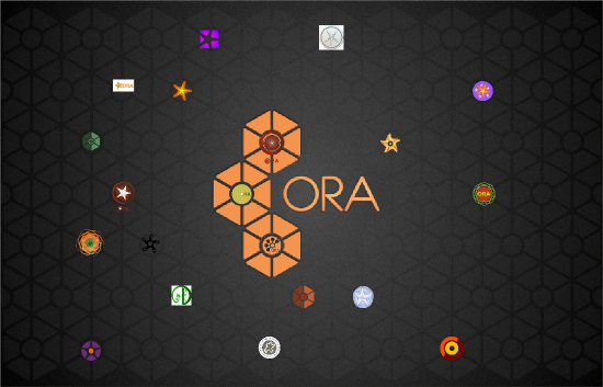